To make a room feel cosier, you can colour cap by carrying your wall colour onto the ceiling, which visually lowers height and creates a warm, wrapped-in “lid”. In UK homes, use coving or a pencil line as your boundary, and choose a full cap, a 100–300mm perimeter band, or a short wrap. Pick warm, matte tones, especially in north-facing rooms. Mask with low-tack tape, seal edges, and peel while tacky. Keep going to see the best heights and colour choices.
Key Takeaways
- Extend wall colour 10–30cm onto the ceiling, or cap the full ceiling, to visually lower height and feel more cocooning.
- Choose warm, muted tones (clay, terracotta, caramel, blush) to add comfort and avoid stark contrasts.
- In tall rooms, drop the cap line 200–400mm to create a “lid” effect and reduce echoey spaciousness.
- In low rooms, keep caps light and limit the band to 50–150mm to stay cosy without making ceilings feel lower.
- Use matte or soft-matte paint and crisp taped lines; warm lighting and north-facing rooms benefit from warmer undertones.
What Is Colour Capping on Ceilings?
Ever wondered how you can add colour to a room without making the ceiling feel heavy? Colour capping is a decorating technique where you paint the ceiling the same shade as the top section of your walls, creating a continuous “cap” around the room. Instead of a hard stop at the cornice, the colour wraps up and across, which changes how you read the room’s proportions.
You typically carry the wall colour 10–30cm onto the ceiling, or paint the full ceiling to match, depending on your ceiling height and period details. In UK homes with coving or picture rails, you can use those lines as clean boundaries. Consider Lighting effects: warm bulbs deepen paint tones, while daylight can cool them. Apply colour psychology to choose a mood-setting shade.
Why Does Colour Capping Make Rooms Feel Cosy?
When you colour cap a ceiling, you visually compress the room’s height, so the space feels lower and more intimate rather than tall and airy. By carrying the wall colour up and over, you create a clear line of enclosure that reduces stark contrast and makes the room read as a snug zone. In typical UK homes with standard ceiling heights, that subtle shift is often all you need to make a room feel properly cosy.
Visual Height Compression
Although your ceiling height hasn’t changed, colour capping makes it feel lower by pulling the visual “lid” of the room down the walls. By extending the ceiling colour 10–30cm below the junction, you shorten the apparent wall height, so your eye reads the space as more contained and less lofty.
You’ll get the strongest compression when the cap colour is a shade deeper than the wall, because Color psychology tells you darker, weightier tones seem to advance. Keep the line crisp on modern plasterboard; soften it with a slight blend for older Victorian lath-and-plaster where edges can look harsh. Also factor in ceiling textures: heavy artex or timber boards already add visual weight, so use a smaller drop; smooth ceilings can take a deeper cap without feeling abrupt.
Warmth Through Enclosure
Colour capping doesn’t just visually lower the ceiling; it also makes the room feel cosier by tightening the sense of enclosure. When the ceiling edge matches the wall tone, your eye reads the space as wrapped, not open-ended, which taps into Color psychology: darker or warmer hues signal shelter and calm. You’ll also notice a subtle shift in Room acoustics, as the perceived “hard box” feels smaller and sound seems less airy—ideal for UK living rooms, snug studies, and terraces with high ceilings.
- Use warm neutrals to create instant comfort.
- Choose deeper shades for evening cosiness.
- Keep the cap consistent around the whole room.
- Pair with soft lighting to reinforce enclosure.
- Balance with lighter floors to avoid gloom.
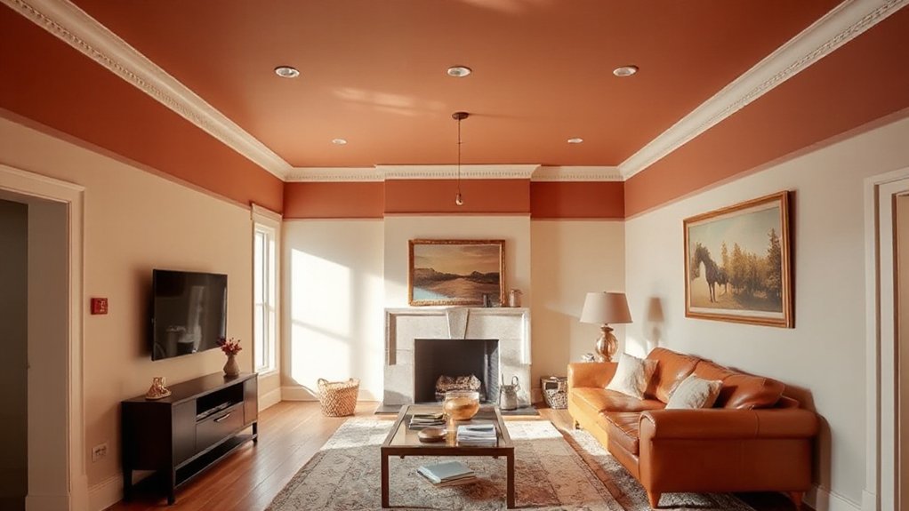
3 Colour Capping Styles (Ceiling, Band, Wrap)
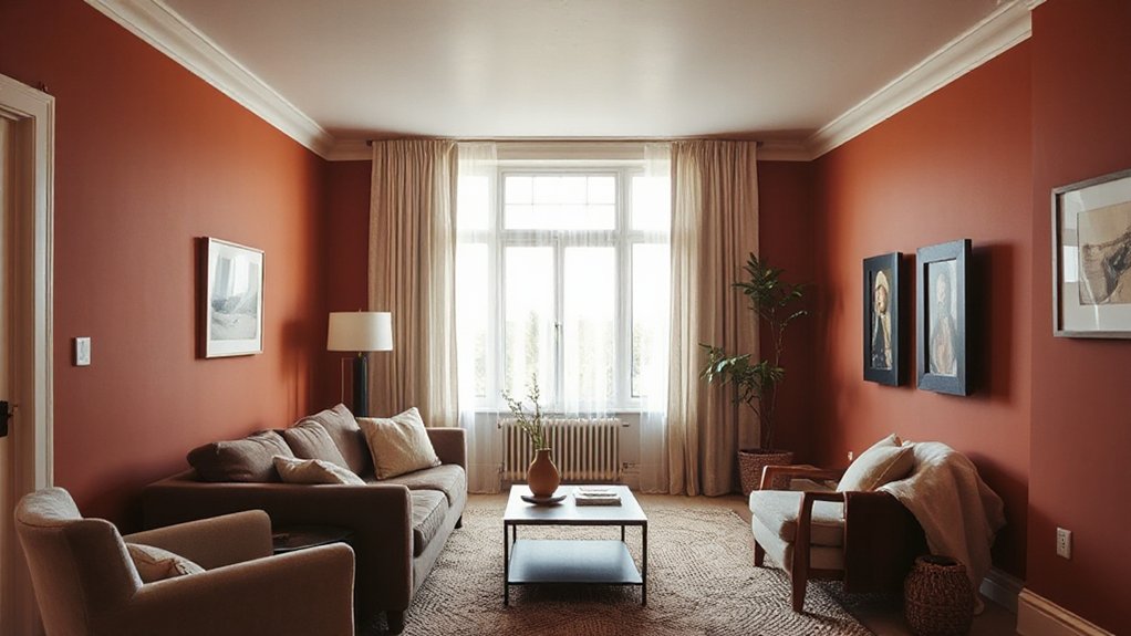
You’ve got three reliable ways to colour cap a ceiling, and each one changes the room’s proportions in a different way. Choose full ceiling capping for maximum impact, perimeter band capping for a crisp border, or a wall-to-ceiling wrap to soften edges and pull the scheme together. In UK homes, your ceiling height, coving, and existing light levels will tell you which style will work best.
Full Ceiling Capping
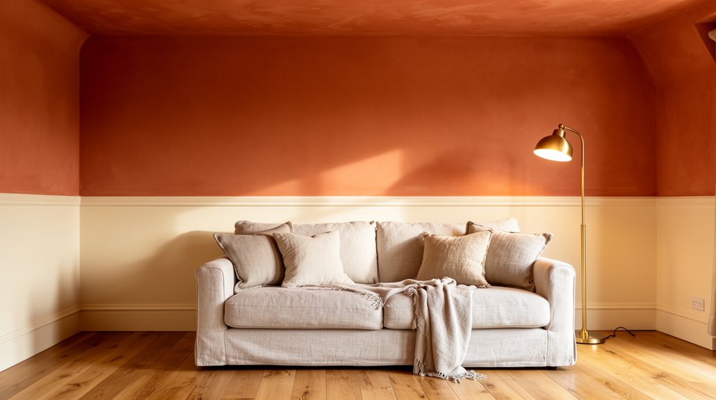
When you want a bold, cohesive finish, full ceiling capping takes the wall colour right across the entire ceiling plane for a deliberate, modern look. You’ll amplify warmth and intimacy, using Color psychology to make the room feel wrapped and settled, while managing ceiling illusions so the height reads as intentional, not cramped. In UK homes with lower ceilings, choose mid-tones or soft deep shades rather than stark darks.
- Match ceiling and walls in the same finish for seamlessness
- Use matt to hide plaster flaws and reduce glare
- Keep coving, cornices, and woodwork crisp in white or a paler tone
- Test the colour under evening lamps and grey daylight
- Repeat the shade in textiles so it looks designed, not accidental
Perimeter Band Capping
Although full ceiling capping can feel dramatic, perimeter band capping gives you the same sense of intent with less commitment by painting a band of wall colour around the ceiling edge (typically 100–300mm) and leaving the centre in white or a lighter tone. It tightens proportions, lowers the perceived ceiling line, and makes a room feel snugger without darkening it.
You’ll get the cleanest result if you mark the band with a laser level, then cut in with a quality angled brush and finish with a small roller to match wall texture. Use Lighting accents by keeping the band clear of downlights and coving shadows so the edge reads crisp. Build Texture contrasts by pairing matte walls with a soft-sheen band for subtle definition.
Wall-To-Ceiling Wrap
Wall-to-ceiling wrap takes the perimeter band idea and carries the wall colour right up and over the ceiling, either fully or for a set depth, so the room reads as one continuous envelope. You’ll reduce contrast at the junction, which visually lowers the ceiling and boosts cosiness—classic Color psychology in practice. Use it in UK terraces and new-build boxes where sharp white ceilings can feel stark, especially under cool LEDs.
- Choose mid-to-deep tones for snug lounges; keep LRV moderate in small bedrooms.
- Wrap 200–400mm for subtlety, or full-ceiling for maximum cocooning.
- Match finish: matt hides flaws; sheen can telegraph ceiling texture.
- Keep coving, cornices, and downlights the same colour for calm.
- Test at night; lamps shift undertones dramatically.
How Far Down Should Colour Capping Go?
Ideally, how far down should your colour cap run from the ceiling? In most UK rooms, aim for 150–300mm to soften the junction without dragging the ceiling down. If you’ve got high ceilings or tall coving, you can push it to 300–450mm, but keep it consistent on every wall. Use your ceiling texture as a guide: on heavy artex or deep plaster detail, stop the cap just below the busiest pattern so edges look intentional, not messy. Factor in lighting effects too. With uplighters, a deeper cap can highlight imperfections; with pendants and side lamps, a shallower band often reads cleaner. Mark a level line, test in daylight and evening, then commit.
Should You Cap With the Wall Colour or Darker?
Once you’ve settled the depth of your colour cap, the next decision is whether it should match the wall colour or go a shade darker. Matching creates a seamless envelope that lowers the perceived ceiling height without fuss, ideal for smaller UK rooms and uneven plaster. Going darker adds Accent contrast, visually ‘pressing’ the ceiling down and making the space feel more intimate—useful in tall terraces or draughty-feeling lounges.
Use this quick check before you commit:
- Match if you want calm, continuous lines and minimal edges
- Go darker if you need stronger definition around coving or beams
- Match in low daylight rooms to avoid a heavy lid effect
- Go darker to balance large windows and bright white woodwork
- Let Colour psychology guide you: darker caps feel cocooning, lighter caps feel open
Warm Undertones That Flatter Colour Capping
Because the ceiling catches cooler daylight and throws it back across the room, warm undertones in your colour cap can stop the top of the space feeling stark or clinical. In UK north-facing rooms, choose caps with a hint of red, yellow, or brown: clay, caramel, warm greige, soft terracotta, or muted blush. Color psychology matters—these undertones read welcoming and help your eye settle, so the room feels snug without looking smaller. Match the warmth to existing timber, brass, or warm LEDs to keep the palette coherent. Also consider ceiling texture: artex, heavy stipple, or rough plaster can make paint appear lighter and chalkier, so sample a half-step warmer than you think. Use test swatches under day and evening light.
When a Dark Colour-Capped Ceiling Works Best
Although many people worry a dark ceiling will shrink the room, a deep colour cap often works best when you want to visually “lower” a tall UK ceiling, hide uneven plaster or old artex, and make the space feel cocooning rather than cold. You’ll get the best result when the walls stay lighter, so the eye reads the ceiling as a deliberate feature, not a mistake. Pay attention to Lighting effects and Material textures: uplighters can emphasise patchiness, while textured coving, beams, or ceiling roses look richer against depth.
- Victorian terraces with lofty heights
- North-facing rooms needing warmth and depth
- Bedrooms and snug lounges for a calmer feel
- Open-plan zones you want to “zone” without walls
- Ceilings with imperfect joins you’d rather disguise
What Sheen Looks Best for Colour Capping?
A dark colour-capped ceiling can look beautifully intentional, but the sheen you choose decides whether it reads as rich and even or highlights every ripple in the plaster. For most UK homes, go matt or soft matt: it disguises minor defects, keeps the colour saturated, and avoids glare from downlights. If you want wipeability in a kitchen-diner or child-proof hall, choose durable matt or eggshell; you’ll get better paint durability without turning the ceiling into a shiny focal point. Satin and silk are usually poor sheen options overhead because they telegraph patches, roller marks, and joins, especially on older plaster. Whatever you pick, match it to the wall finish and use a ceiling-rated formula for consistent coverage.
Colour Capping for Low Ceilings: Do’s and Don’ts
If your ceiling’s on the low side, you’ll get the best result by colour capping with light, warm shades that lift the room without closing it in. Keep the cap line lower down the wall to stretch the perceived height and keep the proportions balanced. Don’t use dark colours or take the cap too high, or you’ll make the ceiling feel lower and the space tighter.
Choose Light, Warm Hues
When you’re colour capping a low ceiling, stick to light, warm hues to lift the plane and keep the room feeling open. In UK homes, that means creamy off-whites, soft ivories, pale biscuit, and gentle blushes rather than stark brilliant white or cool greys. Use Color psychology to your advantage: warm tints read welcoming and reduce visual “weight” overhead, especially in north-facing rooms.
- Choose a warm white with a hint of yellow or red undertone
- Match to your wall’s undertone so the transition looks intentional
- Test swatches under daylight and warm LED in the evening
- Pick a scrubbable matt for paint durability in busy family spaces
- Keep sheen low to avoid highlighting ceiling imperfections
Keep Cap Line Lower
Although you might be tempted to take the colour cap right up to the ceiling line, dropping it a touch lower usually makes a low ceiling feel higher. Set the cap 50–150mm down from the ceiling, then keep it consistent around the room, including over doors and across bays, so your eye reads one clean datum. Use a laser level or chalk line; don’t rely on coving that’s out. If your Ceiling texture is heavy (artex, stipple, rough plaster), keep the cut line on the wall, not the ceiling, to avoid ragged edges. Nail your paint preparation: fill dings, sand the top band smooth, and prime repairs so the cap colour covers evenly. Finish with quality masking tape and burnish lightly.
Avoid Dark, High Caps
Because low ceilings already compress the room, a dark cap set high on the wall will drag the ceiling down and make the space feel squat. You’ll notice it most in UK terraces and compact new-builds, where light is limited and proportions matter. If you want a cosy feel without shrinking the space, keep darker tones low and let the ceiling read lighter.
- Choose a pale cap or ceiling tint, not charcoal or navy.
- If you crave depth, use a mid-tone cap and a lighter ceiling.
- Reserve inky shades for skirtings, alcoves, or chimney breasts.
- Test Creative colour combinations in daylight and lamplight.
- In Historical interior styles, echo period trims with softer heritage hues.
You’ll get warmth, but the room still breathes and feels taller.
Colour Capping for Tall, Echoey Rooms
If your room has a high ceiling and a noticeable echo, colour capping gives you a quick way to make it feel lower, warmer, and more controlled. Drop the cap line by 200–400mm to visually compress the height, especially in Victorian terraces and newer open-plan builds. Choose a mid-tone rather than near-black, then take it across the ceiling and down the walls to your marked line for a cohesive “lid”.
Check your Ceiling texture first: heavy artex or stipple catches paint and can look patchy, so use a stain block and two full coats. Plan for Lighting effects: pendants and spots throw shadows at the cap edge, so keep the line level and crisp, and use a durable matt.
North vs South Light: How Colour Shifts on Ceilings
In a north-facing UK room, your colour-capped ceiling will read cooler, so hidden blue, grey, or green undertones can suddenly stand out. In a south-facing room, stronger, warmer daylight boosts saturation, making the same shade look richer and sometimes more intense overhead. Check the room’s aspect before you commit, because light direction can change the ceiling colour more than you expect.
North Light Ceiling Undertones
While you might pick the perfect ceiling white in the shop, its undertone can flip once it’s up—especially in a north-facing room. North light in the UK runs cool and can exaggerate blue, grey, or green casts, making a “clean” white feel stark and a colour-capped ceiling look flat.
- Choose warmer whites (pink, cream, or gentle yellow undertones).
- Test a1 sheets on the ceiling, morning and late afternoon.
- Balance with warmer wall paint, not just lamps.
- Match with Exterior accents so indoor whites don’t clash through windows.
- Adjust for Seasonal colour schemes; winter light makes cool undertones harsher.
If you’re capping in a pale tone, pick one with warmth built in, or you’ll amplify chill.
South Light Ceiling Saturation
Ever wondered why the same colour-capped ceiling that looks crisp in a north-facing room suddenly reads louder in a south-facing one? South light is warmer and more direct, so it boosts saturation and makes undertones pop. Your carefully chosen cap can feel richer, sometimes even slightly brash, especially with yellows, reds, and warm greys.
To keep it cosy, drop your ceiling colour a step lighter or add a touch more grey. Test at different times: morning sun, midday glare, and late afternoon. Pay attention to Ceiling texture too—heavy artex or stipple creates shadowing that deepens colour, while smooth plaster reads cleaner. Manage Lighting effects with warm LEDs (2700K) and avoid cool lamps that fight the sunlight indoors.
Colour Capping Around Trim, Coving, and Cornices
Because trim, coving, and cornices create hard visual breaks, you’ll get the cleanest colour cap by choosing a single boundary line and sticking to it all the way round the room. In UK homes, decide whether the cap stops at the wall/ceiling junction or runs onto the moulding, then keep that decision consistent so the eye reads one calm band.
- If you’ve got Decorative trim, paint up to its bottom edge for a crisp cap.
- For ornate coving, carry the ceiling colour onto the flat face, stopping at the first curve.
- With Crown moulding, cap to the lower step to visually drop the ceiling.
- Mask with low-tack tape; burnish lightly for sharp lines on plaster.
- Use the same finish as the ceiling so the moulding doesn’t ‘flash’ under lamps.
Common Colour Capping Mistakes (and Fixes)
Once you’ve picked your boundary line around trim, coving, or cornices, the job becomes keeping that line—and the finish—consistent across the whole room. A common mistake is choosing a cap colour that fights the walls; use colour psychology: warm neutrals and muted reds make ceilings feel lower and cosier, while icy blues can feel stark. Another slip is ignoring lighting effects: north-facing rooms flatten cool shades, so go a touch warmer; under LEDs, test for unwanted pink or green casts. Don’t swap paint sheens mid-room—matt next to silk highlights every wobble. Watch your batch numbers too, or you’ll see banding at certain angles. Finally, don’t rush drying times; scuffs happen fast on fresh paint, especially in hallways and landings.
How to Tape and Paint Crisp Colour Cap Lines
After you’ve marked your cap height, you’ll get the sharpest line by treating masking tape as a precision tool rather than a shortcut: clean and de-grease the surface (sugar soap works well), let it dry fully, then run a good low-tack decorator’s tape tight to your pencil line and burnish the edge with a filling knife. For tricky Ceiling texture (Artex, stipple), seal first, or paint will bleed.
- Paint the taped edge with the base colour to “caulk” leaks.
- Use a small angled sash brush; don’t overload it.
- Pull tape back on itself while paint’s still tacky.
- Keep a wet edge; work one wall at a time.
- Touch in with an artist’s brush, not a roller.
Choose shades with Color psychology in mind: warm mid-tones feel snug; cools recede.
Frequently Asked Questions
Can I Colour Cap Over Textured or Popcorn Ceilings?
Yes, you can colour cap textured or popcorn ceilings, but you must prep for reliable paint adhesion. Clean thoroughly, scrape loose ceiling texture, spot-fill, then use a stain-blocking primer. Apply two coats with a roller.
How Do I Calculate How Much Extra Paint Colour Capping Needs?
Measure ceiling area, add the capped drop area, then add 10–15% for overlaps and cutting-in. Check tin coverage (m²/L) and buy one extra litre. Do paint mixing carefully to keep colour accuracy.
Is Colour Capping Renter-Friendly and Removable Without Damage?
Yes, you can make colour capping renter-friendly, but it isn’t fully damage-free. Like a gentle nod to Dulux, use low-tack masking, test first, prioritise paint durability, and factor budget considerations for repainting.
Will Colour Capping Affect Room Resale Value or Buyer Appeal?
You’ll likely boost buyer appeal if you execute colour capping neatly, using durable paint for strong paint durability and broader aesthetic appeal. Poor prep or bold colours can deter UK buyers; stick to tasteful, neutral tones.
Can I Use Peel-And-Stick Wallpaper Instead of Paint for Capping?
Yes, you can use peel-and-stick wallpaper for capping, but choose ceiling-rated stock and prep well. As Wallpaper alternatives, it’s faster. Paint vs wallpaper: paint lasts longer, hides seams, and resists UK humidity better.
Conclusion
Colour capping’s your quickest route to a cosier room: you lower the “ceiling” visually, soften hard edges, and make light feel warmer. Choose a cap depth that suits the height, test the colour in your north or south light, and decide whether to match the wall or go a shade deeper. Work neatly around coving and trim, and don’t cut corners with prep and taping. Get it right, and the space just settles.