You’ll get a timeless look by letting 1–2 British heritage motifs (tartan, floral, paisley) lead, then building everything else on a modern “quiet base” of clean-lined solids in oat, stone, ink, or ivory. Keep patterns to about one-third of what you see, and push scale contrast—one bold repeat, one smaller accent—so nothing competes. Repeat one solid tone three times, anchor with a rug pulling 2–3 muted hues, and finish with modern lighting; there’s more ahead.
Key Takeaways
- Start with a quiet modern base: clean-lined, low-profile furniture in neutral solids to let vintage motifs stand out.
- Choose one hero British pattern (tartan, floral, paisley) on the largest surface, like a rug or sofa.
- Add only one secondary pattern in a different scale; avoid multiple mid-scale prints that compete visually.
- Repeat one solid tone or undertone from the pattern in at least three places to create cohesive color flow.
- Anchor and modernize with texture and materials—tweed, linen, leather, walnut, and aged brass—while keeping accessories minimal.
Start With a Simple 3-Step Mixing Plan
Whether you’re pairing a chesterfield-inspired pattern with a low-slung sectional or setting a modern dining table against heritage wallpaper, you’ll get a cleaner result if you follow a simple three-step plan. First, set a modern baseline: pick one dominant finish family (warm oak, matte black, or brushed brass) and repeat it twice so the room reads current. Second, map furniture placement before you add motifs; anchor the largest piece, then keep clear sightlines and consistent walkway widths so the vintage elements feel intentional, not busy. Third, control scale and spacing: use one oversized motif and support it with solids, then cap accents at three touchpoints (pillow, lamp, art) to lock in Vintage charm without visual clutter. Keep edits ruthless, and you’ll stay timeless.
Choose 1–2 British Heritage Patterns to Lead
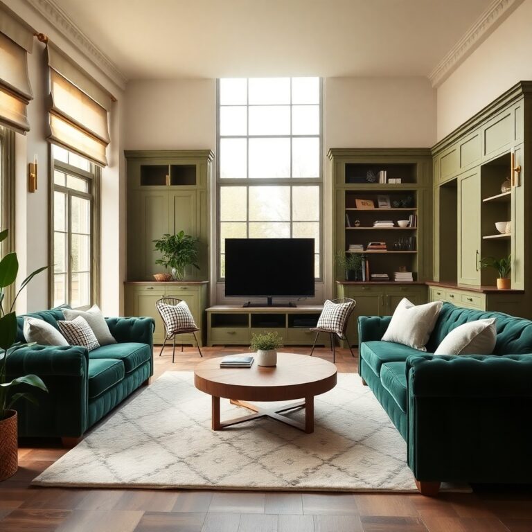
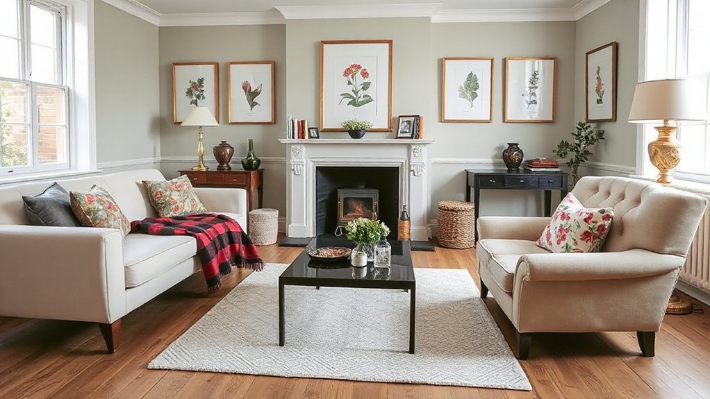
Pick just one or two British heritage patterns—like tartan, paisley, or a tight floral—and let them lead the room. You’ll keep it current by prioritizing scale and contrast: pair one bold, large-repeat motif with one quieter, smaller-repeat print so modern furniture reads clean, not busy. Anchor the mix with solid colors on key pieces (sofa, rug, drapery) to give the patterns crisp breathing space.
Limit To Two Patterns
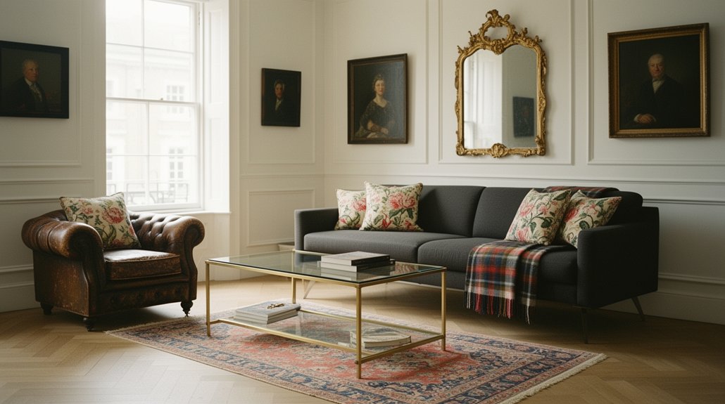
Because British heritage patterns carry so much visual history, you’ll get a cleaner, more modern result by letting just one—or at most two—take the lead. Start by naming your anchor motif (think tartan, William Morris florals, or regimental stripe), then pick a single supporting pattern that shares a related palette or era-specific sensibility. This keeps the historical influence readable instead of turning your room into a costume set. Commit to disciplined pattern pairing: use the lead motif on a primary element like curtains, a rug, or an upholstered chair, and reserve the second pattern for a smaller, repeatable accent such as cushions or a lampshade. Everything else should stay textural and quiet—linen, leather, oak, or matte metal—so modern pieces feel intentional.
Prioritize Scale And Contrast
Keeping your scheme to one or two heritage patterns sets the guardrails; scale and contrast decide if the room reads sharp and modern or busy and nostalgic. Choose a lead motif—say, bold tartan or oversized William Morris florals—and assign it the largest canvas: a rug, drapery run, or upholstered sofa. Then build pattern hierarchy with a secondary print in a different scale: tight pinstripe, small check, or subtle paisley on cushions or a single chair. Push scale contrast so the eye can sort layers quickly; avoid two mid-scale patterns competing. Keep contrast intentional: pair high-contrast blackwatch with quieter neutrals, or soften a vivid floral with low-contrast micro-geometrics. This feels curated, not costumed.
Anchor With Solid Colors
Once you’ve chosen your one or two heritage patterns—tartan, houndstooth, or a Morris floral—lock in the rest of the room with solid, modern blocks of color so the motifs read intentional, not overwhelming. Treat the pattern as your headline and let upholstery, walls, and rugs deliver calm. Aim for crisp Color contrast: think ink navy, bone, camel, or charcoal against the print’s dominant tone. That discipline sharpens Pattern coordination, so vintage reads curated, not costume. Keep finishes sleek—matte lacquer, blackened steel, pale oak—to modernize the story.
- You’ll feel instant visual quiet without losing character.
- You’ll get a confident “gallery wall” focus for the eye.
- You’ll notice the room looks larger and cleaner.
- You’ll enjoy heritage warmth without visual clutter.
Build a Modern “Quiet Base” With Clean Lines
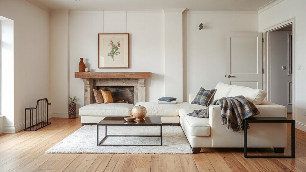
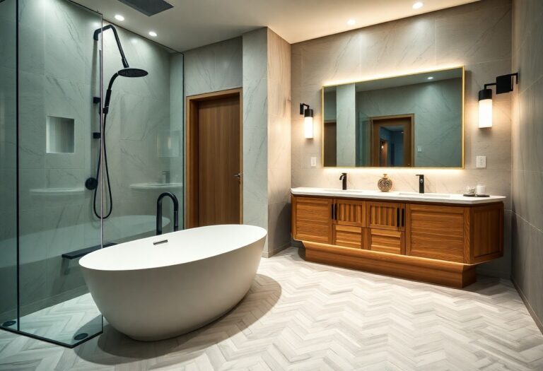
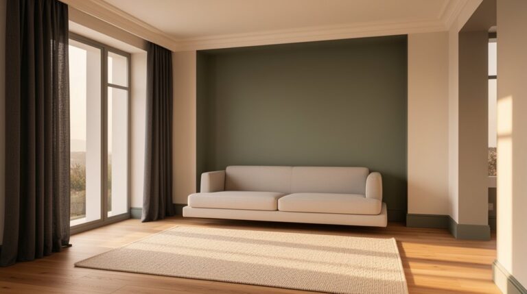
If you want vintage British motifs to feel intentional rather than busy, start by building a modern “quiet base” of clean-lined furniture and restrained forms. Choose low-profile sofas, streamlined casegoods, and simple dining chairs with minimal ornament. Prioritize consistent silhouettes, tight tailoring, and slim legs so the room reads calm before you layer pattern. Keep surfaces edited: one substantial coffee table, one sculptural lamp, and discreet storage to hide visual noise. Then introduce Vintage accents with purpose—an embroidered cushion, a framed hunting print, a brass umbrella stand—each given breathing room. In Modern decor, you’ll get the best results by repeating one or two finishes across the space, like blackened steel or warm oak, to unify old and new. This structure lets heritage details look curated, not cluttered.
Set a Heritage Color Palette (Plus Neutrals)
Although a modern base thrives on restraint, you’ll get the most authentic British-vintage impact by anchoring the room in a heritage palette—then tempering it with disciplined neutrals. Start with one historically grounded hue: oxblood, deep forest, inky navy, or warm tobacco. Keep it matte or softly chalky to feel timeworn, not trendy-glossy. Then layer Neutral accents—stone, oatmeal, parchment, and soot—across walls, rugs, and upholstery so the vintage notes read refined, not theatrical. Use brass, walnut, and aged leather as bridges between eras, and repeat your key tone in small, intentional touches to create continuity.
- You’ll feel calm, not cold
- You’ll sense history without heaviness
- You’ll get richness without clutter
- You’ll see modern pieces look instantly grounded
Use Scale: One Bold, One Medium, One Small
When you control scale on purpose, vintage British motifs stop feeling fussy and your modern pieces don’t get visually steamrolled. Pick one bold motif as the anchor: a large-scale tartan drapery, oversized chintz on a single accent chair, or a mural-style toile panel behind a sleek sofa. Then add one medium element that bridges eras, like a plaid ottoman, a gingham bench cushion, or a patterned rug with clean geometry for Modern contrast. Finish with one small note for Vintage charm: trim on pillows, a lampshade lining, framed prints, or porcelain with transferware. Keep bold pieces low in count, and let modern silhouettes stay crisp so the motif reads intentional, not busy. Aim for breathing room, always.
Mix Patterns With the 60/30/10 Rule
To keep vintage British patterns from competing with your modern furniture, apply the 60/30/10 rule as a visual hierarchy rather than a strict formula. Let 60% be your dominant motif (say, a softened William Morris-style print), 30% a supporting pattern (a restrained stripe or check), and 10% a sharp accent (a small-scale floral or heraldic repeat). Pattern pairing works best when you control contrast through Color coordination—repeat one hue across all three layers, then vary scale and line weight to keep it current.
- You’ll feel calm when the dominant print anchors the room.
- You’ll get confidence from a clear second pattern.
- You’ll spark delight with a precise accent dose.
- You’ll avoid chaos by repeating color intentionally.
Add Solids So the Room Can Breathe
Once you’ve set your vintage British motifs, you’ve got to counter them with solids so the room can breathe. Balance checks, florals, and stripes with calm, solid upholstery and large-scale fields of color, keeping the eye from getting overstimulated. Use neutral solid anchors—stone, oat, ink, or warm greige on a sofa, rug, or drapery—to ground the mix and make the patterns read intentional and current.
Balance Patterns With Solids
Although vintage British motifs thrive on visual richness—think chintz florals, ticking stripes, tartan checks, and heritage damasks—you’ll get a sharper, more modern result by anchoring them with confident solids so the room can breathe. Treat Pattern clash as a deliberate accent, not the whole story: let one hero pattern lead, then use solid upholstery, casegoods, or drapery to frame it. Aim for Solid harmony by repeating one solid tone in at least three places, so your eye moves smoothly, not frantically. Keep patterned pieces to about a third of the visual field, and scale them—large on one item, smaller elsewhere—so nothing competes.
- You’ll feel instant calm without losing character
- Your focal pieces look curated, not chaotic
- The room reads larger and cleaner
- Every motif lands with confidence
Use Neutral Solid Anchors
Neutral solid anchors give your vintage British patterns a clean runway, building on that one-hero-pattern approach without letting the room tip into visual noise. Choose modern upholstery in oat, stone, ink, or warm ivory, then let your motif live on a single statement: a chintz chair, tartan drapery, or a William Morris-style rug.
Use matte or nubby textures—bouclé, brushed cotton, wool felt—to add depth without adding print. Lock in Color harmony by pulling one undertone from the pattern and repeating it in solids: piping, sofa legs, or a painted bookcase. Keep pattern repetition deliberate and minimal: echo the hero motif once in a cushion or lampshade, then stop. Your neutrals create pause points, so the vintage details read intentional, not busy.
Layer Textures: Tweed, Linen, Leather, Velvet
- You’ll feel grounded by tweed’s reassuring heft.
- You’ll sense ease in linen’s cool, lived-in drape.
- You’ll get confidence from leather’s polished resilience.
- You’ll experience quiet drama as velvet glows at dusk.
Pick a Rug That Anchors Pattern and Color
Where should your eye land when vintage British florals, plaids, and stripes start competing with modern silhouettes? It should land on the rug, so choose one that sets the room’s visual temperature and scale. Start with color: pull two to three tones already present in your vintage textiles, then repeat them at a lower saturation for a modern, edited feel. Next, control pattern: if your upholstery runs busy, pick a rug with a restrained ground—faded Persian, Oushak, or heathered wool—so British motifs read intentional, not noisy. If furniture is clean-lined and quiet, you can go bolder with a tartan-inspired check. Size matters: go large enough that front legs sit on it. That’s how you unify eras.
Refresh the Look With Small Swaps (Pillows, Throws)
Even if your core pieces stay put, you can recalibrate the whole vintage-British-meets-modern mix with a tight edit of pillows and throws. Start with Pillow pairing: keep one heritage pattern (tartan, chintz, or needlepoint) and balance it with two solids pulled from your rug, plus one modern geometric in a matte weave. For Throw styling, choose a single drape point—arm, back, or chaise—so it looks intentional, not fussy. Prioritize texture contrast: brushed wool against sleek leather, or linen against bouclé.
- You’ll feel the room exhale when colors finally harmonize.
- You’ll get that collected, London-flat confidence without clutter.
- You’ll spark warmth on cold nights with a better hand-feel.
- You’ll see your modern lines look sharper beside softer heritage motifs.
Use Modern Lighting to Keep It Current
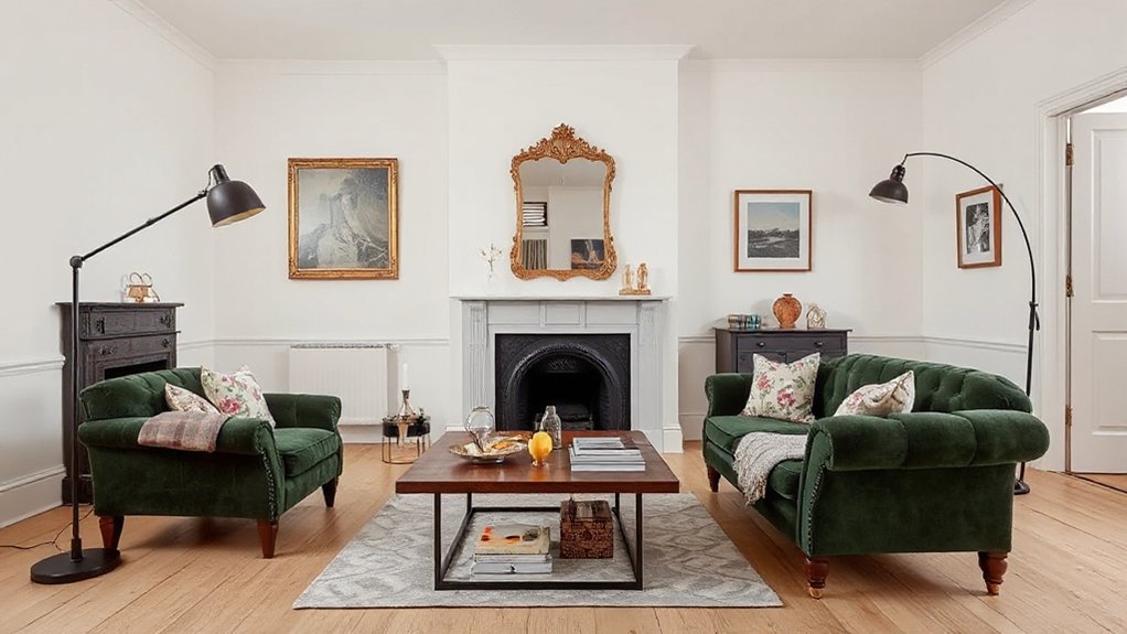
Although you’re layering in tartans, chintz, and other heritage motifs, modern lighting is what stops the room from reading like a period set and keeps the mix firmly current. Start with one clean-lined statement piece: a slim blackened-metal chandelier, an opal-glass globe pendant, or an architectural LED bar over the dining table. Keep finishes intentional—mix aged brass with matte black or polished nickel, but repeat each finish at least twice for cohesion.
Then edit your Vintage fixtures. If you love a cut-glass sconce or a pleated-shade lamp, rewire it, add a warm 2700K dimmable LED, and choose crisp linen shades to sharpen the silhouette. Layer task, ambient, and accent light so patterns feel tailored, not busy. Use dimmers throughout.
Hang British Artwork: Placement, Frames, Spacing (and Fixes)
- You’ll feel grounded when sightlines line up
- You’ll get instant drama from a single hero piece
- You’ll calm the room with disciplined spacing
- You’ll save plaster using hooks, anchors, and museum putty
Frequently Asked Questions
Where Can I Source Authentic Vintage British Textiles on a Budget?
You’ll find Vintage fabrics cheaply at UK charity shops, car boot sales, and local antique centres; also check Etsy, eBay, and Facebook Marketplace. For reliable Textile sources, join textile fairs, deadstock outlets, and museum surplus sales.
How Do I Blend Antiques With Modern Pieces Without Risking Damage?
If you’ve just bought an antique, coincidence says your modern sofa’s feet can scratch it—use felt pads, coasters, and UV-filtering film. Prioritize Antique preservation with stable humidity and spacing; choose reversible Modern restoration, avoid harsh cleaners.
What Modern Furniture Brands Pair Best With British Heritage Motifs?
You’ll pair British heritage motifs best with B&B Italia, Vitra, and Hay for Contemporary craftsmanship, plus Ligne Roset and Muuto for Global influences. Choose clean silhouettes, muted leathers, and oak veneers to spotlight tartans and chintz.
How Can I Mix British Motifs in a Small Rental Without Painting Walls?
You can layer British motifs without paint by using removable wall decals, swapping cushion covers, and hanging plaid curtains. Anchor the scheme with floor rugs in tartan or herringbone, and keep furniture silhouettes clean.
How Do I Avoid Cultural Clichés When Using British-Inspired Decor?
Avoid clichés by prioritizing Cultural sensitivity and Authentic representation: research regional sources, mix eras, and credit makers. You shouldn’t overuse Union Jacks or guards. Choose subtle textiles, heritage ceramics, and contemporary art for balance.
Conclusion
You’re curating like a time traveler with a rulebook: pack 1–2 heritage patterns, then set them on a quiet, modern base. Keep your palette disciplined—heritage hues plus tailored neutrals—and control scale with one bold, one medium, one small. Let a grounding rug tie the story together. Swap pillows and throws seasonally, but keep silhouettes clean. Finish with modern lighting and crisply framed British art, spaced with gallery precision.