You’re seeing espresso brown and olive green replace cold grey because they look warmer and more expensive in real light. Espresso adds depth and stability, while olive brings a muted, botanical softness that flatters skin, wood, and stone. Grey can skew blue under LEDs and feel sterile, but earthy undertones stay rich at 2700–3000K. Pair them with linen, travertine, and warm metals, then balance with ivory to keep rooms bright. Next, you’ll see exactly where to use them.
Key Takeaways
- Espresso and olive have natural undertones that look warmer and richer on skin, wood, and stone in real-world lighting.
- Grey often reads blue or sterile under LEDs, making rooms feel colder and less inviting.
- Espresso adds grounded depth and contrast, while olive softens transitions as a muted mid-tone.
- Brown and green are linked to comfort and restoration, aligning with today’s desire for calm, lived-in spaces.
- Earthy palettes pair easily with linen, leather, travertine, and warm metals, creating intentional, high-quality interiors.
Why Espresso Brown and Olive Green Feel Warmer Than Grey
While grey reads sleek and neutral, espresso brown and olive green feel warmer because they carry natural, “living” undertones that flatter skin, wood, and stone in real-world lighting. You see it immediately: grey can skew blue or sterile under LEDs, but espresso anchors a space with depth, and olive softens contrast with a muted, botanical cast.
Color psychology explains the shift: you read brown as shelter and reliability, and green as restoration, so you relax faster than you do with cool greys. The Cultural significance matters, too—earth pigments recall craft, heritage materials, and landscape-driven design, from Mediterranean olive groves to Japanese wabi-sabi neutrals. That resonance boosts perceived quality, which is why premium brands and builders now specify these tones to signal warmth and longevity without going rustic.
Where to Use Espresso and Olive (By Room + Surface)
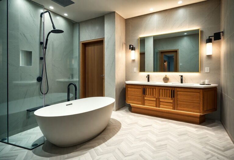
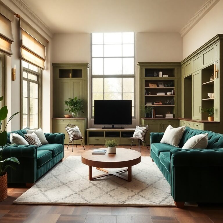
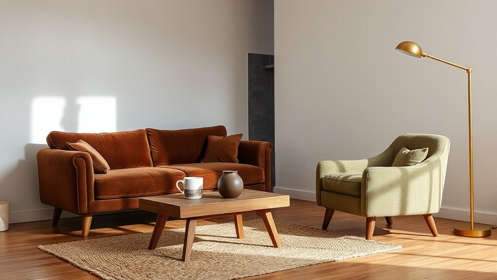
Because espresso brown and olive green behave like “quiet neutrals” with built-in depth, you can place them strategically by room and surface to upgrade warmth without darkening your whole home. In the living room, ground the space with an espresso media unit or coffee table, then bring olive in through Textile textures like velvet pillows or a nubby throw. In the bedroom, use espresso on a headboard, nightstands, or picture frames for a tailored feel; keep olive to a single wall or linen bedding to soften glare. In the kitchen, choose espresso for lower cabinetry or open shelving; use olive on backsplash tile or barstools for a fresh, earthy note. In baths, go olive on walls and espresso on vanities, then finish with metal Decorative accents.
Pairings That Make Espresso and Olive Look Intentional
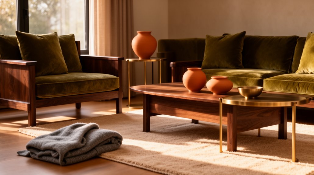
For Material pairing, lean on tactile neutrals: cognac leather, linen in flax, and honed travertine or creamy ceramic. If you want a sharper, editorial edge, introduce inky navy, tobacco, or oxblood in small hits like piping, art frames, or a single patterned textile. Keep wood species consistent—walnut and smoked oak outperform red oak here—and repeat one finish twice so the palette feels intentional across the space. Avoid icy chrome and stark optical whites.
How to Balance Earthy Tones With Light and Contrast
Even if you love a fully earthy palette, you’ll get a more elevated, design-forward result when you build in light and contrast on purpose. Start by reserving 30–40% of the room for lighter values: warm white paint, ivory upholstery, pale oak, or travertine. Then place espresso in smaller, high-impact moments—frames, hardware, legs—so it reads crisp, not heavy. Use olive as a mid-tone bridge, especially in textiles, to keep the scheme current.
Let Color psychology guide you: lighter neutrals expand and calm, while espresso signals stability and olive reads grounded and restorative. Finally, layer Material textures to reflect light: bouclé, linen, honed stone, ribbed glass, and matte metals. You’ll get depth without losing brightness.
Common Espresso-and-Olive Mistakes (and Easy Fixes)
When you pair espresso with olive, small missteps can make a room feel muddy, dated, or heavier than you intended. The first mistake is matching undertones: cool olive plus ashy espresso kills warmth. Fix it by choosing one temperature and repeating it in trim, textiles, and art. Another common issue is over-saturating the room; Color psychology says deep greens read restful, but too much turns cave-like. Add negative space with creamy whites, pale oak, or warm metal. You’ll also lose the trend-forward look if you ignore Material textures. Balance matte paint with nubby linen, veined stone, and brushed leather, then add one crisp, light-reflective finish. Finally, don’t skip lighting; use 2700–3000K layers to keep both hues rich.
Frequently Asked Questions
What Undertones Should I Check Before Choosing Espresso or Olive Paint?
Check your room’s light and finishes for undertones: espresso needs warm red/golden or neutral bases; olive favors yellow/gray-green. Use undertone matching with your flooring, metals, textiles for seamless color coordination that sells.
Do Espresso and Olive Colors Affect Resale Value Compared to Greys?
Yes—done right, they can boost resale versus greys. Espresso signals stability; olive signals wellness. You’ll leverage Color psychology, highlight Environmental impact, and stage with light neutrals so buyers see warmth, not risk.
Are Espresso and Olive Suitable for Small, Low-Light Apartments?
Yes, you can use espresso and olive in small, low-light apartments if you balance them with light ceilings, mirrors, and warm bulbs. Color psychology adds coziness; in modern or rustic decorating styles, keep trims crisp.
Which Finishes Work Best for Espresso and Olive: Matte, Satin, or Gloss?
Choose matte for espresso walls, satin for olive cabinetry, and gloss on trims—you’ll get Color pairing that feels like candlelit velvet, not harsh glare. Add Texture contrast with brushed metals and linens; it’s a current designer move.
How Do I Transition From Grey Decor to Espresso and Olive Without Replacing Everything?
You can shift by layering espresso and olive accents over grey: swap pillows, throws, and art first. Use color mixing techniques like warm neutrals and brass. Explore furniture pairing options: espresso wood, olive upholstery, retain core basics.
Conclusion
You’re watching the pendulum swing from steely grey to espresso and olive, and it’s no accident. Like a Tuscan café and an old-world library, these hues wrap your rooms in lived-in warmth while still reading modern. Use them where you touch and linger—cabinets, walls, upholstery—then sharpen the look with crisp ivory, brass, and black. Skip muddy mid-tones, keep contrast deliberate, and your space will feel current, not dated.