When you’re choosing a colour scheme for black wall units, you need to balance contrast with warmth so the room feels composed rather than stark. Start by checking your light levels and the units’ undertone, then decide whether you’ll soften them with oatmeal, stone, or greige, or sharpen the look with crisp white and a measured accent shade. The next step is where most schemes either succeed quietly or start to feel heavy…
Key Takeaways
- Pair black wall units with warm neutrals like stone, oatmeal, or greige to soften contrast and create a welcoming, lived-in feel.
- Use crisp or creamy white walls and trim to frame black units cleanly and make the room feel brighter and larger.
- Add calm, cool tones like sage or duck-egg blue for an airy, ordered look that balances black’s visual weight.
- Introduce jewel-tone accents—emerald, navy, sapphire, or amethyst—on one feature wall or textiles for drama without overwhelming the space.
- Match colors to black’s undertone: warm blacks suit earthy hues and brass; cool blacks pair with crisp greys, steel, and saturated blues.
How to Choose Colors for Black Wall Units
Although black wall units look striking on their own, you’ll get the best result by choosing colours that balance their visual weight and suit the room’s light. Start with your desired mood: Color psychology suggests warm neutrals (stone, oatmeal) soften black and feel welcoming, while cool shades (sage, duck-egg) create calm order. If you want drama, pair black with deep jewel tones, but limit them to one wall or key textiles so the unit remains the anchor.
Next, apply furniture coordination. Match undertones: choose creamy whites with warm woods, or crisp whites with oak and chrome. Repeat one accent colour across cushions, rugs, and artwork, and keep metals consistent. Finally, test paint samples beside the unit and assess them across the day.
Lighting Tips for Black Wall Units
Because black wall units absorb light rather than reflect it, you’ll get a sharper, more balanced look by layering your lighting instead of relying on a single ceiling fitting. Start with dimmable downlights or a central pendant on a warm-white LED to provide even ambient coverage. Add wall washers or picture lights to lift Wall art and stop the unit reading as a flat block. Under-shelf LED strips work well for open bays, while discreet puck lights suit cabinets and help you find items without glare. Place a floor lamp to one side to create depth and soften hard edges. Choose fittings with opal diffusers, and keep switches accessible for scenes. Finish by spotlighting decorative accessories so they look intentional, not lost.
Warm vs Cool Black: Undertones to Check
Once you’ve layered your lighting, check the undertone of your black wall unit, as it will shift under warm-white LEDs and daylight. In UK homes, “black” often reads as brown-black, blue-black, or green-black, and each drives different pairing choices and mood.
Test with large peel-and-stick swatches beside the unit at morning, midday, and evening. If it looks brownish, you’ve got a warm black; you’ll usually balance it with earthy tones and aged metals for a welcoming feel. If it reads inky or bluish, it’s a cool black; you’ll typically complement it with crisp greys, steel finishes, and saturated jewel accents for clarity. Use colour psychology: warm blacks feel intimate; cool blacks feel precise.
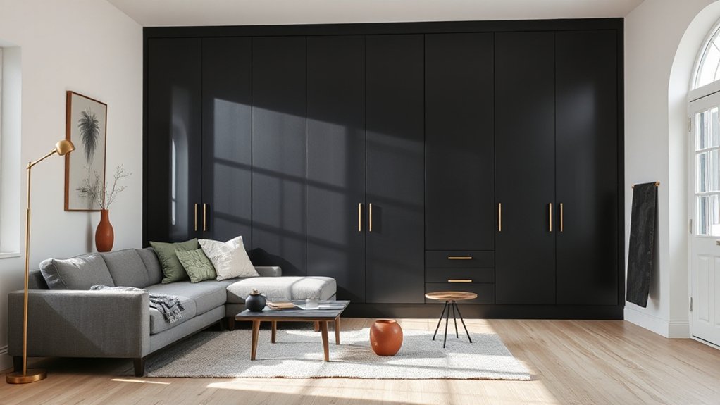
White Walls + Black Wall Units (Crisp to Creamy)
If you want a reliable, high-contrast backdrop for a black wall unit, start with white walls and then choose the right white for your light levels. In north-facing UK rooms, pick a soft, creamy white to prevent the unit looking stark and to keep shadows warm. In south-facing spaces with strong sun, use a crisp, clean white to sharpen Color contrast and make edges look precise. Keep the ceiling and woodwork in the same white for a seamless envelope, or go one shade brighter on trim to frame the unit neatly. Add a Bold accent through brass handles, oak shelves, or a single coloured artwork, rather than busy patterns. Choose a durable matt emulsion for walls and a satinwood finish for skirting and architraves.
Greige and Beige Pairings for Black Units
Choose a warm greige wall colour to soften black wall units and keep the room balanced in typical UK light. Then add beige accents—such as linen curtains, wool rugs, or textured cushions—to introduce warmth without competing with the units. You’ll get a calm, cohesive scheme that still feels grounded and practical.
Warm Greige Wall Balance
While black wall units bring sharp definition to a room, warm greige walls soften the contrast and keep the scheme feeling inviting rather than stark. You’ll get a balanced backdrop that lets the cabinetry read as intentional, not heavy. In terms of regarding color psychology, greige sits between cool grey and comforting beige, so it supports focus and calm without draining warmth.
Choose a mid-depth greige with a subtle warm undertone, especially in UK homes with north-facing light. Test swatches morning and evening under your actual bulbs. Use a matt or soft-sheen finish to control reflections around the units, and consider wall texture: smooth plaster gives a crisp modern look, while lightly textured paint hides imperfections and reduces glare. Keep trims in an off-white to frame the scheme cleanly.
Beige Accents And Textures
Warm greige on the walls sets a calm base, and beige accents let you add softness around black wall units without losing definition. Choose matte beige trims, lampshades, or storage baskets to prevent glare and keep the scheme refined. You’ll get the best balance if you repeat beige in small doses at eye level and near the floor, such as a neutral rug or linen curtains.
To stop the palette feeling flat, introduce textured surfaces: bouclé cushions, woven jute, ribbed ceramics, or a lightly grained oak side table. Keep undertones consistent—pick pink-beige with warm greige, or stone-beige with cooler greige—then match metals accordingly, with brushed brass for warmth or satin nickel for a crisper look. Finish with warm white bulbs for British light conditions.
Gray Color Schemes That Soften Black Units
Although black wall units create a striking focal point, a well-judged grey scheme softens their visual weight without diluting the contemporary look. You’ll get cleaner colour contrast by pairing matte charcoal on adjacent walls with pale dove-grey on the remaining surfaces, keeping the units crisp and intentional. In smaller UK lounges, choose a light warm-grey (with beige undertones) on walls to prevent a cold cast, then add mid-grey upholstery to bridge tones. If your room faces north, specify greys with a touch of taupe; if it faces south, cooler greys stay balanced. Use grey stone-look tiles or a grey rug to ground the scheme, and keep trim in soft white for definition. Maintain consistent undertones across paints and fabrics.
Wood Tones That Warm Up Black Wall Units
To warm up black wall units, you can pair them with light oak for crisp contrast that suits bright UK interiors. If you want more depth and richness, choose walnut on shelving, worktops, or flooring to balance the black with a refined, traditional note. For a softer warmth, natural maple keeps the scheme light while still tempering the units’ sharpness.
Light Oak Contrast
When you pair a black wall unit with light oak, you create a crisp contrast that keeps the room feeling bright while softening the unit’s visual weight. Using colour psychology, you’ll find the honeyed undertone reads welcoming and calm, which balances black’s formality without making the space feel stark.
For furniture coordination, match the oak across a coffee table, shelving, or picture frames, then repeat black in hardware or lighting for a disciplined look. Choose a matte black finish if your oak is pale and heavily grained; it prevents glare under typical UK daylight. Keep adjacent walls warm white or soft greige, and add natural textiles such as linen or wool. Finish with brushed brass or chrome accents, not both, to maintain coherence.
Walnut Depth And Richness
Light oak keeps a black wall unit crisp and airy, but walnut shifts the balance towards depth and warmth. You’ll notice walnut depth immediately: it softens stark lines and makes the unit feel more anchored in the room. Choose mid-to-dark walnut for a confident contrast, especially in UK homes with cooler daylight.
Pair walnut shelves or a walnut back panel with matte black fronts to highlight richness without looking heavy. Keep surrounding walls in warm off-whites or putty tones, and add brass or aged nickel handles for a refined finish. If you’re using black wood textures, assure the grain directions align, so the mix feels intentional. Limit other dark timbers nearby, and let walnut remain the primary warming note throughout.
Natural Maple Soft Warmth
Although black wall units can read sharply against pale interiors, natural maple introduces a soft warmth that keeps the look clean rather than cold. Choose maple for shelving, plinths, or a contrasting worktop to soften the unit’s edges while maintaining a tailored finish.
You’ll get the best result with a matt or satin lacquer, which preserves maple’s creamy grain and prevents yellowing under typical UK daylight. Pair it with warm whites, oatmeal linen, and brushed brass, then ground the scheme with charcoal textiles so the black still feels intentional. For colour accents, lean into Autumn foliage tones—rust, muted ochre, and olive—rather than bright primaries. If your room faces the coast, add a cool counterpoint with an Ocean breeze blue in ceramics or paint.
Jewel-Tone Accents for Black Wall Units
Because black wall units create a strong, graphic backdrop, you can introduce jewel-tone accents—emerald, sapphire, amethyst, and ruby—to add depth and richness without softening the overall look. Keep the scheme disciplined: choose one dominant gem colour, then repeat it in small doses across the room so it feels intentional rather than theatrical. In UK homes, pair these tones with brushed brass, smoked glass, and crisp white ceilings to maintain a tailored finish.
- Velvet cushions or a mohair throw in sapphire to lift a dark seating zone
- Framed prints with ruby detailing to punctuate long runs of cabinetry
- Gloss ceramics or a coloured table lamp in amethyst to add controlled shine
Use warm, dimmable LEDs inside shelving to heighten colour and avoid glare.
Earthy Green Palettes With Black Wall Units
When you want a calmer alternative to jewel tones, earthy greens sit beautifully against black wall units and keep the room grounded rather than stark. Choose muted olive, sage, or moss on surrounding walls, then repeat the tone in cushions, rugs, or artwork for dependable Color harmony. In smaller UK rooms, keep greens mid-to-light so the black cabinetry still reads crisp, not heavy. Use warm off-whites on ceilings and trim to lift the scheme and soften contrast. Introduce natural materials to create Texture contrast: linen curtains, wool throws, rattan storage, and oak-effect flooring all balance the units’ clean lines. If you’re repainting, test swatches under daylight and evening lamps, as green shifts noticeably with low winter light.
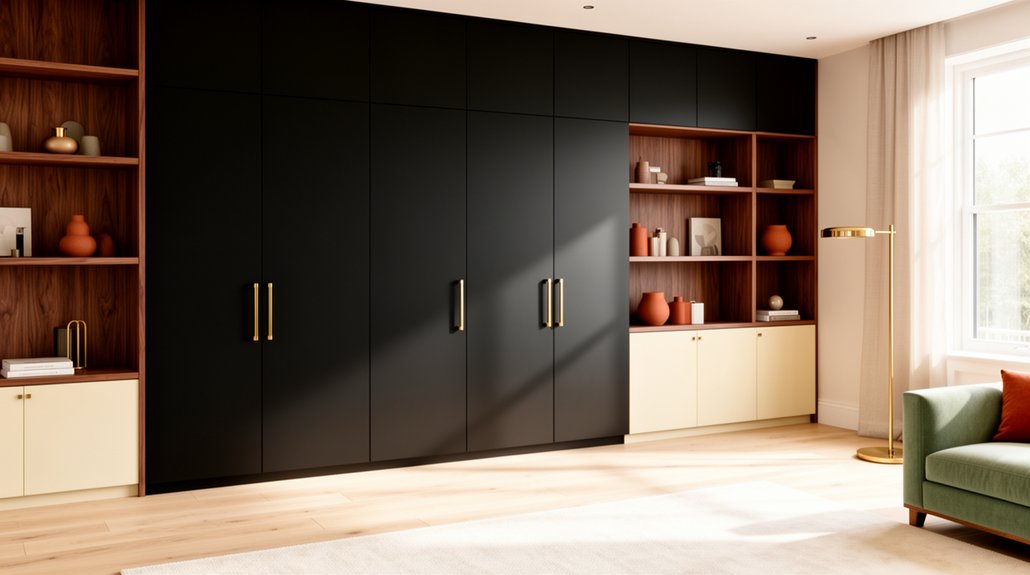
Metal Finishes That Look Great With Black
If you’re pairing black wall units with metal accents, you’ll get the cleanest, most intentional look by committing to one main finish and using it consistently across handles, hinges, lighting, and nearby furniture legs. Start with brass if you want warmth; it softens black without looking dated. Choose brushed nickel or chrome for a sharper, modern feel that suits compact UK rooms and reflects light. Go for matte black metal only when you’re aiming for a restrained, architectural look, and introduce contrast through texture instead.
- Aged brass: pairs well with oak, warm whites, and classic panelling
- Brushed nickel: complements cool greys and crisp white ceilings
- Satin chrome: reads clean and bright under LED downlights
Two-Tone Wall and Trim Ideas With Black Units
When you’re pairing black wall units with a two-tone scheme, you can sharpen the look with crisp white walls and matching trim for a clean, modern finish. If you want softer contrast, you’ll get a warmer balance from greige walls with white trim, which suits many UK period and new-build homes. For a bolder result, you can choose deep-colour walls and keep the trim light to frame the units and maintain brightness.
Crisp White Walls, Trim
Although black wall units already command attention, crisp white walls and trim give them a clean backdrop that keeps the room feeling bright and balanced. You’ll sharpen edges, increase perceived space, and let your cabinetry read as intentional rather than heavy. From a colour psychology standpoint, white signals order and calm, so the contrast feels structured and modern.
- Choose a soft “chalky” white for north-facing UK rooms to prevent a cold cast.
- Match skirting boards, architraves, and cornices to the same white to unify sightlines.
- Specify a scrubbable matt or durable eggshell on trim to protect high-traffic areas.
Prioritise paint durability: kitchens, hallways, and family rooms need washable finishes that resist scuffs. Keep sheen levels consistent, and test samples under evening lamplight before you commit.
Greige Walls, White Trim
Greige walls keep the crisp contrast of white trim but soften the overall look around black wall units, so the room feels warmer and more lived-in. Choose a mid-greige with balanced undertones to prevent the units looking harsh under UK daylight.
Keep the trim bright: a clean white in satin or durable eggshell frames doors, skirting, and architraves, and sharpens edges against the dark furniture. During black wall unit installation, you’ll get the neatest finish by painting walls first, then trim, and touching up after fixing and caulking. Use low-sheen greige to hide minor scuffs near high-traffic routes. For Black wall unit maintenance, dust weekly, wipe with a damp microfibre cloth, and protect the paint by avoiding abrasive cleaners and harsh sprays.
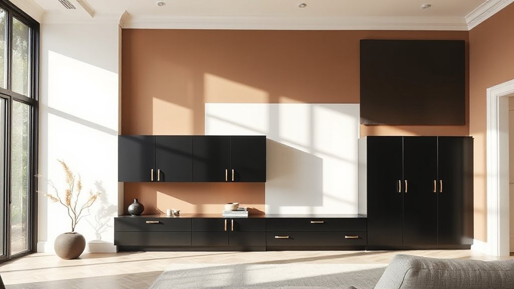
Deep Color Walls, Light Trim
If you want black wall units to feel deliberate rather than heavy, pair them with deep wall colour and light trim to create a crisp two-tone frame. In UK homes, navy, bottle green, or oxblood on the main wall adds depth, while off-white or pale stonewoodwork sharpens edges and lifts the units.
- Use Colour psychology: blues steady the room, greens soothe, and reds add formality.
- Choose a suitable Wall texture: matte hides flaws, eggshell wipes clean, and limewash softens the contrast.
- Keep consistency: match skirting, architraves, and coving, and repeat the trim tone in lampshades or a rug.
Limit the deep shade to one feature wall if daylight’s scarce, and test swatches at different times of day.
Frequently Asked Questions
Do Black Wall Units Show Dust and Fingerprints More Than Lighter Colors?
Yes, you’ll notice dust and fingerprints more on black wall units than on lighter colours, especially in strong light. Choose matte finishes, clean regularly, and use colour contrast and decorative accessories to camouflage marks.
Which Paint Sheens Work Best With Black Wall Units in High-Traffic Rooms?
You’ll get best results with durable eggshell or satin on walls, and semi-gloss on trim; they’re kinder to scuffs in busy UK rooms. Use colour contrast and accent accessories; avoid matt, it marks easily.
Are Black Wall Units a Good Choice for Renters or Temporary Installations?
Yes, you can choose black wall units as a renter if you use freestanding, non-drilled options. In a renting apartment, confirm the tenancy terms. For temporary decor, use removable fixings and protect walls and floors.
How Do I Prevent Black Wall Units From Making My Room Feel Smaller?
You prevent black wall units shrinking your room by maximising daylight, like a Victorian clerk. Use Color contrast with pale walls, add lighting enhancement via uplighters, and keep surfaces glossy; choose slim profiles and tidy cable management.
What Budget-Friendly Decor Updates Complement Existing Black Wall Units?
You’ll refresh the space cheaply by adding Decor accessory ideas like brass knobs, woven baskets, and warm LED strips; choose Wall color options such as soft white, greige, or sage; layer affordable rugs and cushions too.
Conclusion
Treat your black wall units like a steadfast gate in a well-kept garden: you’ll guide the eye with light, then soften the path with oatmeal, stone, or greige. Check undertones so the “gate” doesn’t turn blue or brown in your room. Let white walls run from crisp to creamy, and add jewel accents like emerald sparingly, as flowers. Finish with brass or nickel “hinges”, and you’ll keep the space refined yet welcoming.