Like a well-cut Savile Row suit, your home’s palette needs proportion and intent. You start by deciding how each room should feel, then you check the shifting UK light from morning to evening. Choose one anchor colour you genuinely love, pull a tight set of supporting shades, and balance them with the 60–30–10 rule. Before you commit, you’ll need to test undertones and sheen properly—because that’s where most schemes fail…
Key Takeaways
- Define the room’s mood and choose colors with matching saturation and depth to support that feeling.
- Assess natural light direction and changes through the day; north light cools, south light warms, shifting paint appearance.
- Pick one anchor color, then pull 3–5 supporting shades from its undertones for a cohesive palette.
- Coordinate undertones with fixed finishes (floors, brick, tiles) so walls, textiles, and wood tones feel intentional.
- Test large A3 swatches on multiple walls under daylight and your actual bulbs before committing to paint or fabrics.
Define the Mood and Function of Each Room
Map the Emotional impact you’re after—energising, grounding, sociable, or restorative—then match saturation and depth accordingly. Respect Cultural influences too: British period details, brick, and heritage wood often read best with nuanced neutrals and heritage palettes rather than flat, synthetic brights.
Check Your Natural Light First (Morning to Night)
Once you’ve set the mood you want each room to deliver, check how natural light actually behaves there from morning through to evening, because it will shift every colour you put on the walls. Stand in the space at breakfast, midday, and after sunset, and note where the sun falls and where it doesn’t. A south-facing room in the UK can push paints warmer and brighter; north-facing light skews cooler and can flatten soft tones. East light gives crisp mornings then drops off; west light turns golden and dramatic later. This is colour perception in action, not guesswork. Test large sample swatches on multiple walls, not just by the window, and review them under daylight and interior lighting.
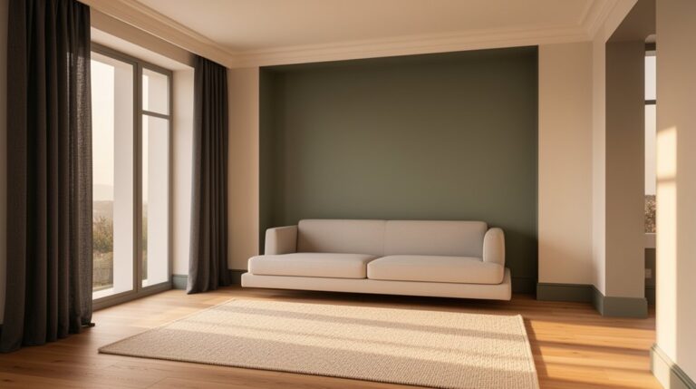
Choose One Anchor Color You Truly Love
Where do you want your eye to land the moment you walk in? Choose one anchor colour you genuinely love, then let it set the room’s intent. This isn’t about trends; it’s about commitment. In UK homes, where rooms often connect tightly, an anchor colour gives continuity without feeling themed. Use Color psychology deliberately: deep green signals calm authority, inky blue feels restorative, warm terracotta reads sociable, and soft blush can lift north-facing spaces. Test it on large swatches and view it from the doorway, sofa, and under lamps, not just daylight. Treat it like interior branding: it should express your lifestyle and make your home instantly recognisable. If it doesn’t make you feel something, it’s not your anchor.
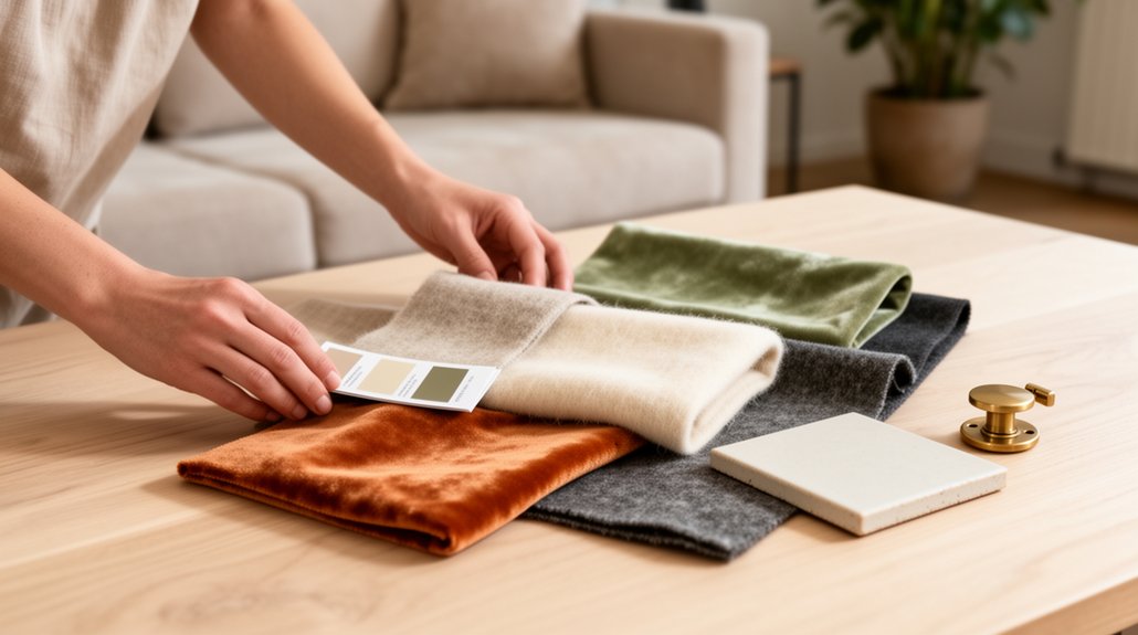
Pull 3–5 Supporting Colors From the Anchor
You’ve chosen your anchor colour; now build a tight supporting cast around it so the room feels layered, not loud. Start by sampling the anchor’s undertones (warm, cool, muted, inky) and pull three to five companions from the same family. Add one lighter tint for breathing space, one deeper shade for definition, and one neutral that suits UK light—often greyed off-whites, putty, or soft taupe. Then introduce one accent drawn from adjacent hues on a colour wheel, keeping saturation controlled. Use Color psychology: greens and blues steady a space; ochres and clay tones warm it. Respect Cultural influences too—heritage reds, coastal chalks, or city greys—so your palette feels rooted, not generic. Test swatches morning-to-evening before committing.
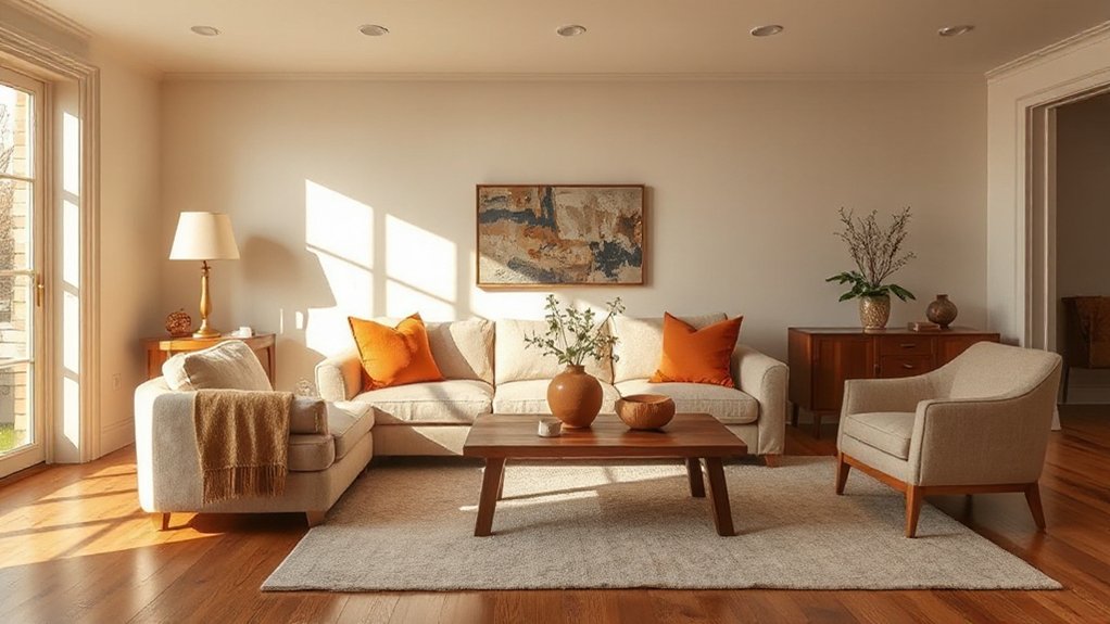
Use the 60–30–10 Rule to Balance the Palette
If your palette looks right on paper but feels restless on the wall, apply the 60–30–10 rule to give it structure. Use 60% as your dominant field colour—typically walls or large rugs—so the room reads as intentional. Allocate 30% to a secondary colour across upholstery, curtains, or fitted joinery to build depth without competing. Reserve the final 10% for crisp accents: cushions, lampshades, art, or a painted door.
You can keep it calm with Monochromatic harmony by shifting values and textures within one family, then punctuating with that 10%. Or sharpen the scheme with Complementary contrast, using the accent portion to energise the dominant hue. In UK terraces and new-builds alike, this ratio keeps spaces balanced and visually legible.
Keep Undertones Consistent (Warm vs Cool)
The 60–30–10 rule sorts the proportions, but undertones decide whether the whole scheme feels calm or slightly “off”. You’ll spot undertones as the hidden bias in a colour: yellow/red reads warm; blue/green reads cool. Keep them consistent across your main walls, key furniture, and accents so the palette sits together in both daylight and evening lamplight, common in UK homes.
Test swatches against pure white and a mid-grey to reveal warmth or coolness, then commit. If you mix undertones, do it deliberately: repeat the “odd” undertone at least twice so it looks intentional. Colour psychology matters here—cool undertones feel crisp and orderly, warm undertones feel welcoming. Use colour symbolism to steer mood without visual discord.
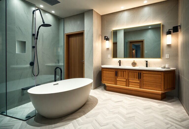
Match Your Palette to Fixed Finishes (Floors, Tile, Stone)
Start with your fixed finishes—timber floors, tile and stone—and identify their undertones before you choose any paint. You’ll get a cohesive scheme when you coordinate wall colours and textiles with the material’s natural hues, not against them. Treat these finishes as your anchor, then build the palette around what’s already there.
Identify Undertones First
Before you pick a single paint shade, identify the undertones already baked into your home’s fixed finishes—floorboards, tiles, stone worktops, and even brick. Stand near a window in natural daylight (not warm LEDs) and decide if they read pink, yellow, green, or blue beneath the surface colour. In many UK homes, oak boards skew honey-gold, terrazzo can lean cool, and limestone often carries a soft greige cast.
Once you’ve named the undertone, you’ll steer your palette with confidence and avoid that “something’s off” clash. This is where Color psychology and color symbolism matter: cooler undertones support calm, crisp schemes; warmer ones cue comfort and sociability. Test large swatches beside the finish at different times of day, then commit.
Coordinate With Material Colors
Once you’ve pinned down the undertones, align your paint and soft-furnishing colours with the finishes you can’t easily change—timber floors, tiles, stone worktops, and brick—so the whole scheme reads intentional rather than “close enough”. Treat these surfaces as your baseline neutrals: oak skews warm, slate leans cool, travertine sits creamy. Then echo or contrast them with controlled intent, not guesswork, and keep samples in the actual light (especially north-facing UK rooms). Use this checklist:
- Pull a dominant tone from flooring and repeat it in rugs
- Match grout and tile warmth before choosing wall paint
- Balance busy stone with quieter cabinetry and fabrics
- Plan furniture coordination around wood species and metal finishes
- Let wall art choices bridge tricky hues with one shared accent
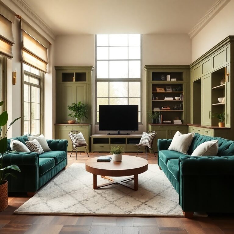
Create a Room-to-Room Color Palette That Flows
To make your home feel cohesive from hallway to lounge, start with one base neutral and carry it through every space. Then choose one or two accent colours and repeat them in a disciplined way—on soft furnishings, joinery, or feature walls—to create continuity without monotony. You’ll get a calm, intentional flow that suits typical UK room passages and natural light shifts.
Choose A Base Neutral
Most cohesive whole-home schemes start with one dependable base neutral that you can carry from room to room. It gives you a Neutral foundation and supports effortless Color harmony, even as light shifts from north-facing halls to sunnier lounges. Choose a neutral with the right undertone for British daylight, then keep finish and temperature consistent for a calm, connected flow.
- Test large paint swatches at different times of day
- Match undertone to your flooring, brick, and stone
- Decide between warm greige, cool grey, or soft off-white
- Keep sheen practical: matt for walls, durable eggshell for woodwork
- Use the same neutral on key sightlines (hall, landing, open-plan edges)
Once you’ve nailed the base, every room feels intentional rather than patchwork.
Repeat Accent Colors
Because your eye craves pattern as it moves through a home, repeating a tight set of accent colours is the quickest way to create flow without making every room look identical. Pick two or three accents and let them travel: a rust cushion in the sitting room, the same rust in a hallway runner, then as a lampshade trim in the bedroom. That Accent color repetition reads intentional, not matchy-matchy. Keep the proportion flexible—10% in one room, 25% in another—so each space keeps its own character. Anchor those accents to your base neutral and you’ll maintain Color palette consistency even when you swap finishes or patterns. In UK homes with tighter sightlines, repeat accents at thresholds—door frames, stair runners, and artwork—to stitch spaces together.
Pick Paint Sheens That Fit the Room’s Use
While colour grabs the attention, sheen decides how your walls cope with everyday life, from muddy paw prints in the hallway to steam in the bathroom. Choosing paint sheen is as practical as it is aesthetic: it controls durability, cleanability, and how confident your finish looks under British daylight and evening lamps.
- Matt: best for low-traffic lounges; hides minor defects, softens bold hues.
- Eggshell: ideal for bedrooms and dining rooms; subtly reflective, wipeable.
- Satin: suits halls, staircases, and children’s rooms; tough, tidy, modern.
- Semi-gloss: use on skirting, doors, and cupboards; crisp definition, easy care.
- Specialist moisture-resistant: bathrooms and utility rooms; fights condensation.
Factor in Room lighting considerations: glossier paints emphasise texture and bounce light, so prep well.
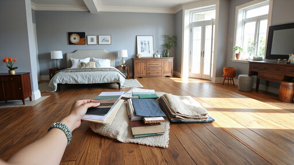
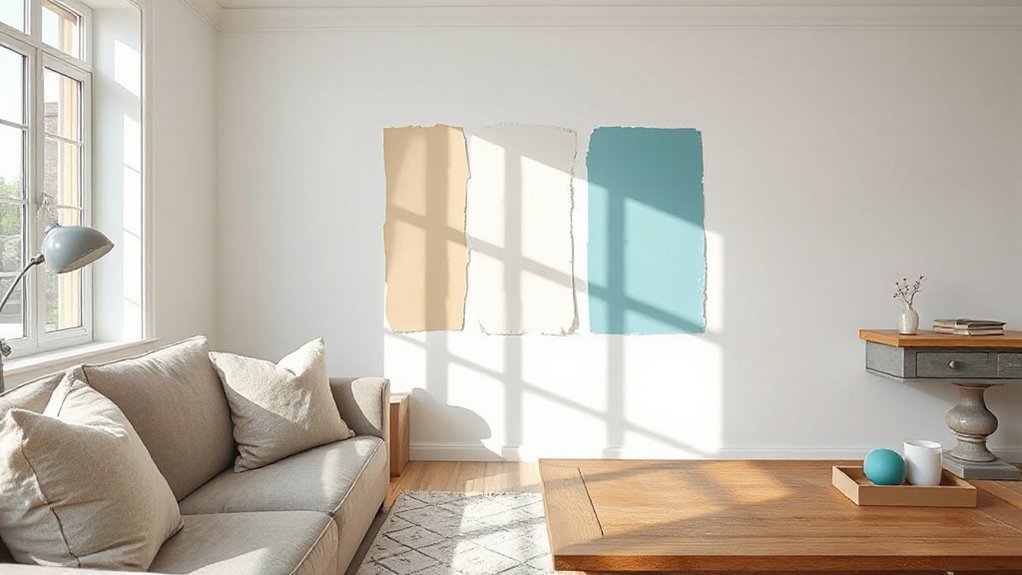
Test Paint Samples the Right Way (Walls + Lighting)
Even if you’ve narrowed your shortlist to two or three shades, you won’t know which one truly works until you test it on the wall and watch it change through a full day of UK light. Paint large swatches (at least A3) on two walls: one facing the window, one in shadow. Better still, paint on lining paper and move it.
Check colour at breakfast, midday, dusk, and under your actual bulbs. UK north light cools tones; south light warms them, so your choice must hold steady. Use Color psychology deliberately: ask how the shade feels when you’re tired, not just when it’s sunny.
Test near skirting, radiators, and cabinetry, and wipe it—paint durability shows fast. Avoid judging from tiny tester pots alone.
Color Palette Ideas by Mood (Calm, Cozy, Bright, Bold)
Once you’ve seen your testers in real UK daylight, choose a palette by the mood you want the room to deliver. Use Color psychology to steer undertones, contrast, and saturation so the space feels intentional from morning to dusk. Tie choices to seasonal palettes too: what looks crisp in a south-facing London flat can feel flat in a north-facing terrace in Manchester.
- Calm: soft sage, chalky off-white, misty blue, light oak, brushed nickel.
- Cozy: warm greige, terracotta, deep taupe, caramel leather, antique brass.
- Bright: clean white, sunny yellow, sky blue, pale mint, light birch.
- Bold: inky navy, forest green, oxblood, black accents, high-gloss lacquer.
- Balance: pick one hero colour, two supporting tones, and consistent trims throughout.
Avoid Common Color Palette Mistakes: and Fix Them Fast
Because colour behaves differently across UK light levels and room orientations, the quickest way to derail a palette is to rely on a showroom swatch or a single “perfect” paint chip. Paint large test patches on two walls, then check morning, afternoon, and lamplight before you commit.
Next mistake: ignoring undertones. If your grey turns lilac or your cream goes green, you’ve paired it with the wrong white. Match whites by undertone, not by name.
You’ll also overuse one accent. Limit bold colour to 10–20% and repeat it in three small hits for balance. Use Color psychology: reds energise, blues calm, but cultural associations matter too—navy reads classic British, while bright orange can feel transient. Finally, keep a consistent finish; sheen shifts colour fast.
Frequently Asked Questions
How Do I Choose Colors if I Rent and Can’T Repaint?
You choose renter-friendly colour by using Temporary wall solutions like peel-and-stick wallpaper and large art, then apply Color sampling techniques with tester pots and swatches. Anchor schemes with rugs, cushions, and curtains that suit UK light.
What Are the Best Color Palettes for Small Apartments and Studios?
Go light, go layered, go calm: choose warm off-whites with greige, soft sage, or misty blue. Use Color psychology for Mood enhancement—add charcoal accents and brass. In UK flats, keep saturation low, maximise light.
How Can I Coordinate Wall Colors With Existing Furniture and Artwork?
You’ll coordinate wall colours by sampling your furniture and artwork undertones, then choosing Complementary color schemes for contrast. Keep main walls muted, echo one hue in soft furnishings, and apply Accent wall ideas behind key pieces.
Do Paint Colors Look Different on Textured Walls Like Stucco or Brick?
Yes, they do—textured surfaces shift shades. Texture effects scatter light, making colours appear deeper or dirtier. Choose flatter Paint sheen for brick or stucco, and test large swatches in UK daylight before committing.
What Apps or Online Tools Help Visualize My Home’s Color Palette?
You’ll get the best results with Dulux Visualizer, Crown Colour Edit, and Farrow & Ball’s online tools, plus Canva for mood board creation. Use virtual color sampling with UK daylight settings and test trims.
Conclusion
You’ve mapped the mood, watched your light shift from grey morning to golden evening, and—coincidentally—the shade you’ve always loved now looks right on your wall, not just on a swatch. Trust that: it’s your anchor. Keep your supporting colours tight, balance them with the 60–30–10 rule, and match sheen to how you live. Test properly, repeat accents, and you’ll get a palette that feels distinctly British—and effortlessly pulled together.