Like a well-composed hotel suite, you can set the tone of a guest bedroom with a disciplined colour pairing rather than bold statements. You’ll want a base that feels calm and universal, then you’ll layer one or two accents to add depth and polish. If you choose the wrong undertone, the room can turn cold or flat, even with good furnishings. The next combinations show what consistently works—and why.
Key Takeaways
- Choose calming, broadly appealing colours like warm whites, greige, soft beige, or dusty blues for a restful guest-friendly feel.
- Match undertones to daylight: cooler hues visually expand small rooms, while warm neutrals add comfort in low-light spaces.
- Pair white walls with warm wood furniture to keep the room airy, natural, and universally welcoming.
- Use blue with warm neutrals (oat, sand, taupe) and brass accents for depth, calmness, and a polished hotel-like look.
- Build a simple hierarchy: soft wall colour, crisp white bedding, and a few darker or textured accents for contrast without visual clutter.
How to Choose Guest Bedroom Colour Combinations
Although a guest bedroom doesn’t need to mirror your own taste exactly, you should choose colour combinations that feel calm, broadly appealing, and easy to live with. Start by evaluating daylight levels, room size, and the view; cooler hues can recede, while warmer tones add perceived comfort. Apply Color psychology to anticipate how guests may respond: blues and greens tend to support rest, whereas high-chroma reds can feel stimulating. Build a simple hierarchy—walls, textiles, and accents—so the scheme reads coherent rather than busy. Test swatches on multiple walls and observe them morning and evening under your bulbs. Finally, select paint finish options that suit durability and light: matt softens flaws, eggshell cleans easily, and satin highlights joinery without glare.
Neutral Guest Bedroom Colour Combinations (Top Picks)
If you want a guest bedroom that feels calm yet considered, you can’t go wrong with neutral pairings that manage light and warmth with precision. Start with warm whites and greige to create a clean backdrop with subtle depth, then consider beige and soft taupe for a gentler, more cocooning finish. In each case, you’ll get a versatile scheme that suits changing linens and seasonal accents without losing cohesion.
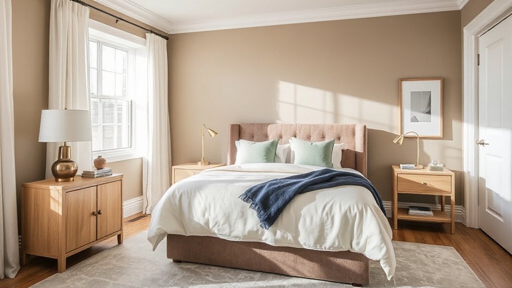
Warm Whites And Greige
When you want a guest bedroom to feel calm yet quietly refined, pairing warm whites with greige creates a neutral scheme that reads inviting rather than clinical. You’ll notice, through Color psychology, that creamy whites soften contrasts, while greige adds grounded warmth that helps guests unwind. Prioritise paint finish selection: choose a scrubbable eggshell for walls, crisp matte for ceilings, and satinwood for trim to keep the palette polished.
- You create a sense of welcome the moment they enter.
- You reduce visual noise, so rest feels effortless.
- You add depth without heaviness, encouraging quiet comfort.
- You support better sleep by keeping undertones balanced.
Keep lighting warm (2700K) and layer linen, oak, and brushed brass for restrained luxury.
Beige And Soft Taupe
How do you achieve a guest bedroom that feels effortlessly restful yet still considered? You’ll find beige and soft taupe deliver quiet sophistication without reading flat. Beige sets a welcoming base, while taupe adds depth through its grey-brown undertone, creating gentle contrast on walls, upholstery, and soft furnishings. From a Color psychology perspective, these hues reduce visual noise and support calm, steady attention—ideal for unfamiliar spaces. Use a warm beige on larger planes and a soft taupe on the headboard wall, curtains, or a wool throw to anchor the room. Consider Cultural influences: beige often signals comfort and hospitality, while taupe conveys restraint and refinement across many design traditions. Finish with brushed brass, oak, and layered textures to keep the palette tactile. Add crisp white bedding for lift.
White + Warm Wood Tones for Airy Comfort
You’ll achieve airy comfort by layering crisp white across walls and trim to maximise light and visual clarity. You can then introduce warm wood furniture accents to add depth and a welcoming, natural contrast. You’ll finish the scheme with balanced textiles—linen, wool, or cotton—to soften the look and make sure your guest space feels cosy, not stark.
Crisp White Wall Layers
Although crisp white walls can read as stark in a guest bedroom, layering them with warm wood tones creates an airy, composed scheme that still feels welcoming. You’ll harness Color psychology by choosing a white with a soft undertone, which signals cleanliness without feeling clinical. Build depth through Wall textures: limewash, microcement, or a fine matte emulsion diffuses light and prevents glare. Keep progressions gentle by repeating white across ceiling, trim, and built-ins, then introduce wood through small, tactile details rather than dominant pieces. This controlled restraint helps guests feel calm, looked after, and unhurried.
- You invite quiet relief the moment they enter.
- You create breathable light that eases travel fatigue.
- You add subtle warmth that feels considerate.
- You maintain order that supports restful sleep.
Warm Wood Furniture Accents
Crisp white walls gain instant hospitality when warm wood furniture accents take the lead, softening the palette without dimming its airiness. Choose oak, ash, or walnut in matte finishes to introduce depth while keeping the room bright. A wood bedframe or bedside tables anchor the scheme, and you’ll avoid the clinical feel that pure white can create.
Keep tones consistent: pair honeyed timber with warm whites, or choose mid-toned wood against cooler whites for controlled contrast. Use clean-lined silhouettes to maintain a calm profile, then add Decorative wall art in simple frames that echo the timber grain. Prioritise guest comfort by selecting sturdy, quiet-closing drawers and a supportive chair or bench in matching wood, so the space functions as well as it looks.
Textiles For Cozy Balance
When white walls and warm wood set an airy baseline, textiles supply the cosy balance that makes a guest bedroom feel considered rather than sparse. You’ll achieve comfort without visual heaviness by layering Textile textures that soften hard lines and temper brightness. Use natural fibres to reinforce the calm, then introduce controlled Color accentuation to keep the scheme inviting, not bland. Keep contrasts gentle, and repeat tones to make the room feel intentionally composed.
- Add a wool or boucle throw to the foot of the bed for instant warmth and reassurance.
- Choose linen bedding in ivory, oat, or stone to keep the space breathable and refined.
- Introduce a muted rug (sage, clay, or ink) to anchor the floor and hush footsteps.
- Finish with velvet or brushed-cotton cushions to invite lingering and ease.
Cream + Soft Beige for Easy, Timeless Warmth
For a guest bedroom that feels instantly welcoming, you can’t go wrong with cream paired with soft beige, as this combination delivers understated warmth without overpowering the space. From a Color psychology perspective, these hues reduce visual noise and support rest, making visitors feel settled on arrival. Keep cream on walls for brightness, then layer soft beige through upholstery, curtains, or a tailored headboard to add depth.
Choose paint finish options with care: matt minimises glare and disguises minor wall flaws, while eggshell offers better wipeability for high-touch areas such as behind bedside tables. Anchor the palette with warm metals, light oak, or tan leather, and introduce contrast through charcoal accents or textured linens. You’ll achieve a timeless scheme that still feels deliberately designed.
Blue Guest Bedroom Colour Combinations (Light to Moody)
Choose airy blues with crisp white to keep your guest bedroom bright, then layer tonal blues and warm neutrals to add depth without losing freshness. If you want a richer scheme, shift to moody blues on the walls and balance them with brass accents for controlled warmth. You’ll create a calm, considered space that suits everything from light coastal looks to intimate, hotel-like styling.
Airy Blues With White
Although a guest bedroom benefits from calm restraint, airy blues paired with crisp white create a bright, welcoming scheme that feels effortless yet considered. In colour psychology, pale blue signals ease and trust, helping guests unwind without feeling drowsy. Keep ceilings and trim in a clean white to sharpen edges and lift daylight, then use your paint finish options to control mood: matte on walls for softness, eggshell for durability, and satin on woodwork for a subtle gleam. Balance is key—let blue dominate, and let white define.
- You’ll greet guests with instant freshness, like a cleared sky.
- You’ll make the room feel larger, even when it’s compact.
- You’ll calm visual noise, so sleep comes easier.
- You’ll create quiet confidence that feels hotel-level.
Blue And Warm Neutrals
When you temper blue with warm neutrals such as oat, sand, biscuit, or greige, you get a guest bedroom palette that reads calm but never cold. Use a light, softened blue on walls for openness, then layer warm neutral bedding to add approachability and comfort. According to Color psychology, blue lowers perceived stress, while warm neutrals signal safety and welcome—ideal for visitors who need to settle quickly.
For a more enveloping scheme, keep the blue mid-tone and shift neutrals deeper, choosing taupe curtains, camel throws, and linen lampshades. You’ll maintain balance by repeating each hue at least three times across the room. As Interior decorating tips, prioritise matte finishes, natural fibres, and warm-white bulbs to prevent the blue from turning stark.
Moody Blue With Brass
If you want a guest bedroom that feels intimate yet assured, pair a moody blue with brass accents for controlled drama and warmth. Keep the blue on the walls or a tailored headboard, then echo brass in lighting, frames, and hardware. Through colour psychology, deep blue signals calm authority, while brass adds human warmth and a hint of ceremony. Use mood lighting to prevent the scheme feeling heavy: choose dimmable wall lights and warm-white lampshades to soften shadows and flatter skin tones.
- You’ll create a cocooning refuge that still feels impeccably hosted.
- You’ll give guests confidence, as the palette reads composed and intentional.
- You’ll spark quiet delight when brass catches light at night.
- You’ll balance richness with restraint by adding crisp white bedding and one textured throw.
Navy + Crisp White for Classic Contrast
To create a guest bedroom that feels immediately composed and enduring, pair navy with crisp white for a classic, high-contrast scheme that reads both tailored and welcoming. Apply navy to the headboard wall to anchor the room, then use crisp white on remaining walls, trim, and bedding to lift light levels and sharpen lines. In Colour psychology, navy signals trust, calm, and depth, helping guests unwind while still feeling supported by structure. Choose paint finish options deliberately: use matt on walls to soften glare, eggshell on woodwork for durability, and satin on doors for subtle refinement. Balance the contrast with warm oak, rattan, or brushed nickel, and add layered whites in linen and cotton so the scheme feels inviting, not stark.
Dusty Blue + Warm Taupe for a Relaxed Look
How do you achieve a guest bedroom that feels calm yet quietly sophisticated? Pair dusty blue walls with warm taupe upholstery, then let the balance do the work. This is one of the most reliable Complementary colour schemes: blue cools the space, while taupe grounds it with subtle warmth. According to colour psychology in bedrooms, this blend lowers visual noise and supports restful, unforced comfort for short stays.
- Choose dusty blue for the largest surface to create an airy, dependable calm.
- Layer warm taupe through headboards, rugs, and curtains to add secure, cocooning depth.
- Introduce brushed brass or oak to make the palette feel considered, not cold.
- Keep textiles matte and softly textured so your guests feel welcomed, not staged.
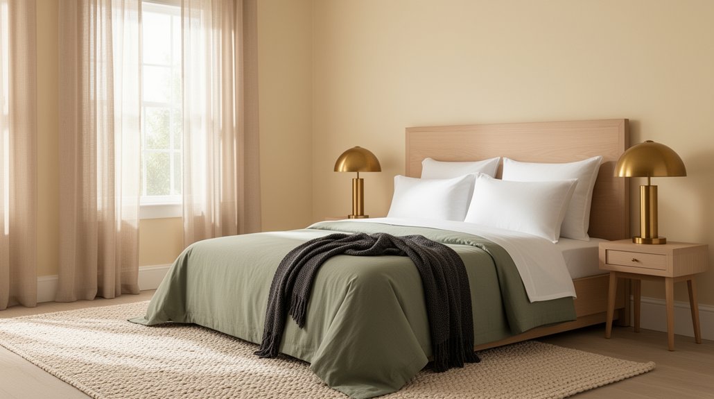
Sage Green + Cream for a Calming Guest Room
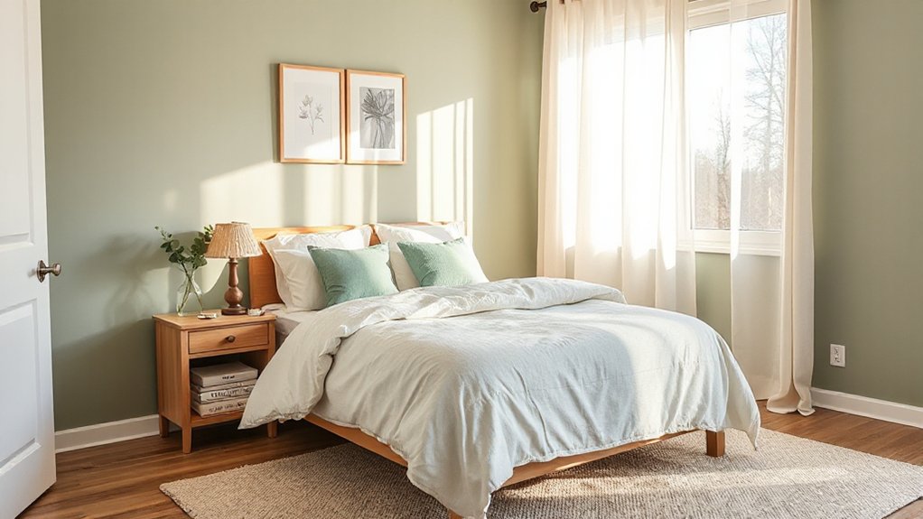
Although sage green reads as understated, it lends a guest bedroom a composed, restorative character when you pair it with clean cream. You’ll support effortless relaxation while keeping the scheme crisp and contemporary, which is central to sound Color psychology in sleep spaces. Apply sage to the main walls and reserve cream for ceiling, trims, and bedding to sharpen edges and reflect light.
Choose paint finish options deliberately: use matt or soft-matt on walls to minimise glare and conceal minor imperfections, then select eggshell on woodwork for durability and gentle sheen. If you want extra depth, introduce a darker sage on a headboard wall, keeping cream textiles dominant. Add brushed brass or pale oak, and you’ll maintain a calm, balanced palette throughout, beautifully.`
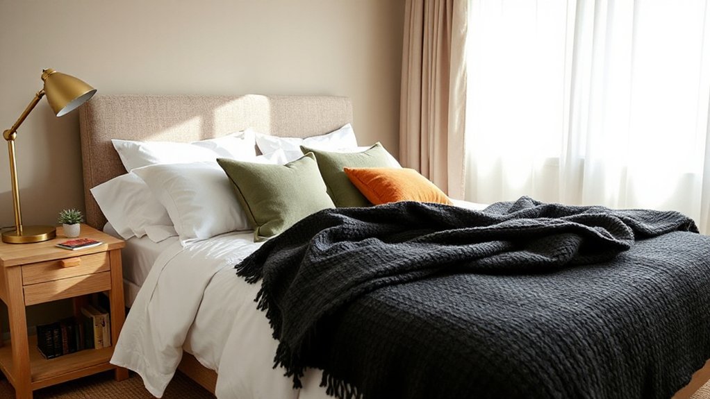
Beige + Terracotta for Cozy Hotel Vibes
Why does beige feel instantly welcoming in a guest bedroom? You’re tapping into Color psychology: beige lowers visual noise, so guests relax on arrival. Pair it with terracotta to introduce grounded warmth that recalls boutique hotel suites. Keep beige on larger planes, then use terracotta on cushions, a throw, artwork, or an upholstered chair for controlled richness. Choose paint finish options strategically: a washable eggshell for walls, and a soft matt for the ceiling to reduce glare; reserve satinwood for woodwork to look crisp yet calm. You’ll create a layered, cocooning effect without heaviness.
- You invite slow exhalations and longer sleep.
- You deliver sun-baked comfort on grey days.
- You make the room feel cared for, not staged.
- You encourage guests to linger, read, and reset.
Greige + Black Accents for a Modern Look
When you want a guest bedroom to feel current without turning cold, anchor the scheme in greige and sharpen it with restrained black accents. Use greige on walls or large upholstery to create a calm, neutral field, then introduce black through a slim bedframe, picture rails, lighting, or hardware for definition. Keep contrasts deliberate: too much black will read severe. For Complementary accent colors, add muted brass, soft white, or sage in cushions and art to lift the palette without diluting the modern edge. Prioritise Texture and finish choices: pair matte black metal with brushed timber, boucle, or linen, and use a low-sheen greige paint to avoid glare. Finish with layered lighting to keep the mood inviting.
Charcoal + Sand to Ground the Room
If you want the guest bedroom to feel grounded yet refined, build the scheme around charcoal and sand. Charcoal delivers depth and security in line with Color psychology, while sand adds warmth and approachability without losing sophistication. Choose paint finishing options deliberately: a matte charcoal on the feature wall absorbs glare and feels cocooning, while an eggshell sand on the remaining walls reflects light and stays practical. Balance the palette with oak, brushed brass, and crisp white bedding so the room reads calm, not heavy. Keep pattern subtle; texture should do the work.
- You’ll create a reassuring, hotel-like hush.
- You’ll give guests a sense of shelter and ease.
- You’ll add warmth that feels quietly welcoming.
- You’ll anchor the space with confident elegance.
Lavender + Light Grey for a Quiet Retreat
Although you might associate lavender with sweetness, pairing it with light grey produces a composed, quietly restorative guest bedroom. You’ll temper lavender’s floral character with a neutral base, creating visual calm without sacrificing warmth or personality.
Use Relaxing lavender tones on a feature wall or upper sections to soften the room’s envelope, then extend tranquil grey shades across remaining walls and key surfaces to stabilise the palette. You should choose lavender with a muted, greyed undertone rather than a vivid lilac, as this keeps the scheme mature and restful. Keep contrast gentle: aim for close tonal values and let texture provide interest, so the bedroom reads as serene rather than decorative. If you want a slightly richer finish, incorporate deeper lavender in small architectural details to add depth.
Make the Palette Work: Bedding, Lighting, and Mistakes to Avoid
To make lavender and light grey feel intentional rather than tentative, you’ll need to control the bedroom’s “soft elements” with the same discipline as the paint. Choose Bedding textures that echo the palette: crisp cotton for clarity, brushed linen for calm, and a single velvet cushion to add depth without drama. Specify layered lighting fixtures—ceiling, bedside, and a low accent—so guests feel both welcomed and subtly guided at night.
- Keep bedding largely light grey; let lavender appear as a measured accent that soothes.
- Use warm-white bulbs (2700K) to prevent lavender turning cold or bruised.
- Avoid busy patterns; they dilute the quiet retreat and create visual fatigue.
- Don’t mix too many metals; commit to one finish for composed reassurance.
Frequently Asked Questions
What Paint Finishes Are Best for Guest Bedrooms: Matte, Eggshell, or Satin?
You’ll get the best results with eggshell on walls for durability, matte to disguise imperfections, and satin for trim. Consider wall texture options, and use flat, bright ceiling paint choices to reduce glare.
How Can I Choose Colours That Suit Guests With Allergies or Sensitivities?
Choose low-VOC, fragrance-free allergy friendly paints and allow full curing with good ventilation. Prefer muted, low-contrast sensory sensitive colours such as warm greys or soft greens. Avoid intense hues, glitter additives, and heavy off-gassing.
What Are Renter-Friendly Ways to Add Colour Without Repainting?
Like a Victorian telegram, you’ll add colour without repainting by applying removable wallpaper or decorative wall decals, then layering bold cushions, throws, and curtains. You’ll choose low‑VOC fabrics and washable covers, ensuring sensitive guests’ comfort.
How Do I Coordinate Guest Bedroom Colours With an Adjacent Hallway Palette?
To coordinate with the hallway, maintain Hallway color flow by repeating one undertone and shifting one shade lighter or deeper. Use Coordinating accent walls to echo trims and textiles, ensuring progression feel deliberate, calm.
How Often Should I Update Guest Bedroom Colours to Keep Them Feeling Fresh?
You should refresh guest bedroom colours every 5–7 years, or sooner if wear appears or trends shift. Use colour psychology to guide calming choices, and rely on seasonal updates via textiles, art, and accessories.
Conclusion
Choose your guest bedroom colours as you’d compose a chamber piece: start with quiet neutrals, then let blues, greige, charcoal, or a whisper of lavender carry the melody. You’ll keep the room inviting by pairing soft walls with warm wood, brass, and layered textiles that feel like a reassuring handshake. Balance light with considered contrast, and avoid harsh, cold pairings. When you refine bedding and lighting, you’ll deliver calm, effortless hospitality.