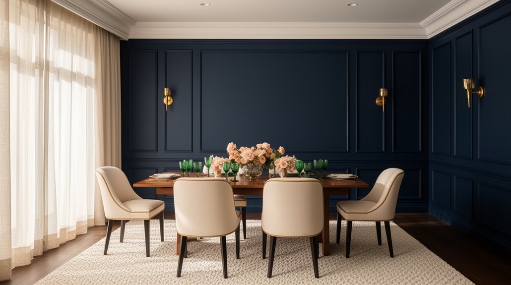
Navy blue can make a dining room feel like a tailored lounge, but the wrong pairing turns it heavy fast. You’ll get the best balance when you sharpen it with crisp white trim, warm it with brass or aged gold, and ground it with oak or walnut tones. Add controlled color through blush, terracotta, or sage accents so the space stays inviting. The key is choosing which layer leads—and that’s where most palettes break.
Key Takeaways
- Pair navy walls with crisp white trim, ceilings, and linens to brighten the room and create sharp, tailored contrast.
- Add warm brass or aged gold lighting and hardware to reflect light and keep navy from feeling cold.
- Balance navy with natural wood tones like light oak or walnut in furniture and floors for warmth and texture.
- Use soft neutrals—greige, taupe, or stone—on adjacent surfaces and rugs to smooth transitions and reduce visual heaviness.
- Choose two muted accent hues like blush/terracotta or sage/olive in art and textiles for controlled warmth and organic contrast.
Best Colors To Pair With a Navy Dining Room
If you’ve committed to navy in the dining room, pair it with colors that either lift the depth or echo its richness without competing. Choose crisp white for trim, ceiling, and linens to sharpen edges and keep the room bright. Bring in warm brass or aged gold to reflect light and add polish without glare. Add natural oak, walnut, or rattan to prevent the space from feeling cold. Use soft greige, taupe, or stone on adjacent surfaces to smooth progressions. Introduce muted blush or terracotta in art and textiles for controlled warmth, or sage and olive for an organic counterpoint. Apply Artistic wall techniques like limewash or a subtle textured panel to break up solid navy. Rotate Seasonal decor ideas: amber glass in fall, fresh greens in spring.
How To Choose a Navy Dining Room Palette
Start by matching your navy’s undertone to the room’s light: cool navies stay crisp in bright daylight, while warmer navies feel richer under softer, warmer bulbs. Then you’ll balance the palette with trim, textiles, and artwork that either echo that undertone or provide clean contrast without muddying the blue. Finish by coordinating metals and woods—choose warm brass and walnut to amplify warmth, or polished nickel and ash/oak to keep everything sharp and modern.
Balance Undertones And Light
Because navy can read crisp, smoky, or even slightly purple depending on its base, you’ve got to balance undertones with the room’s natural and artificial light before you lock in a palette. Start by checking your dining room at three times: morning, late afternoon, and evening with fixtures on. If navy turns gray in cool north light, warm it with creamy whites, soft greige, or sand. If it shifts violet under warm LEDs, choose cleaner whites and cooler taupes to neutralize it. Use large paint samples and view them beside upholstery, art, and flooring. For Complementary wall tones, match the undertone, not the name. Then tighten accent color coordination by limiting accents to two related hues so light changes don’t create visual noise.
Coordinate Metals And Woods
Once you’ve dialed in how your navy reads under changing light, lock the palette by coordinating metals and woods so the room feels intentional rather than mixed at random. Treat navy as the anchor, then limit metal finishes to one dominant and one accent so sightlines stay calm. Match wood tones by temperature: warm navy pairs best with walnut, oak, or brass; cooler navy aligns with ash, espresso, chrome, or nickel. Repeat each finish at least twice—hardware and lighting, chair legs and frame—to create rhythm.
- A brass chandelier over a navy table wall with walnut chairs
- Matte black pulls on a navy sideboard with white-oak top
- Polished nickel sconces beside navy wainscoting and ash floors
- Bronze flatware against navy linens and a dark-stained bench
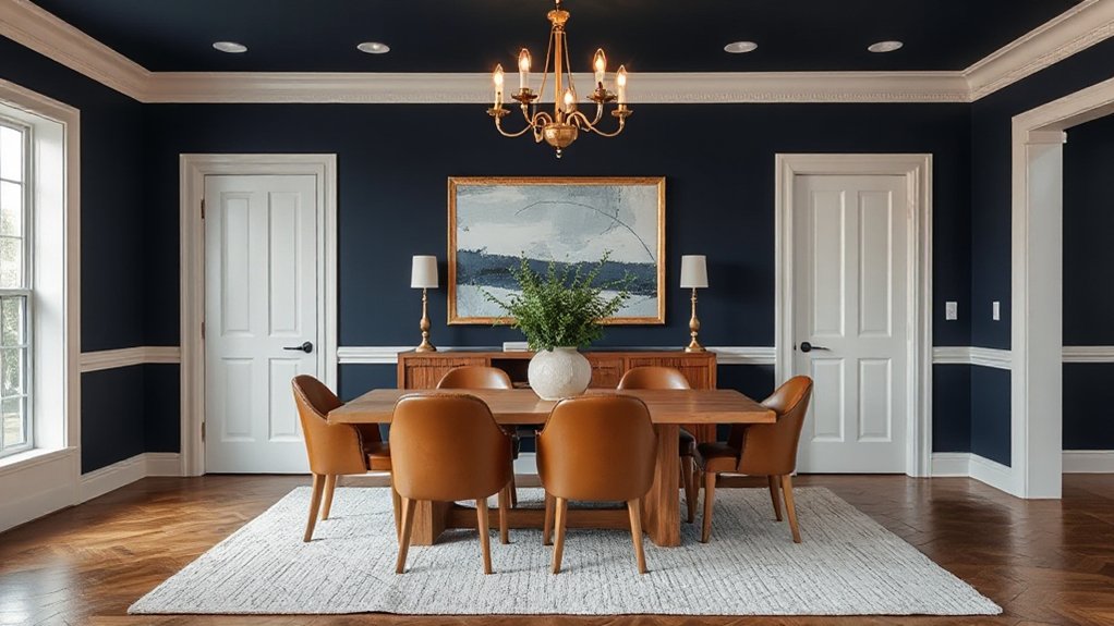
Navy Walls With Crisp White Trim
When you pair navy walls with crisp white trim, you create a dining room that feels tailored, high-contrast, and intentionally designed. Keep the navy saturated and matte to reduce glare and deepen the backdrop, then use bright, clean white on casings, crown, and baseboards to sharpen every edge.
Prioritize White trim details: choose a consistent sheen (often satin) and carry it across doors, window frames, and wainscoting for continuity. Add Navy blue accents sparingly—upholstery piping, a runner, or art mats—so the walls remain the statement. For balance, repeat white in ceiling paint, light fixtures, and table settings to keep the room from reading heavy. Finish with crisp lines and minimal pattern to preserve the graphic look.
Navy With Warm Wood Furniture and Floors
Crisp white trim makes navy feel sharp and graphic; warm wood shifts the same color toward rich, inviting, and grounded. Pair navy walls with oak, walnut, or cherry dining pieces, and you’ll get depth without heaviness. Keep sheen low—matte paint and satin wood read refined under warm bulbs. Use Navy blue wall decor sparingly so the grain stays the star, then repeat Warm wood accents in frames, shelving, or a sideboard to unify the room.
- Walnut tabletop catching amber light, navy walls behind it
- Honey-toned floors balancing a deep blue ceiling or wainscot
- Slatted wood chairs adding texture against smooth painted walls
- Brass hardware and a wood buffet anchoring the dining zone
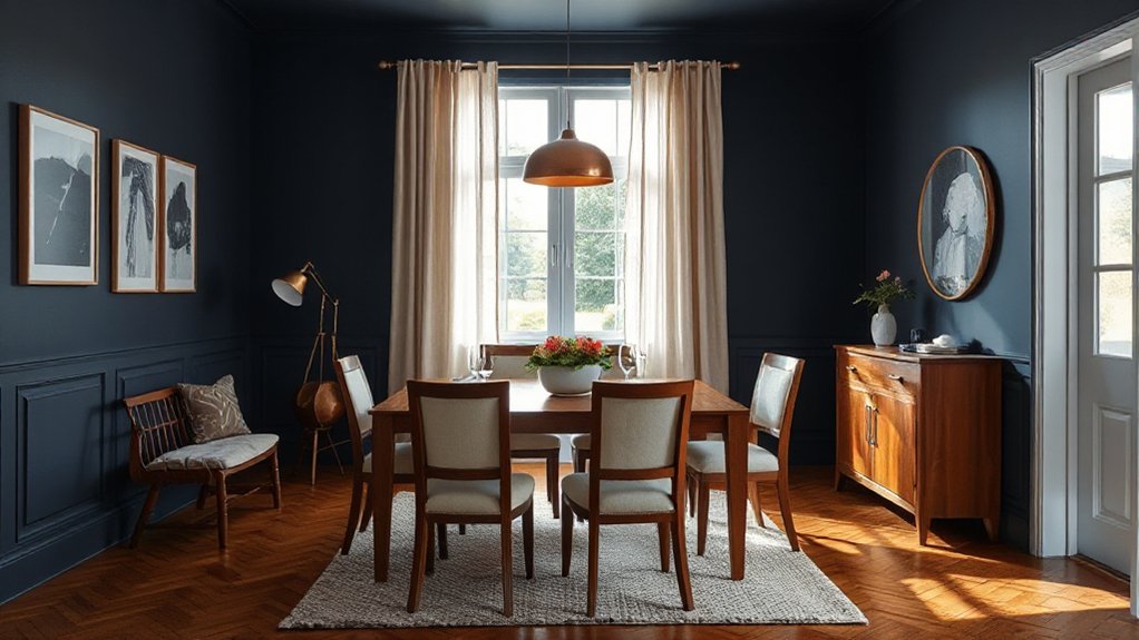
Navy With Beige and Greige Neutrals
Two neutrals—beige and greige—soften navy’s intensity without washing it out, so you get contrast that still feels calm. Paint navy on the lower walls or built-ins, then balance it with greige on upper walls, trim, or a linen-look ceiling. Bring in beige through upholstered dining chairs, a jute or sisal rug, and woven shades to add Coastal vibes without turning beachy. Use greige stoneware, ceramic pendants, or a plaster-texture feature to keep the palette grounded and modern. For Vintage charm, choose brass or aged bronze hardware, a weathered mirror, and creamy off-white table linens. Keep undertones aligned: pick beige with soft sand notes and greige with taupe warmth so navy stays rich. Add warm bulbs.
Navy With Soft Gray for a Cool Look
Pair navy with soft gray to keep the room cool and controlled, but you’ve got to balance undertones so the blue doesn’t skew harsh or the gray doesn’t read flat. Anchor the scheme with soft gray dining chairs or a light gray sideboard, then let navy lead on the walls, rug, or drapery for contrast. You’ll lock in the look by choosing crisp, neutral lighting and layering matte and tactile textures—linen, wool, brushed metal—to prevent the palette from feeling cold.
Balancing Cool Undertones
When you want navy blue to feel clean and composed rather than heavy, balance its cool undertones with a soft gray. You’ll get a crisp, modern mood because gray diffuses navy’s depth and keeps shadows from pooling. In color psychology, this pairing signals calm focus, so your dining room feels intentional, not moody. For interior harmony, keep undertones aligned: choose blue-leaning grays, and avoid warm greiges that can make navy look flat.
- Cool gray walls that read like morning fog behind deep navy accents
- Brushed nickel or chrome details that echo the gray’s chill
- White trim that sharpens edges and prevents visual heaviness
- Pale stone or concrete textures that ground the palette without warmth
Soft Gray Furniture Pairings
Soft gray furniture takes that cool gray-and-navy balance off the walls and puts it at the table, keeping the room sleek without feeling stark. Choose upholstered dining chairs in a heathered gray to soften navy walls and ground the palette with a tailored, modern feel.
If you’re using a navy dining set, swap in a soft gray sideboard or credenza to break up the saturation and add visual breathing room. Keep finishes consistent: matte gray reads calm, while brushed nickel pulls the look cooler. Layer Soft gray accents through a bench cushion, seat pads, or a low-pile rug so the navy doesn’t dominate. Aim for Seamless color transitions by repeating gray in adjacent pieces and varying tone only one shade at a time for cohesion.
Lighting And Texture Choices
Although navy and soft gray already set a cool, tailored baseline, your lighting and texture choices decide whether the room reads crisp or flat. Use layered light: a dimmable chandelier for sparkle, wall sconces to wash navy, and a warm 2700–3000K bulb to keep gray from turning icy. Then build tactile contrast so the palette feels intentional, not sterile.
- Brushed brass or matte black fixtures that outline clean silhouettes
- Linen shades and sheer drapery that soften shadows on navy walls
- Wall art with thin white mats and charcoal frames to sharpen edges
- A low-pile wool rug with rug patterns in slate, ivory, and inky blue
Finish with a satin paint on navy and a textured gray upholstery to catch light.
Navy With Black for Modern Contrast
Pair navy with black to create a crisp, modern contrast that reads intentional rather than heavy. Use navy on walls or upholstered seating, then ground the room with Black furniture like a streamlined dining table or matte chairs. Keep finishes consistent—stick to satin or matte blacks to avoid visual noise and prevent the palette from feeling busy.
Balance depth with negative space. Add Navy blue accents through seat cushions, a runner, or art, but limit them to a few repeats so the room stays tailored. Choose light countertops, pale rugs, or white trim to break up dark masses and preserve definition. If you go navy on cabinetry, use black hardware only where it sharpens lines, not everywhere. Maintain clean silhouettes, minimal patterns, and tight color boundaries.
Navy With Brass or Gold Accents
When you want navy to feel elevated rather than flat, bring in brass or gold accents to add warm, reflective contrast. You’ll keep the room grounded while making it glow, especially at night under layered lighting. Choose satin or aged finishes so the shine reads sophisticated, not flashy, and repeat metal touches at least three times for cohesion. Balance the warmth with crisp neutrals and rich wood tones, then let Navy accents frame the metal so it pops.
- A navy wall with a brushed-gold mirror catching candlelight
- Brass fixtures over the table, casting a honeyed pool of light
- Gold-edged place settings against deep blue linen napkins
- A walnut sideboard with brass pulls beside a navy rug border
Navy With Chrome or Silver Finishes
If you want navy to read crisp and modern instead of moody, bring in chrome or silver finishes to sharpen the color and bounce cooler light around the dining room. Choose Chrome finishes on a linear chandelier, cabinet pulls, or chair frames to add clean highlights against deep walls. Pair them with Navy blue accents—napkin rings, a runner, or upholstered seats—so the palette stays intentional, not cold.
Keep undertones consistent: select blue-leaning silvers, not yellowed nickel, and match sheen levels across metals. Add glass, mirror, or polished stone to amplify reflection and prevent navy from absorbing light. Balance the look with white trim or a pale ceiling, and you’ll get a tailored, architectural finish that feels fresh daily.
Navy With Blush and Dusty Rose
Pair navy with blush or dusty rose to soften the room without losing depth, and keep the balance by using navy as the anchor and pinks as controlled accents. You can bring in dusty rose through upholstered dining chairs, a patterned rug, art, or napery, then repeat the tone in small touches for cohesion. Add soft-contrast texture with velvet, linen, bouclé, or matte ceramics so the palette feels layered rather than sweet.
Balancing Navy And Blush
Although navy blue can read serious in a dining room, blush and dusty rose soften it without diluting its richness. You’ll get the best balance when you anchor the room with navy and treat blush as a controlled counterweight. Keep undertones consistent: pair inky, cool navy with muted, gray-leaning pinks, and avoid overly peach blush that can clash. Use Navy blue accents to define edges and structure, then let a blush color pairing lift the mood with lighter, airy surfaces. Aim for a 70/30 split—navy dominant, blush secondary—so the room stays sophisticated, not sweet.
- Deep navy walls against a pale pink ceiling wash
- Blush-upholstered chairs surrounding a dark wood table
- Matte black hardware bridging navy and pink
- Warm brass lighting reflecting soft rose tones at night
Dusty Rose Accent Ideas
Once you’ve nailed the navy-and-blush balance, dusty rose gives you a more grounded way to warm the room without turning it pastel. Use dusty rose accents in small, intentional doses so navy still reads as the anchor.
Try dusty rose dining chair cushions, a tailored table runner, or a single large art print that repeats both tones. Swap in rose-tinted glassware, tapered candles, or a muted floral centerpiece to soften the tablescape without looking sweet. If you’ve got built-ins or a bar cart, add dusty rose ceramics or serving trays to pull the color up to eye level. Keep metals consistent—brass for warmth or nickel for restraint—and repeat dusty rose two or three times for cohesion. This approach supports romantic decor while staying modern.
Textures For Soft Contrast
When you layer texture instead of adding more color, navy stays crisp while blush and dusty rose read as soft contrast rather than “pink.” Start with a matte navy base (paint, a lacquered buffet, or upholstered host chairs), then introduce blush and dusty rose through tactile materials—washed linen napkins, a slubbed table runner, bouclé or velvet seat pads, and a low-sheen wool rug. Keep fabric textures varied but restrained so the palette feels tailored. Balance softness with grounded surfaces by mixing wall finishes like eggshell paint, limewash, or subtle grasscloth. Finish with warm metal and natural wood so rosy tones look sophisticated, not sweet.
- Velvet blush cushions against navy dining chairs
- Dusty rose linen drape pooling lightly at the floor
- Wool rug with a nubby, low-contrast weave
- Hammered brass candlesticks catching candle glow
Navy With Sage and Olive Green
Because navy blue already brings depth and formality to a dining room, pairing it with sage and olive green adds a softer, nature-based balance without diluting the richness. Use sage on walls or upholstery to lighten the mood, then bring olive through drapery, art, or a patterned rug for grounded contrast. This mix keeps Navy blue elegance intact while preventing the space from feeling severe.
Aim for Sage and olive harmony by choosing muted, gray-leaning greens, not bright botanical tones. Add brass or aged nickel hardware to bridge cool navy and earthy greens. Keep wood finishes medium oak or walnut, and repeat the greens in small doses—napkins, ceramics, or a centerpiece—so the palette feels intentional, not themed.
Navy With Terracotta and Rust Tones
Sage and olive soften navy with a cool, natural calm, but terracotta and rust heat it up for a richer, more dramatic dining room. You’ll get a grounded, sunbaked look that still feels tailored when you keep navy as the dominant wall or upholstery color and bring warmth in through Terracotta accents. Use matte, earthy finishes to avoid shine and let the palette read sophisticated, not busy. For Rust tone pairing, repeat the shade at least twice—once in textiles and once in a hard surface—so it feels intentional.
- Terracotta ceramic vases centered on a navy runner
- Rust linen napkins against crisp ivory plates
- A warm clay-toned rug under dark wood chairs
- Burnt sienna artwork framed in black over navy walls
Bold Accent Colors That Pop Against Navy
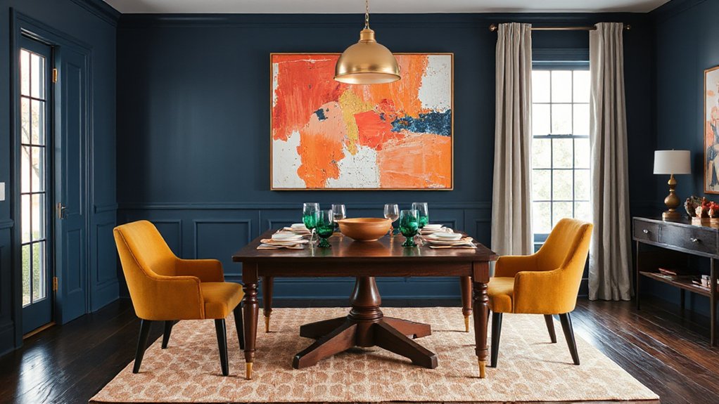
Although navy already brings depth and polish, you can make the dining room feel more energetic by layering in high-contrast accent colors like chartreuse, cobalt, fuchsia, or citrus yellow in small, deliberate hits. Keep the navy dominant, then add Bold accents through a single statement piece: lacquered dining chairs, a pendant shade, or an oversized artwork. Repeat the color twice more at a smaller scale—napkins, a runner, or glassware—so it looks intentional, not chaotic. Choose crisp finishes (high-gloss, enamel, or glazed ceramic) to sharpen contrast against matte navy walls. Balance vibrant hues with neutrals like warm white trim or light oak to prevent visual fatigue. If you want flexibility, use removable accents like cushions and candleholders for quick seasonal swaps.
Frequently Asked Questions
What Ceiling Color Works Best With Navy Blue Dining Room Walls?
Choose a crisp warm white ceiling; it brightens navy walls and keeps the room balanced. You’ll enhance it with Ceiling texture options like smooth or subtle matte. Add wall accent colors: brass, oak, or soft cream.
Which Lighting Temperature Complements Navy Paint in a Dining Room?
You’ll want warm-white lighting, 2700–3000K; it softens navy like lanterns guiding a midnight harbor. Use 3000K for crisp Wall art clarity. On an Accent wall, avoid 4000K— it turns navy cold, flat.
What Is the Best Sheen for Navy Dining Room Paint?
You’ll get the best results with eggshell or satin sheen; they clean easily and soften navy’s depth. Use matte on ceilings. For a navy accent, pair complementary decor in lighter textures to balance.
How Do I Prevent a Navy Dining Room From Feeling Too Dark?
You’ll keep it from feeling too dark by boosting Color contrast with bright trim, layered lighting, and reflective surfaces. In one project, you added ivory curtains and brass Accent accessories, plus a large mirror.
What Tablecloth or Placemat Colors Look Best With Navy Walls?
Choose crisp white, ivory, or light gray tablecloths, and warm tan, camel, or brass-accented placemats. Use Tablecloth patterns like subtle stripes. Favor Placemats textures—woven jute, linen, or leather—for contrast.
Conclusion
Let your navy dining room act like midnight velvet: deep, steady, and made for lingering conversations. You’ll sharpen it with crisp white trim, then warm it with brass gleam and oak or walnut grain—like candlelight catching on heirlooms. If you want softness, you’ll add greige, blush, or dusty rose; for earth, choose sage or terracotta. Finish with one bold pop, and you’ll set a table that feels timeless.