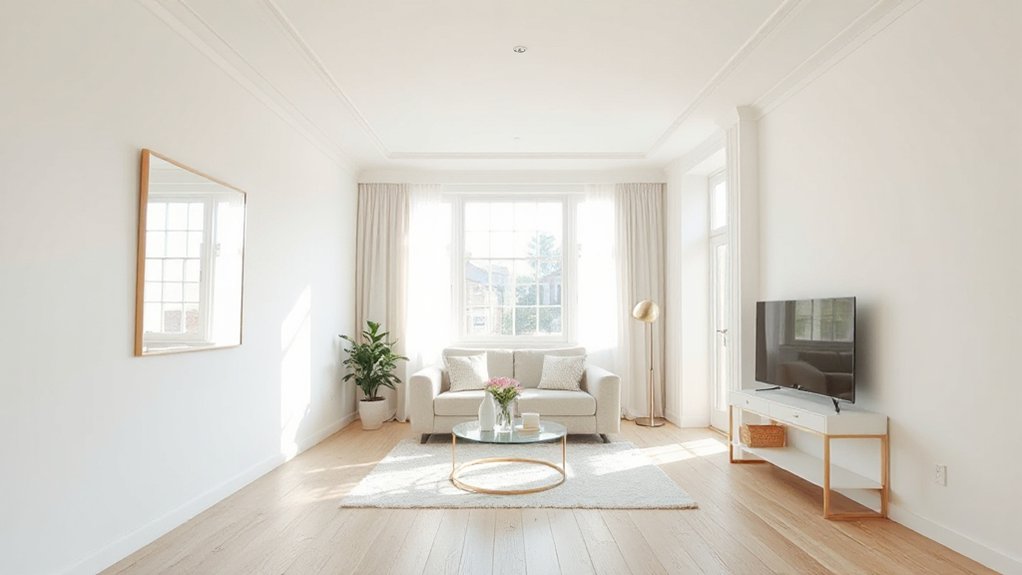
Make your small flat feel almost twice the size by painting walls a light, high-LRV shade (soft white, pale greige, misty blue) and keeping it consistent room to room for calm flow. Lift the ceiling one shade lighter to add height, and minimise contrast by painting doors, trim, and boxing-in to match the walls. Choose matte for bedrooms, eggshell/satin for kitchens and baths, and add one muted accent behind key furniture only. Next, you’ll see how to test and zone.
Key Takeaways
- Use a single light, high-LRV wall colour throughout to reduce visual breaks and make rooms read larger.
- Paint ceilings one shade lighter or the same colour as walls to blur edges and increase perceived height.
- Minimise contrast by painting trims, doors, and boxing-in the wall colour, using different sheens for subtle definition.
- Add one deeper, cool-toned accent behind a sofa or bed to create depth and visually push the wall back.
- Try a two-tone dado break (darker below, lighter above) in halls or narrow rooms to widen the feel without clutter.
Start With the “Bigger Room” Paint Formula
If you want your flat to feel instantly larger, start by using the “bigger room” paint formula: keep the walls light and consistent, push the ceiling a shade brighter, and use one deeper accent sparingly. This reduces visual breaks, so your eye travels farther, and rooms read wider.
Choose a single light tone for most walls across open-plan spaces, so doorways don’t chop the flat into boxes. Use the ceiling shade to lift height without changing colour families. Place your deeper accent behind a sofa or headboard to anchor the room; don’t wrap it around corners. Colour psychology matters: pale neutrals calm, while one rich note adds depth. Support the scheme with furniture placement—float pieces off walls slightly and keep sightlines clear.
Choose Light-Reflecting Paint Colors for Small Apartments
Because light is what makes a small flat feel open, you’ll get the biggest payoff from paint colours that bounce daylight (and lamplight) back into the room. In UK homes, aim for high-LRV shades: soft whites, pale greige, misty blue, or warm stone. Use Color psychology to steer the feel—cool tints read airy and calm, while gentle warm neutrals stop north-facing rooms looking bleak. Choose an eggshell or durable matt designed to resist scuffs; overly flat finishes can swallow light, while full gloss shows every bump. For paint application, prep matters: fill, sand, then apply a quality primer so the topcoat stays bright and even. Prioritise:
- High-LRV, low-chroma hues
- Eggshell or washable matt
- Clean, smooth walls
- Consistent lighting tests before committing
Pick One Main Wall Color for Whole-Home Flow
Pick one unifying neutral as your main wall colour, and you’ll make your flat feel calmer and more spacious. Carry that shade through the living area, hallway, and bedroom so your eye moves smoothly instead of stopping at hard colour changes. You can still add personality with bolder accents on woodwork, soft furnishings, or artwork without breaking the flow.
Choose A Unifying Neutral
While bold colour moments can work in a small flat, you’ll get the biggest “extra space” effect by choosing one unifying neutral and running it through most of your walls. It calms visual noise, and colour psychology says low-contrast backdrops read as more open. Pick a neutral that suits the UK light in your rooms: warm greige for north-facing, softer off-white for south-facing glare, or a pale taupe for balance. Then choose a finish that handles real life; paint durability matters in hallways, kitchens, and rental touch-ups. Aim for a shade you won’t tire of, and test it properly.
- Paint A4 swatches and view morning/evening
- Match undertones to flooring and worktops
- Use washable matt or durable eggshell
- Keep ceilings and trim slightly lighter
Extend Color Across Rooms
Once you’ve settled on a unifying neutral, run that same main wall colour through the flat to create whole-home flow. When rooms share one backdrop, sightlines lengthen and your place reads as one bigger volume, not chopped-up boxes. Use the same shade in the hallway, living area, and bedroom, then vary only sheen to suit use: matte for calm, soft sheen for wipeable spots.
Rely on Color psychology: warm greige feels welcoming in north-facing UK flats; cool grey-beige can brighten south-facing glare. Keep trims consistent in crisp white to sharpen edges without breaking continuity. For kitchens and bathrooms, match the colour but choose higher paint durability—scrubbable, moisture-resistant finishes—so the scheme stays smart without repainting.
Best White Paint to Make a Small Apartment Bigger
To make a small flat feel bigger, you need the right white, and that starts with choosing warm whites for north-facing rooms and cool whites for brighter, south-facing spaces. You’ll also get more light bounce if you pick the right sheen: matt hides flaws, while durable matte or soft sheen can lift tight hallways and kitchens. Get those two choices right, and your walls will read cleaner, brighter, and more spacious.
Warm Vs Cool Whites
Because the undertone of white paint changes how light bounces around a room, choosing between warm and cool whites is one of the fastest ways to make a small flat feel bigger. In UK homes, your daylight, glazing, and surrounding buildings will push white paint either creamy or crisp, so test on several walls.
- Pick Cool whites for north-facing rooms; they sharpen edges and lift dim corners.
- Use Warm whites in south-facing spaces; they soften glare and keep walls from looking sterile.
- In open-plan areas, stick to one undertone to avoid chopping up sightlines.
- Match to fixed finishes: warm oak likes warm whites; grey tiles and chrome suit cool whites.
Aim for a clean, consistent backdrop and you’ll notice rooms feel wider.
Sheen Choices For Space
After you’ve nailed the right warm or cool undertone, the sheen you choose decides how much light the walls throw back into the room. In a small flat, aim for a soft, clean bounce without highlighting every wobble in the plaster.
Go for matt on uneven walls: it hides Surface texture and keeps the look calm, but it marks more easily. Choose a durable “scrubbable matt” for hallways and kids’ rooms to boost Paint durability without glare. Use eggshell or soft sheen in kitchens and bathrooms; it reflects more light and wipes down well, making the space feel airier. Reserve satin for woodwork and doors to frame the room crisply. Avoid full gloss on walls unless they’re perfectly prepped, as it can emphasise bumps and roller lines.
Use Warm Off-Whites to Keep It Cozy, Not Sterile
While bright white paint can make a small flat feel bigger, it can just as easily read cold and clinical under typical UK daylight, so choose warm off-whites instead. You’ll keep bounce and brightness, but soften shadows and make a Cozy ambiance that still feels open. Aim for creamy, slightly yellow or beige-leaning whites, and test them morning and late afternoon; overcast light changes undertones fast in Britain. To avoid a sterile look, carry the same off-white across walls, ceiling, and woodwork, then add contrast with textiles and timber for an inviting atmosphere.
- Pick off-whites with warm undertones, not stark “brilliant” whites
- Use large sample cards on two walls, north and south facing
- Match ceilings and trim to reduce visual breaks
- Pair with warm bulbs (2700–3000K) to stop greying
Use Cool Colors to Make Walls Visually Recede
To make your walls feel further away, switch to cool tones that naturally recede in typical UK light. Choose soft blue-greens and light cool neutrals to open up the room without making it feel stark. Then build a calm, cool monochrome scheme in layered shades so the space reads wider and more continuous.
Choose Soft Blue-Greens
Because cool hues naturally pull the eye backward, soft blue-greens are one of the quickest ways to make a small flat feel larger. Lean on Color psychology: these shades read calm and airy, so your walls seem to recede rather than press in. In UK rooms with limited daylight, pick a blue-green with a touch of grey to avoid a cold, clinical cast, and test it across morning and evening light before committing. Choose finishes that balance sheen and paint durability so the surface stays crisp in tight hallways and busy kitchens.
- Use it on the longest wall to stretch the room
- Pair with white woodwork for clean edges
- Match ceilings to keep lines from chopping space
- Go for washable matt or durable eggshell where scuffs happen
Favor Light Cool Neutrals
If you want your walls to visually recede, reach for light cool neutrals—think pale greys, stone, and greige with a blue or green undertone—rather than warm beiges that can feel closer in tight UK rooms. These Neutral tones bounce daylight from small sash windows and don’t throw a yellow cast under typical 2700K LEDs. Use color psychology to your advantage: cooler undertones read calmer and farther away, so your hallway or studio feels wider without moving a single piece of furniture. Test swatches on the largest wall and view them morning, afternoon, and after dark; cool paints can tip icy in north-facing flats. Keep ceilings a touch lighter than walls to lift height, and choose a soft-matt finish to hide plaster imperfections.
Use Cool Monochrome Layers
While a single pale neutral helps, layering cool monochrome shades makes a small flat feel deeper and more pulled back. Cool blues, blue-greys, and soft sage create colour harmony, so edges blur and walls visually recede. Keep the value changes subtle: you’re aiming for depth without obvious stripes or blocks. Use one family across the room, then shift finish and intensity to define zones without shrinking them.
- Paint the main walls a light blue-grey in matt for a calm base.
- Use one shade darker on the far wall to extend sightlines.
- Pick the palest tint for ceiling and trim to lift height.
- Add satin on alcoves or shelving for gentle contrast.
Test swatches in UK daylight; north-facing rooms need warmer blue-greys.
Paint Ceilings Lighter to Make Them Feel Higher
Even in a compact flat, you can make the ceiling feel noticeably higher by painting it a shade lighter than the walls. This simple shift boosts perceived ceiling height because light tones bounce daylight and lamp light back down into the room, softening shadows at the wall–ceiling line.
For best results, keep your colour coordination tight: use the same hue as the walls, just 10–20% lighter, or choose a warm off-white that relates to your wall colour’s undertone. In UK homes with lower ceilings, avoid stark brilliant white if your walls are creamy; it can look cut-out. Use a matt finish to hide imperfections, and cut in crisply for a clean, lifted edge.
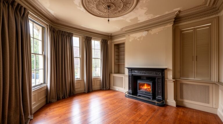
When to Paint the Ceiling the Same Color as Walls
Although a lighter ceiling usually lifts a small room, painting the ceiling the same colour as the walls works brilliantly when you want the space to feel calmer, more cohesive, and less “boxed in” by a harsh ceiling line. You’ll reduce Ceiling contrast, blur edges, and let furnishings lead the eye instead. It’s especially effective in UK flats with awkward soffits, bulkheads, or low picture rails, where a white lid chops the room up. Prioritise Color coordination by using one shade in different finishes: matt on plaster, durable matt on walls, and wipeable on woodwork.
- Low ceilings that feel clipped by a bright white top
- Rooms with lots of angles, beams, or boxed pipes
- Dark, cosy spaces where you want enveloping depth
- Open-plan areas where you need seamless visual flow
Widen a Narrow Hallway With Smart Paint Placement
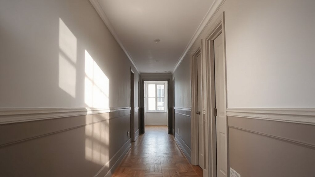
If your hallway feels like a long tunnel, paint can change its proportions faster than any runner or mirror. For a convincing Hallway illusion, keep the side walls light and the lower half slightly deeper using smart paint placement: a pale warm white above, soft greige or muted colour below, split at dado height. This lowers visual “weight” and makes the corridor feel broader without darkening it.
Use satin or durable matt on the lower section to cope with scuffs from coats, prams, and school bags. Paint skirting and architraves the same as the lower band to blur edges and widen the line of sight. If the ceiling feels low, keep it crisp white and extend the light wall colour up to it cleanly.
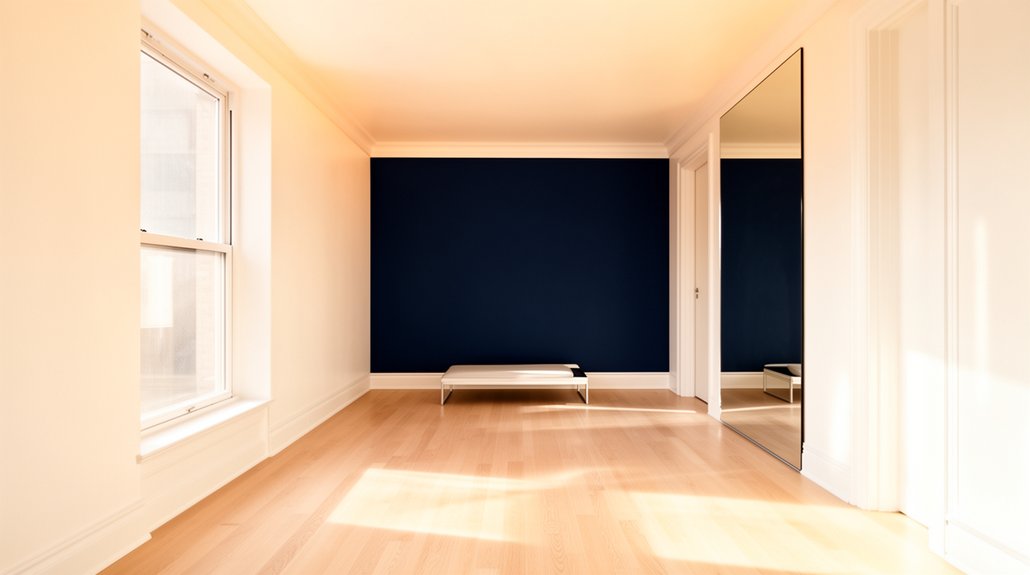
Use an Accent Wall to Push the Room Back
Once you’ve broadened a tight hallway with clever colour blocking, use the same principle in your main room: let paint shift what your eye reads as the “end” wall. Pick the wall you face most often (usually behind the sofa or bed) and paint it a deeper, cooler shade; Color psychology says blues, blue-greens, and charcoals visually recede, so the room feels longer. Keep surrounding walls lighter so the accent reads as distance, not clutter. In UK flats, prioritise paint durability on high-traffic surfaces and around radiators.
- Choose a matte or soft-sheen for a calmer, deeper look
- Use scrubbable finish if kids, pets, or rentals apply
- Extend colour onto skirting for a cleaner “pushed back” edge
- Repeat the accent tone in one textile to anchor it
Use Two-Tone Paint to Fake More Depth
You can make a small flat feel deeper by using two-tone paint with a darker base and a lighter top. Keep the colour break horizontal and level, then run it around the room to stretch the walls and steady the sightline. Choose crisp, washable matt for the lower section and a softer, light-reflective finish above to lift the ceiling.
Dark Base, Light Top
Although most people reach for pale paint to “open up” a room, a two-tone scheme often works harder: paint the lower portion of the wall in a deeper shade and keep the top half (and ceiling) light to create instant depth. You’ll anchor the room at eye level, then let light ceilings lift the visual weight upwards, which makes modest UK flats feel taller and calmer. Keep the darker colour matte to hide scuffs and choose washable durable emulsion for hallways and kitchens. Finish with dark accents—frames, lamps, or a slim console—to tie the base tone through the space without cluttering it.
- Pick one deep neutral (charcoal, olive, inky navy)
- Use a warm off-white above for bounce
- Repeat the base colour in soft furnishings
- Test in daylight and evening LEDs
Horizontal Color Breaks
If your flat feels boxy, a horizontal colour break can stretch the room visually without moving a single wall. Paint the lower third in a grounded shade (charcoal, inky blue, deep olive) and keep the upper section lighter to lift the ceiling line. For best results, run the break at 90–110cm from the floor—roughly dado height—so it reads intentional, not accidental. Use crisp masking tape and a satin finish below for wipeable durability in UK rentals.
Maximise Color contrast, but stay within the same undertone so it doesn’t jar in grey light. Plan furniture placement to sit mostly below the break; sofas, sideboards, and radiators should anchor the darker band, while artwork can straddle the line for depth.
Paint Trim and Doors the Wall Color to Reduce Breaks
To make a small flat feel larger, paint your skirting boards, architraves, and internal doors the same colour as the walls. This removes visual breaks and dials down trim contrast, so your eye reads one continuous plane rather than lots of chopped-up edges. Good color coordination also disguises awkward door positions and makes corridors feel longer, which is especially useful in compact UK flats.
- Match all woodwork to one wall shade throughout the room
- Include door frames, cupboard doors, and boxing-in for pipes
- Paint radiators only if you’re happy with the finish and heat rating
- Keep lines crisp: fill gaps, sand, then cut in neatly
Use a quality primer on previously glossed timber, then apply two coats. You’ll get a calmer, more expansive look fast.
Choose the Right Sheen to Bounce More Light
When you choose the right paint sheen, you’ll make a small flat feel brighter and more open because light reflects and travels further around the room. In UK homes with limited daylight, that extra bounce matters.
Use silk or soft-sheen on walls in living rooms and halls to increase light return without looking overly shiny. Save full gloss for skirting boards, architraves, and doors if you want crisp definition and wipeable surfaces. In bedrooms, go for matt or durable matt to reduce glare while still supporting Light diffusion. For kitchens and bathrooms, choose eggshell or satin that resists moisture and cleans easily, while still lifting the space. Avoid high-gloss on large wall areas if your plaster isn’t perfect—it’ll highlight bumps and roller marks.
Test Paint Swatches in Day and Night Light
Because daylight shifts so dramatically across the day in most UK flats, you should test swatches on several walls and check them in morning sun, grey afternoon light, and under your evening lamps before you commit. Paint a decent A4 patch, not a tiny dab, and leave it up for 48 hours so you see it in real life, not showroom conditions. Use Color psychology: warmer off-whites can feel welcoming at night, while cool greys may look flat when skies turn slate.
- View swatches beside your sofa fabric, flooring, and curtains
- Check undertones under LED, halogen, and warm filament bulbs
- Note how shadows fall near windows, radiators, and alcoves
- Choose scrubbable finishes to protect paint durability in busy spots
If the colour shifts too much, pick a steadier mid-tone and save headaches later.
Define Studio “Zones” With Paint (Without Shrinking It)
Once you’ve picked a colour that behaves in both daylight and lamplight, use paint to map out clear “zones” in a studio without putting up anything bulky. Paint a headboard-sized block behind the bed, a shallow arch around your desk, or a low band behind the sofa to signal purpose while keeping sightlines open.
Use Color psychology: calmer blue-greens for sleep, soft warm neutrals for lounging, and a slightly crisper tone for work so you feel alert. Keep tones in the same family so gradations look intentional, not chopped up. Use the same finish throughout for unity, then upgrade only high-contact areas (desk wall, kitchen corner) to a tougher washable matt or eggshell for paint durability. Mask clean edges with low-tack tape, then feather the roller for a soft boundary.
Small-Apartment Paint Mistakes That Make Rooms Look Smaller
Although paint can visually stretch a boxy room, a few common choices will do the opposite and make your flat feel tighter than it is. In UK rentals, you’ll often inherit low light and busy trim, so avoid decisions that add visual clutter or swallow daylight. Don’t ignore color psychology: heavy, muddy tones can feel cosy, but they also pull walls inward when you’ve got limited square footage. Likewise, poor paint durability leads to scuffs and patchy touch-ups that make surfaces look uneven and smaller.
- Painting ceilings darker than walls, lowering perceived height
- Cutting in harsh contrasts on skirting, doors, and frames
- Using ultra-matt on high-traffic walls, showing marks fast
- Overdoing feature walls in saturated shades in narrow rooms
Frequently Asked Questions
How Can Paint Hide Radiators, Pipes, or Exposed Wiring in Small Apartments?
You can disguise radiators, pipes, and wiring by colour-matching them to walls for Radiator concealment. Use Pipe painting techniques: clean, prime, then apply heat-resistant metal paint. Box-in wiring, paint trunking, and keep finishes matte.
What Are the Best Low-Voc Paints for Tiny, Poorly Ventilated Spaces?
You’ll want ultra-low/zero-VOC water-based emulsions: Dulux Trade Diamond, Crown Clean Extreme, and Little Greene Intelligent. They’ll smell like nothing after minutes. Choose Eco friendly finishes, and use VOC reduction techniques: ventilation, damp cloths, thin coats.
How Do I Paint Over Dark Colors Without Losing Brightness or Adding Coats?
You can’t reliably cover dark colours without extra coats, but you can keep brightness by applying a high-adhesion stain-blocking primer, then one quality topcoat. Choose higher paint sheen and manage colour contrast with tinted primer.
Can Renters Use Removable Paint or Peelable Coatings to Enlarge Rooms?
Yes, you can—Removable paint and peelable coatings let renters brighten walls and boost perceived space without breaching most UK tenancy rules. Choose light shades, prep properly, test adhesion, and peel cleanly at checkout.
How Do I Choose Paint Colors That Match Existing Furniture and Flooring?
Design studies show coordinated palettes can lift perceived harmony by 60%. You’ll choose paint by pulling undertones from flooring, then testing swatches beside key pieces for Color coordination and furniture matching under UK daylight.
Conclusion
With the right paint choices, you can make your flat feel like it’s breathed out and found extra space. Stick to the bigger-room formula: light, light-reflecting tones, one flowing main colour, and a sheen that lifts the light. Test swatches morning and evening, then use subtle shifts to zone a studio without chopping it up. Avoid stark whites and heavy contrasts—they’ll box you in, not open you up.