You’ll get an ideal modern colour combination for living room faster when you start with a warm neutral base—think greige walls and a taupe or soft clay sofa—then adjust for your natural light so undertones don’t turn muddy. Once you’ve nailed warm vs cool, you can add one strategic accent like navy, terracotta, or blush in the right spots to sharpen the look. The key is choosing where that colour lands and how textures back it up…
Key Takeaways
- Start with a warm off-white, greige, or soft clay wall color, matched to your room’s natural light and undertones.
- Anchor the scheme with a deeper neutral sofa like taupe, charcoal, or cognac, echoing it in a rug or curtains.
- Choose one modern accent color—navy, sage, terracotta, or emerald—and repeat it in 2–3 places for cohesion.
- Try proven pairings: white+beige, greige+charcoal, sage+cream, or navy+brass for clean, contemporary contrast.
- Layer textures and finishes—linen, bouclé, velvet, matte walls, and brass or black details—to add depth without adding clutter.
Start With a Modern Base Colour (Walls + Sofa)
If you want your living room to feel current without chasing every micro-trend, lock in a modern base colour on the two biggest surfaces: the walls and the sofa. Start with a warm off-white, greige, or soft clay on walls for flexibility, then pick a sofa in a deeper, steadier neutral like taupe, charcoal, or cognac. Use Color psychology to steer the mood: creamy tones read calm, clay feels grounded, charcoal looks sleek and focused, and cognac adds warmth without turning rustic. Keep undertones aligned (warm with warm, cool with cool) so the room doesn’t fight itself. For furniture coordination, echo the sofa tone in one other anchor—rug pattern, curtain trim, or a media console finish.
Check Your Living Room’s Natural Light First
Before you commit to paint swatches or upholstery, read your living room’s natural light like a filter—it will shift every colour you bring in. Do a quick Natural light analysis: note window size, direction, and any exterior bounce from trees, brick, or nearby buildings. Check the room at three times—morning, midday, and evening—because trendy mid-tones can look flat in low light and overly crisp in strong sun.
Use Light reflection techniques to predict results: hold a white poster board beside your wall, then swap in a black board to see contrast changes. Turn on your lamps, too, and watch how shaded corners behave. Finally, map where light pools and where it dies; that’s where you’ll place bolder accents or quieter neutrals.
Pick Warm vs Cool Undertones (Quick Test)
Once you’ve checked your living room’s natural light, decide whether you’re working with warm undertones (yellow, red, golden) or cool undertones (blue, green, grey) so your colour combinations don’t clash. Do a quick test: hold a true white sheet next to your sofa, rug, or wall—if it reads creamy, you’re in warm territory; if it looks crisp or icy, you’re leaning cool. Then tape up paint chips and view them morning-to-night under your actual lamps and daylight, because lighting can flip an undertone fast.
Warm Or Cool Basics
Although warm and cool palettes can both look “neutral” at first glance, the undertone decides whether your living room feels cozy and inviting or crisp and airy. Warm undertones lean creamy, golden, or earthy; cool undertones skew gray, blue, or green. Use Color psychology to steer mood: warm reads welcoming and social, while cool feels calm and spacious. Cultural influences matter too—some homes favor sun-baked terracotta and brass, others prefer Nordic stone-gray and oak for a cleaner vibe. Build your scheme by pairing your undertone with modern, balanced accents.
- Warm base: ivory, camel, clay; add brushed brass, walnut, rust textiles.
- Cool base: dove gray, sage, icy taupe; add chrome, ash wood, ink-blue.
- Mixed: keep one dominant; echo the other in art or cushions.
Undertone Quick Tests
If your “neutral” paint keeps flipping between beige and gray depending on the light, run a few fast undertone checks to lock in warm vs cool. Hold a true-white sheet beside the wall: if the paint reads creamy, it’s warm; if it looks icy or bluish, it’s cool. Next, compare it to a camel fabric swatch and a charcoal one—whichever feels “cleaner” reveals the lean. Check metals: warm undertones flatter brass and gold; cool undertones click with chrome and nickel. Use Color psychology, too: warm reads social and cozy; cool feels calm and modern. Finally, sample your preferred paint finish: matte can mute undertones, while eggshell or satin makes them pop and feel crisper.
Lighting And Paint Chips
Why does the same paint chip read greige at noon and straight-up beige at night? Your lighting’s spectrum shifts, and so do undertones. For smart Paint chip selection, test chips on two walls and view them under daylight, lamps, and your Accent lighting. Then run a quick warm-vs-cool check: hold a clean white sheet beside the chip; if the color looks yellowed or creamy, it’s warm, and if it snaps crisper or slightly blue/green, it’s cool.
- Check morning, late afternoon, and after-dark readings before you commit
- Match bulb temps: 2700K warms, 3000K stays balanced, 4000K cools
- Watch reflective surfaces (floors, TVs, brass) that tint chips in real rooms
Choose an Accent Colour: and Where It Goes
Now you’ll choose a bold accent colour—think inky navy, terracotta, or emerald—to give your living room a clear focal point. Place it strategically on high-impact pieces like a feature wall, sofa cushions, a rug, or artwork, and repeat it in two to three spots so it feels intentional. Keep the rest grounded with warm or cool neutrals that match your undertone test, so the accent pops without overpowering the space.
Pick A Bold Accent
Although your base palette sets the mood, a bold accent colour gives the living room its punch and personality. Use color psychology to choose a hue that matches how you want to feel: cobalt for energy, terracotta for warmth, emerald for calm confidence. Keep it modern by pairing one saturated accent with two quieter neutrals, then repeat it in small doses so it looks intentional, not random. Let furniture placement guide your choice: if your sofa dominates, pick an accent that flatters its fabric; if you’ve got statement chairs, echo their tone elsewhere.
- Paint one focal surface, not every wall
- Add accent through textiles, art, and ceramics
- Match undertones with flooring and metals for cohesion
Place Accents Strategically
Once you’ve picked your accent colour, decide exactly where it will land so it reads as a deliberate design move, not a scattered mix of “pretty” pieces. Start with one anchor zone—typically the sofa wall, the seating cluster, or the fireplace—and repeat the colour in 2–3 hits. Use Color psychology to guide placement: energising hues work best where you gather and talk, while cooler tones suit reading corners. Tie accents to furniture placement by pairing colour with form: a rust cushion on the main sofa, a matching throw on the adjacent chair, then a small art print above the console. Keep scale varied—large textile, medium décor, small accessory—so it feels intentional, not loud.
Balance With Neutrals
Before you add more colour, lock in a neutral base that lets your accent shade look crisp rather than chaotic. Start with warm white, greige, or soft taupe on walls and large upholstery, then pick one accent hue that supports your mood goals through Color psychology—sage for calm, terracotta for warmth, inky blue for focus. Keep the accent consistent, and let furniture placement control how loud it feels: closer to eye level reads stronger; low and wide reads quieter.
- Anchor the room with a neutral sofa or rug, then repeat the accent in two smaller textiles.
- Put the boldest accent on a single vertical plane: art, curtains, or a bookcase back panel.
- Balance sheen: pair matte neutrals with one glossy accent (lamp, vase) to add lift.
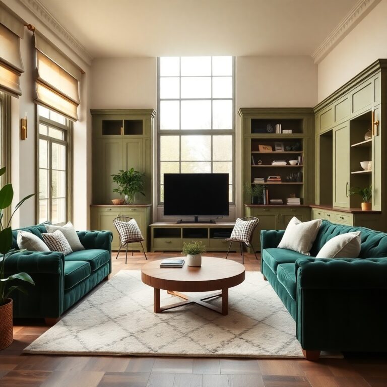
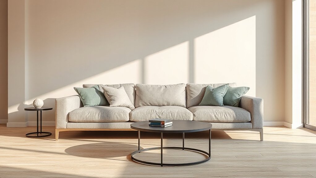
Modern Warm-Neutral Colour Combinations (Cozy Look)
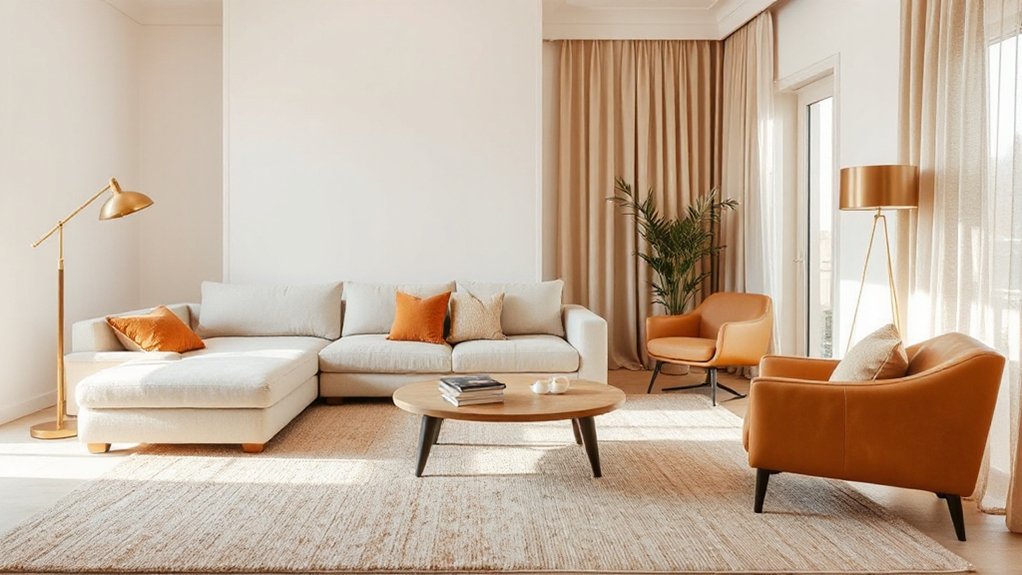
If you want a living room that feels current but still inviting, modern warm-neutral palettes give you that cozy, “designed” look without relying on bold colour. Start with creamy white or oatmeal on walls, then layer camel, toffee, and taupe through rugs, curtains, and upholstery for depth. Add a grounded accent like terracotta, cognac leather, or clay-toned art to keep it contemporary.
Use Color psychology to guide choices: warm neutrals lower visual tension and make seating zones feel intimate. Respect Cultural influences by pulling cues from materials you already love—linen, rattan, walnut, or brushed brass—so the palette feels personal, not staged. Finish with matte textures and warm lighting (2700K) to keep everything softly cohesive.
Modern Cool-Neutral Colour Combinations (Crisp Look)
While warm neutrals read cozy, modern cool-neutrals deliver a crisp, architectural look that still feels livable. Lean into soft dove gray, blue-gray, and muted greige with charcoal accents to sharpen lines without turning sterile. Use Color psychology: cooler bases calm the room, while deeper slate adds focus and grounded sophistication.
- Pair blue-gray walls with matte black metal and pale oak to balance coolness with warmth.
- Add a crisp off-white trim and ceiling to outline details and amplify daylight without glare.
- Layer textiles in stone, fog, and ink tones so seating feels inviting, not clinical.
For paint application techniques, keep sheen consistent (eggshell walls, satin trim), cut in cleanly, and test undertones under both daylight and warm LEDs.
White + Beige: A Modern Living Room Classic
Pairing white with beige gives you a timeless neutral balance that still reads modern, especially when you keep whites clean and beiges softly warm. You’ll get the most impact by layering tones and textures—matte walls, linen upholstery, boucle pillows, and light oak—to prevent the palette from falling flat. Finish it with a few warm accents like brass lighting, terracotta ceramics, or camel leather so the room feels inviting, not sterile.
Timeless Neutral Balance
Because it hits the sweet spot between fresh and cosy, white and beige remains a modern living room classic that won’t date quickly. You get a clean backdrop that still feels welcoming, and color psychology explains why: white reads open and airy, while beige signals comfort and stability, shaping the room’s emotional impact.
To keep the balance modern, you’ll want clear contrast and intentional placement:
- Choose a crisp white for walls, then use beige on larger pieces (sofa, rug) to ground the space.
- Add one defined accent in matte black, brushed brass, or oak to sharpen edges without changing the palette.
- Match undertones: pair warm whites with sandy beige, cool whites with greige, so everything looks cohesive.
Layered Textures And Tones
A white-and-beige base looks most current when you build it up with texture and subtle tone shifts, not more colour. Start with matte, warm-white walls, then choose beige seating in a slightly deeper value so shapes read cleanly. Add Layered textiles: a low-pile wool rug, a nubby boucle throw, and linen drapery with a soft, broken weave. Mix finishes too—chalky paint, honed stone, pale oak, and brushed metal—so light moves across the room. For Tone blending, keep undertones consistent: pair creamy whites with sandy or oatmeal beiges, not pink-leaning taupes. Use pattern quietly through texture—herringbone, rib, basketweave—scaled up on one piece, finer on another. Edit repeats and you’ll keep it modern.
Accents For Warmth
Even if you keep the palette strictly white and beige, you can make it feel inviting by adding a few warm accents that read intentional, not “extra.” Bring in camel or cognac leather (an ottoman, sling chair, or structured cushions) to sharpen the neutrals, then layer in aged brass or bronze through a floor lamp, picture frames, or hardware so the room glows at night.
To avoid flatness, choose one focused move: a soft clay Accent wall or a warm greige limewash that deepens the backdrop without breaking the scheme. Then echo that warmth in small, repeatable doses, so it looks designed, not random.
- Add nubby Throw pillows in sand, oat, or caramel
- Use walnut or smoked oak for one statement table
- Swap stark white bulbs for 2700K warm LEDs
Greige + Charcoal: Modern Depth Without Gloom
When you want a living room that feels current but still inviting, pair greige walls with charcoal accents to add depth without dragging the space into darkness. Greige’s balanced warmth supports calm in Color psychology, while charcoal grounds the room and sharpens modern lines.
Choose paint finish options strategically: go eggshell or matte on walls to soften light and hide minor texture, then use satin or semi-gloss on trim or built-ins for crisp contrast and easy wiping. Anchor the palette with a charcoal sofa, metal coffee table, or window frames; keep the largest rug in a greige-beige blend to prevent heaviness. Add layered lighting—warm LEDs, a floor lamp, and a table lamp—so charcoal reads rich, not flat. Finish with oak, brass, or textured linen to keep it welcoming.
Sage + Cream: Soft Modern Colour Pairing
Because sage sits between green and grey, it delivers a calm, modern backdrop without feeling cold, and cream keeps the whole living room bright and soft. Use Color psychology to steer the mood: sage lowers visual noise, while cream reads welcoming and clean. For paint application, put sage on the main walls or a single feature wall, then reserve cream for trim, ceiling, and built-ins to sharpen edges and bounce light.
- Choose a muted, dusty sage in matte; it hides scuffs and looks current.
- Pair with warm cream upholstery and textured neutrals (bouclé, linen) to avoid flatness.
- Add black or oak details in frames and tables for definition without stealing softness.
Keep undertones consistent—green-leaning sage with yellow-leaning cream.
Navy + Brass: Modern Contrast With Warm Accents
If you want a living room that feels crisp but not cold, pair deep navy walls with brass accents for instant, modern contrast. Navy reads tailored and grounding, while brass adds a warm glow that keeps the space inviting, especially in evening light. Use Colour psychology: navy supports calm focus, and brass signals comfort and confidence.
To keep it current, choose matte navy paint and mix brushed brass hardware with one statement piece, like an arched floor lamp or slim coffee-table legs. Balance the depth with off-white trim, a pale rug, and linen curtains so the room doesn’t feel heavy. In Complementary colour schemes, navy also plays well with small touches of mustard or blush, but keep them minimal and repeat them twice for cohesion.
Terracotta + Sand: Earthy Modern Living Room
Although terracotta and sand sit firmly in the warm-neutral camp, they can look sharply modern in a living room when you keep the tones muted and the finishes clean. Start with sand on large surfaces—paint, a low-pile rug, or Sand wall décor—then layer controlled Terracotta accents for depth without heaviness. Keep lines streamlined and let texture do the work, so the palette feels current, not rustic.
- Choose matte clay planters, rust-toned cushions, or a slim terracotta lacquer side table.
- Pair sand upholstery with blackened steel, smoked oak, or travertine to sharpen the warmth.
- Add linear lighting and minimal art in ochre, sienna, and off-white to unify the scene.
Blush + Taupe: Warm, Modern, and Subtle
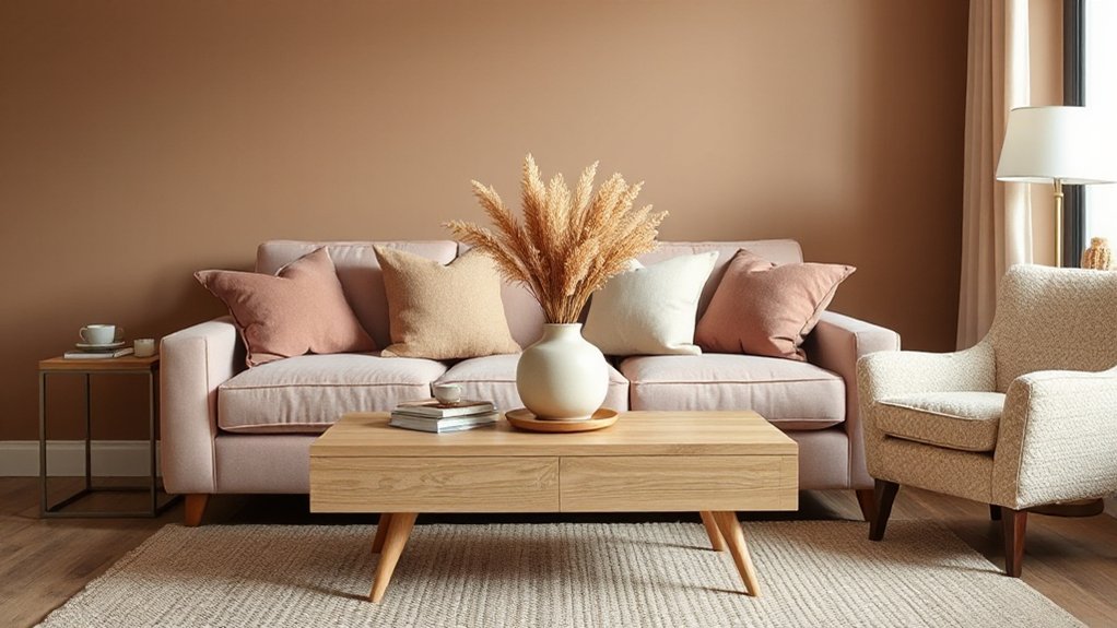
When you want a living room that reads warm and modern without shouting, blush and taupe deliver a soft contrast that still feels tailored. Use taupe on larger surfaces—walls or a sectional—so the room stays grounded and sophisticated. Bring blush in through a single focal area, like an accent wall, built-ins, or a statement chair, to keep it current, not sugary.
Color psychology matters here: taupe signals stability and calm, while blush adds approachable warmth and a hint of optimism. For Mood enhancement, choose a muted, dusty blush rather than bubblegum, and pair it with a greige-leaning taupe to avoid pink-beige muddiness. Test both under daylight and evening lamps; undertones shift fast.
Tie the Colour Combo Together With Décor + Textures
To make blush and taupe feel intentional (not accidental), you’ve got to bridge the gap with layered textures and a tight materials palette. Start with a matte taupe base (walls or rug), then add blush in smaller, repeatable hits so the eye reads rhythm, not randomness. Color psychology matters: blush softens and welcomes, while taupe steadies the mood and keeps the room grown-up. Lock it in with furniture placement—anchor seating on the taupe “field,” then pull blush closer to conversation zones.
- Bouclé or linen upholstery + a brushed brass lamp to add warmth without shine overload
- Ribbed glass, travertine, or pale oak accessories to echo taupe’s earthy undertone
- Velvet blush cushions, a tonal throw, and art with both hues to stitch it together
Frequently Asked Questions
How Do I Choose Colours That Work With Open-Plan Adjoining Rooms?
Choose a cohesive base palette and repeat it across zones to maintain colour harmony. Then apply contrast techniques through accent walls, textiles, and finishes. You’ll balance undertones, match lighting temperature, and shift smoothly with shared trim.
What Paint Sheen Is Best for Living Room Walls and Ceilings?
You’ll get the best results with eggshell or matte on living room walls and flat matte on ceilings; they hide flaws. Compare paint finish options under daylight. Use color wheel application to keep sheen consistent across open-plan passages.
How Can I Match Modern Colours With Existing Hardwood Floor Tones?
Want modern colours that still flatter your hardwood? Match undertones: pair warm floors with creamy whites, muted terracotta, or olive; cool floors with soft greige, slate, or blue. Add a Wall accent for Colour contrast.
Which Modern Colour Schemes Help Hide Pet Hair and Everyday Wear?
You’ll hide pet hair and wear best with mid-tone greige, warm taupe, or heathered charcoal schemes using matte finishes—ideal pet hair camouflage. Add stain resistant palettes like muted olive, dusty blue, or camel with speckled textiles.
How Do I Choose Lighting Temperatures That Flatter My Wall Colours?
Match colour temperature to your walls: use 2700–3000K to warm cool paints, 3500–4000K to crisp warm tones. Test bulbs at night and daytime. Layer lamps for lighting ambiance, and choose high-CRI LEDs.
Conclusion
Now you’ve got a modern living room palette that feels intentional: start with a greige, taupe, or soft clay base, match it to your light, then lock in warm or cool undertones. Add one confident accent—navy with brass, terracotta with sand, or blush with taupe—and repeat it in pillows, art, and a rug. Layer bouclé, linen, and textured weaves for depth. Ready to make your focal point pop?