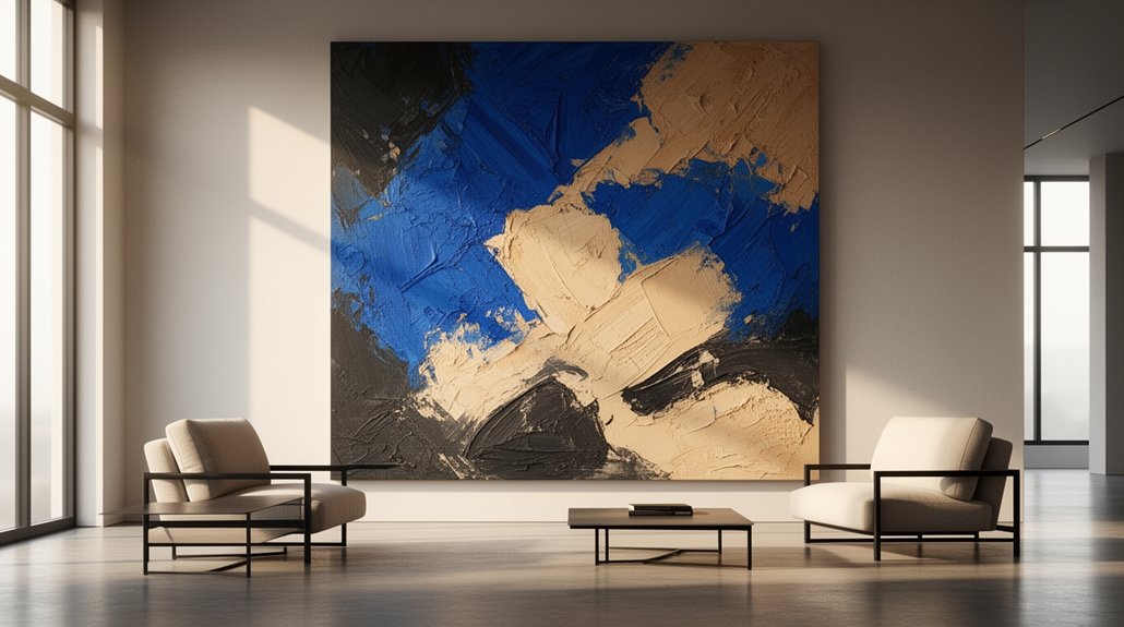
Large-scale abstract wall art leads 2026 décor because you can anchor a room with one commanding canvas instead of cluttered gallery clusters. You get calmer, edited palettes—stone, putty, blue-gray, and charcoal—punctuated with ochre, ink, or cobalt for energy. Oversized pieces (roughly 40–60 inches tall) add instant structure, elevate perceived value, and unify mixed finishes. Tactile surfaces like plaster, impasto, and linen catch light and add depth. Next, you’ll see how to size, place, and choose textures.
Key Takeaways
- Oversized abstract pieces create instant focal points, adding structure and visual hierarchy with fewer, more impactful artworks.
- Calm 2026 palettes—stone, putty, blue-gray, charcoal—feel soothing, while ochre, ink, and cobalt accents bring controlled energy.
- Tactile surfaces like plaster grounds, knife-work impasto, and linen weave add depth, shadow, and light play that elevates minimalist rooms.
- Proper scale (60–75% of wall width) makes spaces feel taller, more deliberate, and more expensive than smaller or clustered art.
- Abstract styles flex across modern, organic, and luxe interiors, helping unify mixed finishes by repeating key textile and decor hues.
Large-Scale Abstract Wall Art: The 2026 Shift
As interiors keep shifting toward calmer palettes and fewer, better pieces, large-scale abstract wall art is taking center stage in 2026. You’re seeing collectors and everyday homeowners prioritize one commanding canvas over gallery clusters, because it delivers instant structure without visual noise. The shift tracks with Color psychology: softened neutrals regulate mood, while deliberate jolts of ochre, ink, or cobalt create energy exactly where you need it. You’ll also notice more tactile finishes—plaster-like grounds, knife-work impasto, and linen weaves—that catch raking light and add depth throughout the day. For Artistic inspiration, you’re borrowing from modernist color fields, aerial landscapes, and fluid gestural marks, then editing the palette to match your furnishings. You get impact, cohesion, and calm.
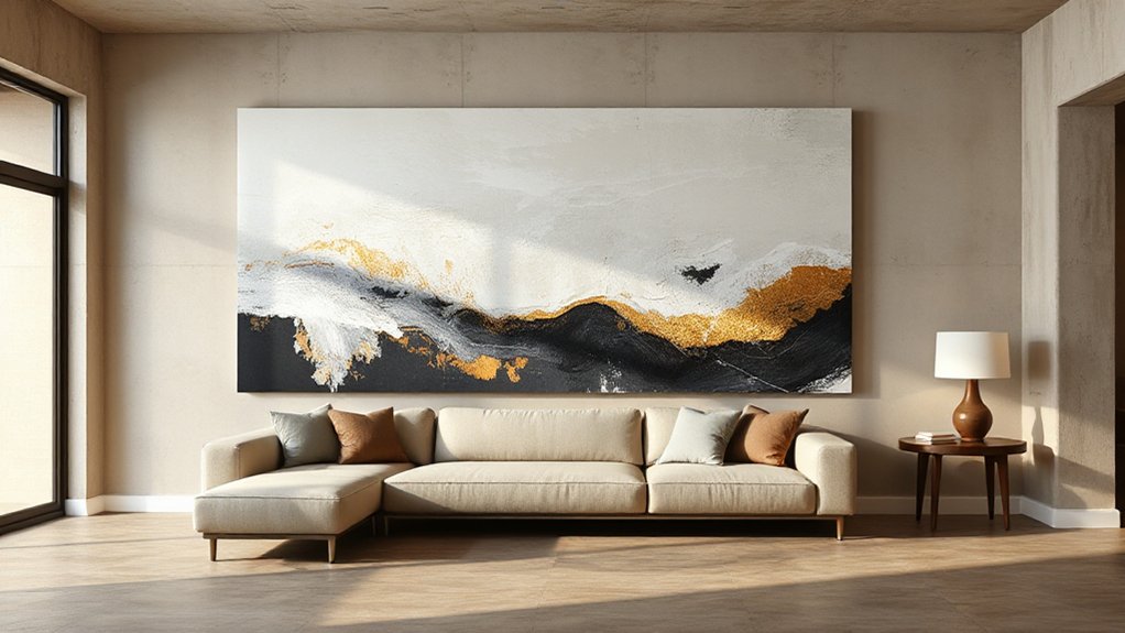
What “Large-Scale” Means (Real Size Ranges)
Although “large-scale” gets tossed around loosely, you can pin it down with real dimensions: start thinking 30″ × 40″ (76 × 102 cm) as the entry point, with true statement pieces landing in the 40″–60″ (102–152 cm) tall range and going up to 48″ × 72″ (122 × 183 cm) or 60″ × 80″ (152 × 203 cm) for rooms that can handle the visual weight. You’ll also see oversized triptychs: three 24″ × 36″ panels read as a single mural-scale work. In 2026, scale isn’t only about inches—it amplifies Artistic techniques like broad palette-knife sweeps, poured acrylic veining, and raw linen texture that need distance to resolve. Color psychology matters more at this size: warm terracottas energize, inky blues calm, and high-contrast monochromes sharpen focus.
What Size Art Fits Your Wall and Furniture?
To get the 2026 “intentional gallery” look, you’ll size your art to the wall, not your gut—aim for roughly 60–75% of the available wall width. You’ll also scale the piece to your furniture: over a sofa, bed, or console, keep the artwork about 2/3 to 3/4 the furniture’s width so it feels anchored. Once you lock those ratios, you can choose a single oversized statement or a tight grid of smaller works without the layout reading random.
Wall-To-Art Size Ratios
Whether you’re styling a sofa wall, a dining room credenza, or a bed, the right wall-to-art size ratio keeps the space looking intentional instead of under-scaled or overpowering. For 2026’s large-scale abstract trend, aim for art that fills about 57–70% of the available wall width, leaving breathing room on both sides. Measure the wall span you want to activate, then choose a single statement piece or a tight grouping that lands in that range. Use color psychology to steer mood—cool tones calm, warm tones energize—while art symbolism adds meaning beyond scale. Follow these ratio checks:
- You avoid the “postage-stamp” feeling.
- You stop blank-wall anxiety.
- You create gallery-grade balance.
- You make the room feel finished.
Art Scale With Furniture
Nail the wall-to-art ratio first, then lock the scale to your furniture so the piece feels anchored instead of floating. Over a sofa, console, or bed, aim for art that spans 60–75% of the furniture width; smaller reads like an afterthought, larger can overpower. Hang the center about 57–60 inches from the floor, or 6–8 inches above the furniture, then adjust for tall headboards and high backs. If you’re using a diptych or triptych, keep total width in that same range and hold 2–3 inches between panels for a clean, 2026-grade gallery rhythm. Use Color psychology to echo upholstery undertones. Treat bold large-scale abstracts as an art investment, not filler.
Where Oversized Abstract Art Works Best
Because scale sets the emotional tone of a room faster than any color palette, oversized abstract art works best where you’ve got clean sightlines and a clear focal wall. You’ll get the most impact in spaces that naturally pause the eye and invite meaning. Use color psychology to steer mood—cool fields calm, high-contrast strokes energize—then lean on art symbolism to echo what you want the room to communicate.
- Entryway: greet guests with instant confidence and direction.
- Living room main wall: anchor conversations without visual clutter.
- Dining area: heighten intimacy with a single, bold horizon.
- Primary bedroom: signal refuge with softened forms and slower rhythms.
Aim for balanced lighting, minimal competing patterns, and enough breathing room around the frame.
5 Ways Big Abstract Art Upgrades a Room Fast
You upgrade a room fast when you hang big abstract art because it instantly locks in a focal point and tells the eye where to land. You don’t need extra décor clutter—one oversized canvas sets the scale, anchors the furniture layout, and makes the space feel intentionally styled. You also get bold color momentum, pulling accent hues through textiles and accessories so the whole palette reads cohesive in minutes.
Instant Focal Point
How fast can a room feel styled and intentional? Hang one large-scale abstract piece, and you’ll reset the entire visual hierarchy in minutes. You don’t need extra furniture or layered decor; you need a clear anchor that tells your eye where to land. With color psychology in mind, you’ll choose a composition that steadies the space and makes everything around it feel curated. Think of it as an art investment: one decisive work that elevates perceived value, not a pile of small fixes.
- You quiet visual clutter by giving the room a single, confident “yes.”
- You create instant depth, making walls feel taller and layouts more deliberate.
- You unify mixed finishes so the space reads cohesive, not chaotic.
- You spark conversation—guests feel the energy before they sit down.
Bold Color Momentum
When a room feels flat or overly neutral, a big abstract piece with saturated pigment pushes instant momentum through the space. You get lift, depth, and energy without renovating, because scale amplifies hue and your eye tracks the color fields across the wall.
Use Color psychology to steer the vibe: cobalt and emerald read confident and restorative, while vermilion and fuchsia spark urgency and social heat. Anchor the palette by repeating one dominant pigment in a rug, vase, or pillows, then let secondary tones stay minimal so the art stays in command. Choose finishes intentionally—matte calms glare, high-gloss intensifies chroma under lighting. Most importantly, treat the artwork as Artistic inspiration: pull two tones, not ten, and your room locks into a modern 2026 rhythm fast.
Big Abstract Art vs Gallery Walls: Which Wins?
- You crave calm: choose one large canvas to quiet sightlines and slow your breathing.
- You want energy: build a gallery wall that pulses with memories, makers, and movement.
- You need polish fast: go big and let scale do the styling heavy lifting.
- You love storytelling: layer frames, textures, and eras until the wall feels like you.
Either way, you’re designing emotion, not just decoration.
2026 Color Trends for Abstract Wall Art
In 2026, you’ll see abstract wall art anchored by future-neutral palettes—warm greige, clay, foggy taupe, and soft charcoal—that keep a room calm and architectural. You’ll sharpen that base with bold chromatic accents like electric cobalt, neon citrus, saturated magenta, or acid green to add controlled energy. You’re not chasing random color; you’re balancing quiet, layered neutrals with one high-impact hue that reads intentional from across the room.
Future-Neutral Color Palettes
As 2026’s interiors tilt toward calm, adaptive spaces, future-neutral palettes are set to dominate abstract wall art with nuanced, livable tones that feel both modern and timeless. You’ll see softened stone, warm putty, foggy blue-gray, and inky charcoal layered in gradients, washes, and mineral textures. This is Color psychology in action: these hues lower visual noise, support focus, and make rooms feel larger without turning sterile. You don’t lose artistic expression—you refine it through tonal contrast, matte-gloss interplay, and quiet depth that reads luxe at scale. Use future-neutrals when you want art that flexes with changing textiles, lighting, and seasons while still anchoring the room emotionally.
- Ground your space with calm certainty.
- Invite slow, restorative breathing.
- Create quiet confidence in every glance.
- Let timelessness feel personal.
Bold Chromatic Accents
While future-neutrals steady a room, bold chromatic accents give 2026 abstract wall art its pulse through concentrated hits of saturated color against muted grounds. You’ll see scarlet slashes, cobalt blocks, and acid-lime drips set into warm greige, putty, or smoky taupe, creating instant focal hierarchy without overwhelming the space.
Use Color psychology to choose intent: red drives urgency and social energy, blue signals clarity and trust, and chartreuse injects risk-taking creativity. Keep the accent-to-ground ratio tight—think 10–20% high-chroma—to maintain sophistication at large scale. Let art symbolism guide placement: a single rising stripe reads momentum, a central flare reads optimism, and off-center bursts feel disruptive in a good way. Match accents to one repeatable textile tone.
Match Abstract Art to Your Style (Modern, Organic, Luxe)
Because abstract art reads like a visual accent, you’ll get the best result when you match its color story, line quality, and finish to your home’s style—modern, organic, or luxe—rather than buying a piece just because it’s “on trend.” Use Color psychology to steer mood: crisp neutrals calm, saturated primaries energize, smoky tones ground. Let Artistic inspiration come from your materials and lighting, then choose scale and texture that feels intentional.
- Modern: Pick hard-edge geometry, clean negative space, matte or acrylic sheen for confidence.
- Organic: Choose fluid lines, earthy pigments, linen or plaster textures for ease.
- Luxe: Go for high-contrast palettes, metallic leaf, and glossy varnish for drama.
- Any style: Repeat one key hue from textiles so the room feels complete.
How to Hang Large Abstract Art (Height + Spacing Rules)
You’ll make large abstract art look intentional in 2026 when you hang it at the right height—aim to place the center around eye level. Keep the spacing tight and tailored above furniture, leaving a clean gap so the piece reads connected, not floating. Then lock in centering and balance by aligning it to the visual weight of the room, not just the wall’s exact midpoint.
Ideal Hanging Height
To make large abstract art look intentional—not “floated” or crammed—set its center at eye level, about 57–60 inches from the floor, then adjust for furniture and sightlines. This 2026-forward rule keeps your Art installation feeling curated, not accidental, and it supports wall symmetry even in open-plan rooms. If you’ve got high ceilings, don’t chase the top line—anchor the piece to human scale, then let negative space breathe. Use painter’s tape to mark the center point, step back 8–10 feet, and confirm the focal weight feels calm.
- Measure twice so you feel confident, not hesitant.
- Align centers to create instant visual order.
- Hang slightly lower for cozy, grounded energy.
- Keep sightlines clear so the art feels generous.
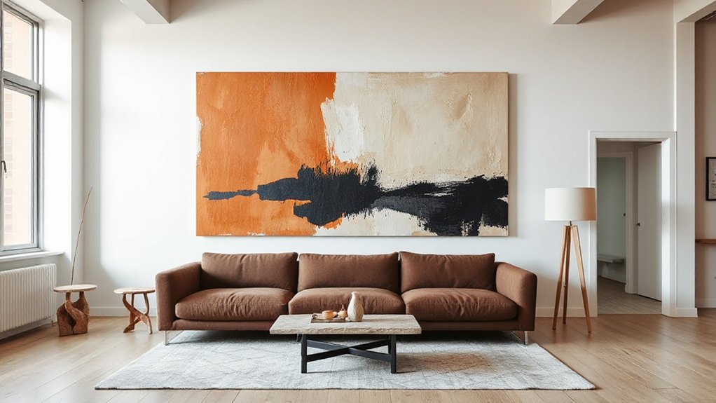
Spacing Above Furniture
When you hang large abstract art over a sofa, console, or bed, the gap matters as much as the height. Keep the bottom edge 6–10 inches above the furniture to create a modern, gallery-clean transition without feeling cramped. If you’ve got tall back cushions, a headboard, or styling objects, push closer to 10–12 inches so nothing visually collides.
Let Furniture placement set the rule: deeper sofas and bulky casegoods read heavier, so a slightly tighter gap keeps the vignette cohesive. For lighter, leggy pieces, give the art more breathing room. Tie the spacing to Wall color coordination, too—high-contrast walls make gaps look larger, so stay on the tighter end to avoid a “floating” effect.
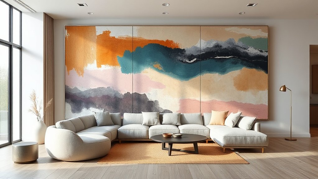
Centering And Balance
Although “centered” sounds obvious, large abstract art looks best in 2026 when it’s balanced to the visual weight of the furniture and the room—not simply aligned to the wall. Start by placing the artwork’s center 57–60 inches from the floor, then adjust so it visually anchors the sofa, credenza, or bed. If you hang a diptych or triptych, keep 2–4 inches between panels, and treat the entire set as one centered mass. Use Color psychology to steer mood: cool hues calm, warm tones energize. Think of it as art therapy—your placement should feel steady, not tense.
- Let the piece “hug” the furniture, not float.
- Nudge left/right to counter heavy lamps or windows.
- Keep equal margins to nearby corners and shelving.
- Step back 8–10 feet; trust your gut.
Frame It or Float-Mount It?
If you’re choosing between a traditional frame and a float-mount in 2026, you’re really deciding whether you want your wall art to feel finished and architectural or curated and gallery-forward. Frame choices telegraph intention: a slim metal profile sharpens edges for modern rooms, while a deeper wood shadow-box adds weight and makes oversized abstracts read like built-in millwork.
Float mounting keeps the perimeter breathing. You’ll see a crisp reveal that separates art from wall color, which feels especially current in minimal, high-contrast interiors. Specify the gap size (¼–½ inch) and hardware so it sits perfectly level and secure at scale. Use float mounting when you want the piece to look collected, not “matched,” and a frame when you need stronger visual containment.
Canvas vs Plaster vs Mixed Media Textures
Three surface families are defining wall art in 2026—canvas, plaster, and mixed media—and each one changes how light, shadow, and scale read in your room. Canvas gives you controlled depth: the weave softens edges, boosts color saturation, and stays stable with strong material durability when stretched well. Plaster reads architectural; its micro-ridges catch raking light, delivering high-drama texture contrast that feels sculptural and calm. Mixed media pushes the sensory dial—sand, fibers, gel, and metallic leaf create shifting highlights that make large abstracts feel alive, not flat. Choose based on how you want the room to react.
- You’ll feel grounded with matte plaster quieting visual noise.
- You’ll feel energized when mixed media glints as you move.
- You’ll feel comforted by canvas warmth and familiar tactility.
- You’ll feel bold when textures command the wall.
Budget-Friendly Ways to Go Big (Without Looking Cheap)
When you want that gallery-scale impact without the gallery-scale price tag, you’ve got to invest in the cues that read “intentional” at a distance—clean proportions, cohesive color, and confident negative space—while saving on what doesn’t. Start with an oversized print or digital download, then scale it through a local large-format shop for crisp pigment output. Choose a simple, wide mat or float mount to create breathing room; it signals premium finish instantly. Hack the frame: use standard poster frames, then upgrade with acrylic glazing and a linen liner for depth. Let Color psychology do the heavy lifting—one dominant hue plus one accent reads curated and modern. Keep your palette aligned to your textiles so Artistic expression feels integrated, not random.
Common Oversized Abstract Art Mistakes to Avoid
Although oversized abstract art can instantly modernize a room, a few predictable missteps will make it read more like an afterthought than a statement. Avoid these trend-killers so your piece feels intentional, elevated, and emotionally resonant.
- Hanging it too high: you’ll break eye-level connection, and the work loses impact and intimacy.
- Ignoring scale math: if it’s under two-thirds of the sofa width, it’ll feel timid, not bold.
- Forgetting Minimalist contrast: pairing muted art with low-contrast walls makes everything blur, draining energy.
- Choosing décor over meaning: without Artistic symbolism—color echoes, repeated shapes, or a narrative cue—your “big moment” reads like filler.
Commit to placement, proportion, and purpose, and the room will feel curated, not crowded.
How to Clean and Protect Large Wall Art
Because large-scale pieces sit at eye level and dominate a room’s visual field, you need a care routine that protects the surface without dulling color, warping substrates, or leaving cleaning halos. Dust weekly with a clean microfiber cloth, moving top to bottom, and never use feather dusters that snag texture. For sealed canvas or acrylic, lightly dampen the cloth with distilled water; skip sprays that can lift pigment and shift your color psychology balance. For framed prints behind glass, clean the glass first, then the frame, using ammonia-free cleaner on the cloth, not the artwork. Control humidity (40–55%), keep art out of direct sun, and add UV-filter glazing when possible. Handle edges only, wear nitrile gloves, and document condition for ongoing artistic inspiration.
Frequently Asked Questions
How Do I Insure Large Abstract Wall Art for Renters or Homeowners?
You insure large abstract wall art by scheduling it under your renter’s or homeowner’s policy or buying standalone art insurance. Document provenance, appraise value, add photos, and protect it with custom framing, too.
What Shipping Options Reduce Damage Risk for Oversized Art Deliveries?
Choose white-glove, blanket-wrap freight or crated LTL with liftgate and appointment delivery; you’ll cut drops and vibration. Specify museum-grade Packaging materials, corner guards, and Framing methods like float frames, rigid backing, and strapping.
Can I Commission Custom Colors Without Delaying Installation Timelines?
Yes—you can commission custom colors without delaying installation timelines if you approve swatches fast and choose in-stock pigments. You’ll streamline color customization by locking a palette upfront and confirming proofs within 48 hours.
Will Large Abstract Art Affect Room Acoustics or Echo?
Yes—large abstract art can improve acoustics: it breaks reflections, reduces echo, and adds sound absorption. Choose thick canvas, textured panels, or felt-backed frames for subtle acoustic enhancement, especially on hard-walled, high-ceiling spaces.
How Do I Authenticate an Artist and Avoid Mass-Produced Knockoffs?
Check Artist credentials via reputable galleries, verified sites, and exhibition history. Demand Authenticity verification: signed COA, provenance, edition numbers, and high-res process photos. Pay securely, compare pricing, and avoid vague listings or stock images.
Conclusion
You’ve seen why large-scale abstract wall art is 2026’s defining decor move: it anchors furniture, corrects empty proportions, and delivers instant, gallery-level impact. Treat size like architecture—measure wall width, keep clearances consistent, and scale to your sofa or bed. Choose texture with intent (canvas for warmth, plaster for depth, mixed media for edge), and avoid undersizing or bad lighting. Done right, your art becomes the room’s North Star.