You can change how your hall feels with a smart wall color combination that works with its light, length, and trim. Start with modern neutrals like warm off-white plus greige for flexibility, or go calmer with sage green and creamy beige. If you want sharper contrast, try charcoal with soft white. Two-tone walls with a chair rail add height and structure, but the finish and undertone decide whether it looks refined or flat—so your next choice matters.
Key Takeaways
- Use warm off-white with greige for a timeless, upscale hall that suits most trims, floors, and artwork.
- Try sage green with creamy beige for a calm, nature-inspired look that reduces visual noise in busy corridors.
- Create modern contrast with charcoal on one accent wall and soft white on the others to add depth without darkening.
- For long halls, choose mid-tones like muted blue, olive gray, or terracotta to visually shorten and warm the space.
- Use two-tone walls with a 36–42 inch chair rail; satin below, eggshell above, and match undertones to lighting.
Best Wall Color Combinations for Hall (Quick Picks)
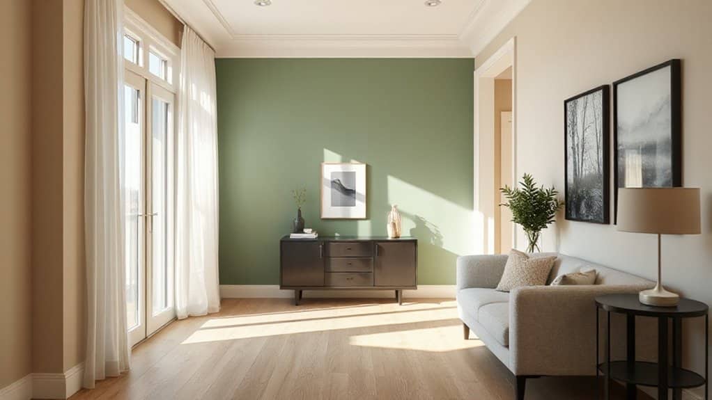
Whether your hall gets abundant daylight or relies on artificial lighting, the right wall color combination can instantly make it feel wider, brighter, and more intentional. Start with warm off-white + greige for a quiet, upscale baseline that flatters trim and art. Try sage green + creamy beige for calm, biophilic Color psychology that reduces visual noise. Prefer modern contrast? Pair charcoal + soft white, limiting dark to one anchor wall for depth without heaviness. For a luxe, trend-forward look, combine dusty rose + taupe or terracotta + sand; both add warmth while staying sophisticated. Keep ceilings crisp white to lift height. Choose paint finish options strategically: eggshell for main walls, satin for wipeable corridors, and semi-gloss on doors and trim.
Choose a Hall Color Combination by Light
Now that you’ve got a shortlist of winning hall color pairings, pick the one that suits your lighting—because light changes how undertones read and how spacious the space feels. Track Lighting effects first: north-facing or cool LEDs can make greige look flat, so lean into warm whites, sand, or clay with brass accents. If you’ve got abundant warm daylight, you can handle cooler pairings like soft sage + crisp white, or slate + pale stone without turning icy. Under mixed lighting, choose balanced neutrals (mushroom, almond) and add one saturated wall—teal, terracotta, or ink blue—to keep depth. For evenings, prioritize Mood enhancing colors: muted blush, cinnamon, or deep olive with a warm white ceiling keeps the hall welcoming. Always sample large swatches at morning and night.
Best Hall Wall Colors for Small vs Long Halls
Because proportions control how light travels, you’ll get better results by tailoring your hall wall color to the layout. In a small hall, keep it airy: warm off-whites, soft greige, or pale clay bounce light and reduce harsh Lighting effects from close walls. Choose low-sheen eggshell to prevent glare, and use subtle wall texture options like fine limewash or microcement for depth without visual clutter.
In a long hall, you can add saturation to stop it feeling like a tunnel. Mid-tone muted blues, olive gray, or terracotta ground the space and visually shorten the run. If lighting is sparse, lean warm to avoid a cold cast; if it’s bright, cooler neutrals stay crisp. Matte finishes hide imperfections and keep the look current and calm.
Two-Tone Hall Wall Ideas (Upper/Lower + Chair Rail)
If you want your hall to feel taller, cleaner, and more intentional, a two-tone wall with a chair rail delivers instant structure while still letting you play with color. Place the rail at 36–42 inches to protect traffic zones and keep proportions crisp; go higher only if your ceiling is tall. Use satin or semi-gloss below for wipeability, and an eggshell finish above to soften glare.
- Pair a deep, grounded lower band with a lighter upper shade to lift the eye without feeling busy.
- Match the chair rail to trim for seamless chair rail styling, or paint it the lower color for a modern wrap.
- Align the color break with door casings and switches so your two tone wall ideas look custom, not chopped.
Neutral Hall Color Combinations for a Modern Look
For a modern hall that won’t date fast, you can’t beat greige as your base—pair it with crisp white trim or muted taupe accents to keep the look clean and elevated. If you want stronger definition, you’ll get a polished, architectural feel by balancing warm beige walls with charcoal on doors, niches, or a single end wall. Keep undertones consistent (warm with warm, cool with cool) and you’ll lock in a neutral scheme that reads intentional in any lighting.
Timeless Greige Pairings
While stark whites can read cold in a corridor, greige (that balanced blend of gray and beige) keeps your hall looking modern without sacrificing warmth. You’ll notice wall color psychology at work: greige calms visual noise, softens shadows, and makes narrow passages feel more expansive. Pair it with clean, contemporary neutrals to keep the palette timeless and flexible across seasons. Choose paint finish options strategically—eggshell hides minor scuffs, while satin boosts light bounce on darker hallways.
- Greige walls + crisp white trim for sharp lines and airy contrast
- Greige walls + soft taupe doors to add depth without heaviness
- Greige walls + muted sage accents for a fresh, modern edge
Keep décor metals consistent, and let lighting temperature guide your undertones.
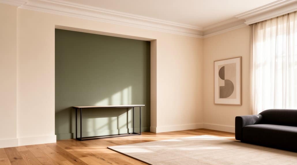
Beige And Charcoal Balance
Greige sets a soft baseline, and beige-and-charcoal takes that neutral strategy sharper and more architectural. Paint your main walls a warm beige to keep the hall inviting, then ground the sightline with charcoal on trims, a feature niche, or the door. You’ll get contrast without the harshness of black, and the palette reads clean in both daylight and warm LEDs.
Use Beige accents in a textured runner, linen bench cushion, or framed prints to echo the wall tone and avoid a flat look. Add Charcoal accessories—matte metal hooks, a slim console, or a ribbed planter—to reinforce structure and modernity. Keep finishes mixed: one matte charcoal, one satin beige, and you’ll nail a current, gallery-like hallway.
Warm Hall Wall Color Combinations for Coziness
Because your hall sets the mood the moment you walk in, warm wall color combinations can make it feel instantly cozier without shrinking the space. Lean into color psychology: soft terracotta with creamy off-white reads welcoming, while caramel paired with muted clay adds depth without heaviness. Keep ceilings and trim in warm whites to maintain lift, then add textured finishes—limewash, suede paint, or micro-cement—to catch light and prevent flatness in narrow corridors.
- Pair cinnamon accent walls with sand-beige surrounds for a modern, grounded look
- Try dusty rose with warm greige to soften angles and highlight art
- Use honey-ochre with taupe for an upscale, hotel-like glow
Finish with brass hardware and warm LEDs (2700–3000K) so the palette stays rich.
Cool Hall Color Combinations for an Airy Feel
Three cool-toned wall color combinations can make your hall feel brighter, longer, and more breathable—especially in tight entries with limited daylight. Try misty blue walls with crisp white trim to sharpen edges and bounce light; Color psychology links blue to calm, so the passage reads quieter and cleaner. Pair soft sage green with warm greige on doors or wainscoting for a balanced, modern organic look that still feels fresh. For a more architectural, contemporary vibe, use pale dove gray with icy off-white ceilings to visually lift height and reduce shadowing. You’ll want matte or eggshell finishes to prevent glare under downlights. Consider Cultural influences too: cooler palettes often echo coastal, Scandinavian, and minimalist interiors, reinforcing an uncluttered first impression.
Bold Accent-Wall Combinations for Hall Drama
To give your hall instant drama, you’ll get the most impact from statement wall pairings—think deep emerald, inky navy, or charcoal behind a console, balanced by warm off-white on the remaining walls. You can also push a high-contrast color duo, like black-and-ivory, terracotta-and-cream, or cobalt-and-sand, to sharpen architectural lines and highlight artwork. Keep undertones aligned and repeat the accent color in trims, textiles, or lighting so the bold combination looks intentional, not loud.
Statement Wall Pairings
While a full-hall repaint can feel overwhelming, a statement wall lets you dial up drama with control and intention. Start by choosing one dominant hue, then pair it with supportive neutrals and finishes that sharpen the look. The best statement wall pairings balance color, texture, and lighting so the focal wall reads intentional, not random. Use your hall’s longest sightline to place it, and repeat the accent once more through art, a runner, or cushions to unify the zone. For trend-forward, timeless results, test swatches morning and evening, and keep trim consistent.
- Deep teal wall + warm white surround + brushed brass accents
- Terracotta wall + sand-beige surround + black-framed mirrors
- Charcoal wall + greige surround + oak console styling
These statement wall ideas deliver impact without overpowering.
High-Contrast Color Duos
Statement walls already give you a controlled hit of drama; high-contrast color duos simply sharpen that impact by pairing an accent wall with a clearly different surround. Choose one saturated anchor (inky navy, forest green, oxblood) and set it against a clean countertone like warm white, greige, or pale sand. For true punch, lean on Complementary color schemes—navy with ochre, emerald with blush, charcoal with terracotta—then keep the rest of the palette quiet so the hall feels intentional, not chaotic. Use contrasting accent walls behind a console or artwork to frame sightlines from the entry. Match undertones (cool with cool, warm with warm), and repeat the accent once in textiles or frames for cohesion. Keep sheen consistent.
Elegant Monochrome Hall Wall Combinations
- Pair light walls with darker skirting for crisp framing
- Use textured paint, limewash, or microcement for movement
- Match hardware and frames to your darkest tone for continuity
Soft Pastel Wall Color Combinations for Hall
If you want a hall that feels light, current, and refined, you can’t go wrong with soft pastels anchored by clean neutrals. You’ll get a polished glow with blush and ivory, a calm-yet-warm balance with mint and warm beige, and an airy modern finish with powder blue paired with greige. Keep trims crisp and finishes consistent so these low-saturation pairings read intentional, not washed out.
Blush And Ivory Pairing
While bold hues can easily overpower a hallway, a blush-and-ivory pairing keeps the space airy and polished with a soft pastel edge. You’ll get warmth without heaviness: ivory lifts the corridor’s light, while blush adds a modern, welcoming tint. Use Blush accents strategically—inside niches, on a single end wall, or as a thin color-block band—to guide the eye down the hall. Balance them with Ivory textures like matte paint, limewash, or subtle plaster for depth that still reads clean. Keep undertones consistent (warm blush, creamy ivory) so the *segue* feels intentional, not patchy.
- Pair ivory walls with blush trim for crisp definition
- Add brushed brass hardware to elevate the palette
- Layer warm-white lighting (2700–3000K) to flatter both tones
Mint With Warm Beige
Mint with warm beige keeps the same airy calm you get from blush-and-ivory, but it reads fresher and slightly more contemporary—perfect for halls that need light without feeling sterile. Choose a warm, sand-leaning beige for most walls to ground the space and flatter warm bulbs. Then layer Mint accents strategically: a single recessed niche, a half-wall, or slim trim lines that guide movement without shrinking the corridor. You’ll get balance when you pair matte mint paint with beige textures like limewash, subtle stucco, or woven grasscloth, because the tactile warmth stops pastel from looking childish. Keep ceilings crisp white, and repeat mint in a runner or artwork for cohesion. Opt for brushed brass or light oak to finish the look cleanly.
Powder Blue And Greige
Why does powder blue feel instantly brighter in a hallway? It reflects light cleanly and, in Color psychology, signals calm and openness—perfect when your corridor feels tight. Pair it with greige to anchor the softness; greige’s balanced undertone keeps the look modern, not nursery-sweet. Use smart wall painting techniques: choose a matte or eggshell powder blue on the longer walls, then apply greige on trim, doors, or a lower “wainscot” band to add structure and hide scuffs. Keep progressions crisp with painter’s tape and a mini-roller for edges so the palette reads tailored.
- Powder blue ceiling to lift height visually
- Greige accent niche to frame artwork
- Two-tone split at 42 inches for proportion
Match Hall Wall Colors With Floors, Trim, and Test Swatches
Even if you’ve nailed your hall wall color, it won’t look “right” until it’s calibrated to your floors, trim, and real-world lighting. Start with undertones: warm oak floors favor creamy whites, clay, and soft greige; cool tile or slate likes crisp whites, blue-grays, and sage. Match trim to your wall’s temperature, not its depth—bright white trim can sharpen muted walls, while warm off-white softens contrast. Prioritize Wall paint durability in high-traffic halls, and choose low-VOC, eco friendly pigments to keep the space healthier. Don’t trust tiny chips. Paint 12×12 swatches on foam boards, move them morning-to-night, and view them beside flooring and door casings. Then pick the winner.
Frequently Asked Questions
How Often Should Hall Walls Be Repainted in High-Traffic Homes?
Repaint hall walls every 3–5 years in high-traffic homes, or sooner if scuffs show. You’ll extend cycles with durable eggshell paint, cleanable wall texture, and refreshed color accents that hide wear.
Which Wall Paints Are Easiest to Clean Without Leaving Streaks?
You’ll clean satin or semi-gloss acrylics easiest, leaving minimal streaks; like a well-armored knight, they repel grime. Choose eco friendly finishes with washable scrubbable labels; avoid flat. Textured wall paints hide marks, reduce wiping.
Are Low-Voc Paints Necessary for Hallways in Homes With Kids?
Yes, you should choose low-VOC paints for kids’ hallways; you’ll protect Indoor air quality and cut odor off-gassing. You’ll still get durable finishes with Eco friendly options like zero-VOC acrylics, and you’ll reduce allergy triggers.
How Do I Fix Wall Color Mistakes Without Repainting the Entire Hall?
Botched a patch and it screams at you? You can fix mistakes by feather-sanding edges, priming stains, and spot-painting with a mini-roller; use Color correction tips like glazing. Add Accent wall ideas to disguise mismatches, fast.
What Paint Finish Hides Scuffs Best in a Busy Hallway?
Choose eggshell or satin; they’ll hide scuffs better than gloss while staying cleanable. For matte finish durability, use washable matte or add a protective topcoat. Consider textured paint options to camouflage dings and traffic wear.
Conclusion
You don’t need a loud color to make your hall feel unforgettable; you need the right pairing. Set warm off-white against greige for timeless ease, or contrast charcoal with soft white for crisp, modern depth. If your space is tight, keep it light; if it’s long, ground it with a darker lower half and a chair rail. Go matte or eggshell, then match floors and trim—and always test swatches in your light.