You probably don’t know that the same paint colour can shift by two shades in a UK bedroom depending on window direction and the softness of our daylight. If you want a space that feels calm yet considered, you need to choose a clear anchor—walls, bedding, or a rug—then layer warm neutrals, moody depth, or jewel tones with the right wood and metal notes. Get that order wrong, and the whole scheme falls flat…
Key Takeaways
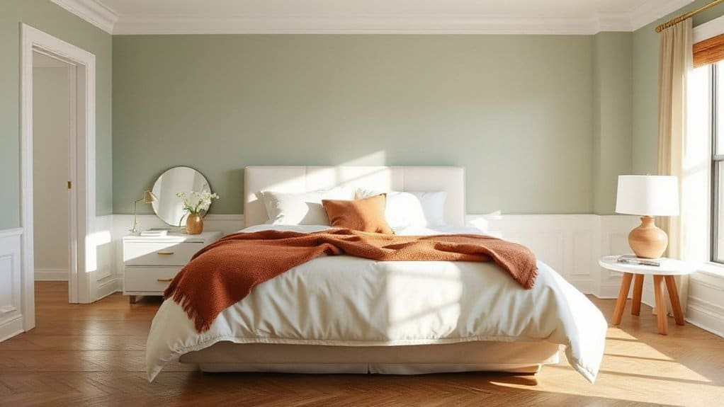
- Warm white walls with sage accents and oak furniture create calm, especially in north-facing UK bedrooms.
- Inky navy walls with off-white trim and brushed brass deliver a boutique-hotel look and sharpen period architecture.
- Clay pink paired with putty grey and small black accents feels modern, flattering, and cosy without overwhelming the room.
- Misty blue with chalk white and pale ash offers coastal freshness and sleep-friendly serenity, especially with warm white lighting.
- Build a simple palette: one dominant wall colour, one secondary textile colour, and one accent, tested in your room’s light.
Best Bedroom Color Schemes (Quick Picks)
Whether you’re invigorating a rented flat or redesigning a forever home, these quick-pick bedroom colour schemes give you reliable, UK-friendly combinations that look considered in most light conditions. Try warm white walls with soft sage and oak for calm that suits north-facing rooms. Pair inky navy with crisp off-white and brushed brass for a tailored, hotel feel in Victorian terraces. Choose clay pink with putty grey and black accents to flatter modern flats and keep it grounded. For coastal freshness, mix misty blue, chalk white, and pale ash; it reads clean even under LED bulbs. Use Color psychology to balance rest and focus, and apply Feng shui principles by keeping the bed wall the deepest tone, letting the other walls breathe.
How to Choose a Bedroom Color Scheme Vibe
Quick-pick palettes give you a strong starting point, but the scheme only feels “right” when it matches the vibe you want your bedroom to project. Decide whether you’re aiming for calm, cocooning, energising, or boutique-hotel polish, then let Color psychology guide the base tone: soft greens and blues quieten the mind, warm neutrals feel safe, and inky shades add intimacy.
Next, set a clear hierarchy: pick one dominant wall colour, one secondary for textiles, and one accent for detail. Keep saturation controlled so the room reads restful, not busy. Use Feng shui principles by choosing colours that support your intention—grounding earth tones for stability, water hues for ease—then place the boldest colour where you want focus, not distraction.
Bedroom Color Schemes: What Your Light Changes
Because light shifts colour more than any paint chart admits, you need to judge your bedroom scheme by its exposure and bulb choice, not just the name on the tin. North-facing rooms in the UK flatten warmth, so creams read grey and blues turn steely; counter with warmer undertones and higher CRI lamps. South-facing sun amplifies yellow, making sage look acid and beige feel brassy, so choose cooler neutrals or muted greens. Your Lighting effects change saturation at dawn and after dusk, so test swatches on multiple walls and view them morning, afternoon, and lamplit. Bulb temperature matters: 2700K softens whites, 3000K keeps them cleaner. Use Color psychology deliberately—cool hues calm, warm hues cocoon—only if the light supports them.
Pick an Anchor: Walls, Bedding, or Rug
Start by choosing one anchor element—walls, bedding, or a rug—and let everything else fall into line around it, so the scheme feels intentional rather than “collected”. If your room’s proportions are awkward, lead with paint: accent walls can correct a long boxy space and set the undertone for timber, metal, and textiles. Prefer flexibility? Anchor with bedding in a confident hue, then echo it in wall art and accessories. If you’ve got draughty Victorian boards, a rug makes the strongest base and dictates how bold you can go elsewhere.
- Match the anchor to what’s hardest to replace
- Repeat its key tone twice, not ten times
- Use accent walls to control visual weight
- Keep wall art on the same temperature (warm/cool)
Soft Neutral Bedroom Color Schemes (White + Cream)
If you want a calm, premium bedroom, you’ll get it by layering whites and creams rather than relying on a single “plain” white. You’ll balance warm neutrals—think ivory, oatmeal, and stone—across walls, bedding, and joinery to keep the scheme cohesive. You’ll then add texture with linen, boucle, wool and matte finishes, so the room feels warm and considered, not flat.
Layered Whites And Creams
While pure white can read stark in a bedroom, layering whites with creamy undertones creates a softer, more liveable scheme that still feels crisp and elevated. You’ll get a tailored look by mixing finishes and temperatures within the same light family, so the room feels intentional rather than flat. Keep your base consistent, then add Cream accents in controlled doses to warm the palette without turning it beige.
- Choose a chalky white for walls, then echo it in cotton bedding for continuity.
- Introduce a cream headboard or lampshade to soften edges and reduce glare.
- Balance warm and cool whites by matching undertones to your flooring and joinery.
- Use brushed brass or pale oak sparingly to underline the quiet, modern UK aesthetic.
With layered whites, your bedroom stays bright, calm, and quietly luxurious.
Warm Neutrals With Texture
Layered whites and creams set a clean, calming base; warm neutrals with texture take it further by adding depth without losing that light, modern feel. Choose oatmeal, stone, and soft taupe in matte finishes, then build contrast through tactile layers rather than colour shifts.
Start with Textured wall finishes: limewash, clay paint, or a subtle plaster effect behind the headboard reads bespoke and hides everyday scuffs. Add a natural oak bedside, brushed brass hardware, and a wool or jute rug to ground the scheme. Keep bedding crisp white, then introduce Cozy throw pillows in bouclé, linen, and chunky knit for a hotel-level finish. If your room’s north-facing, lean warmer with biscuit tones; in sunnier spaces, stick to greige to stay balanced.
Warm Beige Bedroom Color Schemes With Contrast
Because warm beige can read flat in low UK light, you’ll get the best results by pairing it with deliberate contrast that sharpens the scheme without cooling it down. Use Colour psychology: beige calms, while deeper accents add focus and a sense of tailored luxury. Keep undertones consistent (golden, not pink), and plan your Paint application so contrast lands where your eye rests—headboard wall, alcoves, or joinery.
- Ground the room with chocolate or tobacco linen and a darker wool rug.
- Add inky navy bedside lampshades or framed prints for crisp depth.
- Choose aged brass, oak, or rattan to keep warmth while boosting definition.
- Use soft black on handles or picture rails for fine, architectural lines.
Finish with warm white ceilings to lift everything without washing it out.
Greige Bedroom Color Schemes for Modern Warmth
Choose greige when you want a modern bedroom that still reads warm in typical UK light. Pair it with natural textures—oak, linen, wool—to keep the scheme grounded and tactile. Finish with warm metals like brushed brass or aged bronze, and repeat greige across walls, upholstery, and soft furnishings for a clean, cohesive look.
Greige With Natural Textures
If you want a bedroom that feels modern yet genuinely inviting, pair greige walls with natural textures to soften the look and add depth. You’ll keep the palette calm while building subtle contrast through tactile layers, so the room reads considered rather than flat. Aim for colour harmony by repeating warm, earthy notes across textiles and timber, and let daylight do the heavy lifting in typical UK spaces.
- Linen bedding in oat or stone to echo greige undertones
- Oak or ash bedside tables with visible grain for warmth
- A wool or jute rug to ground the scheme and reduce echo
- Rattan shades or woven baskets to add structure without clutter
Keep trims crisp in soft white, and choose matte finishes to stop glare and maintain a relaxed, boutique feel.”””
Warm Metals And Greige
While greige sets a calm, modern base, warm metals bring the glow that stops it feeling cool or flat in typical UK light. Choose greige palettes with a taupe lean for north-facing rooms, or a stone-beige greige for sunnier aspects. Then layer brass, antique gold, or warm bronze to add depth without fuss.Keep it disciplined: specify metal accents in repeat—lamp bases, wardrobe handles, picture frames, and a slim bedframe—so the finish reads intentional, not mixed. Balance the sheen with matte greige walls and a softly textured headboard. If you’re renting, swap in a brushed brass mirror and warm-toned bulb (2700K) for instant lift. Finish with off-white bedding and a single deep colour, like oxblood or forest green, for contrast.
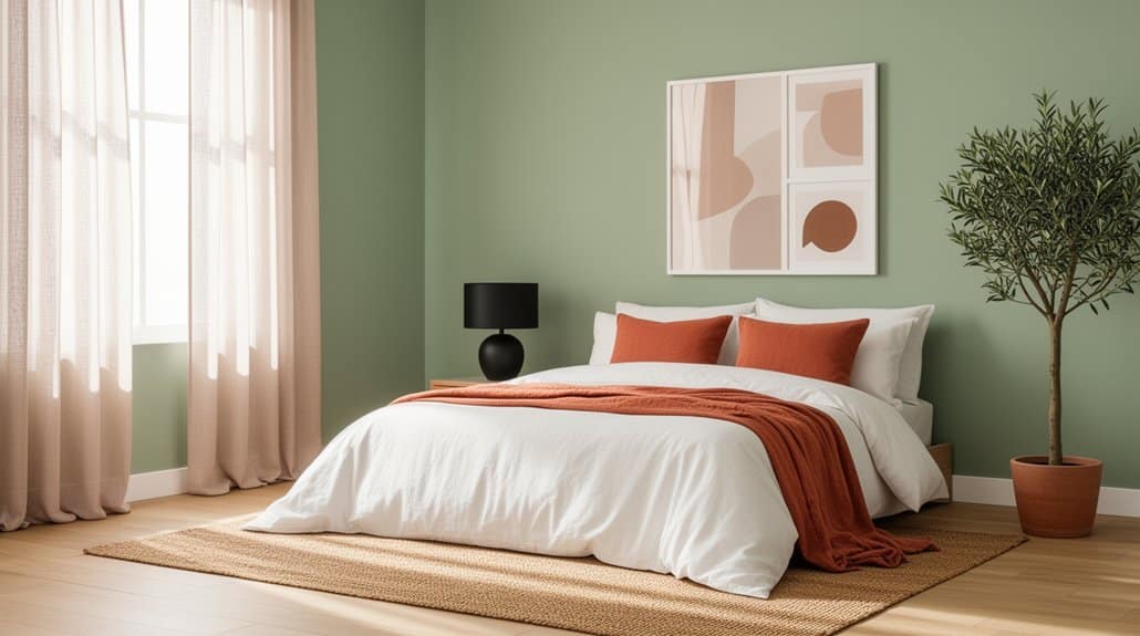
Earth-Tone Bedroom Color Schemes (Tan + Clay + Rust)
Because earth tones sit naturally in the middle of the spectrum, a tan + clay + rust palette gives your bedroom warmth without tipping into gloom. You’ll get grounded calm with enough depth to feel tailored, not bland. Use tan on walls for a softly lit base, then layer clay through upholstery and linen, and reserve rust for punchy, confidence-boosting accents.
- Choose a warm tan with a subtle yellow undertone for grey UK daylight.
- Add clay via matte paint or boucle to soften edges and reduce glare.
- Introduce rust in cushions, artwork, or a headboard to control intensity.
- Balance with off-white ceilings and pale oak to keep proportions crisp.
Colour psychology matters: these hues lower visual noise, and their emotional impact reads secure, restorative, and grown-up.
Sage Green Bedroom Color Schemes With Warm Accents
Although sage green reads cool at first glance, it turns properly inviting in a UK bedroom once you pair it with warm accents that counter grey daylight. Use sage on walls or built-ins, then add ochre, terracotta, or muted brass through lampshades, picture frames, and bedside hardware to lift the temperature without losing calm.
Let color psychology guide you: sage supports restoration, while warm notes signal comfort and sociability, ideal for winding down in a north-facing room. Apply Feng shui principles by grounding the scheme with natural oak, woven textures, and a wool rug, keeping clutter low and pathways clear. Finish with warm white bedding and a cinnamon throw, and choose 2700K bulbs so the green stays soft, never clinical at night.
Blue Bedroom Color Schemes That Feel Sleep-Friendly
Choose soft blue neutrals for your walls and core textiles to keep the room calm, airy, and sleep-friendly. Ground the scheme with warm whites, pale greys, and natural timber, so it still feels cohesive in typical UK light. Then add deep blue accents—an upholstered headboard, bedside lampshades, or a single statement wall—to sharpen the look without disrupting the restful mood.
Soft Blue Neutrals
When you want a bedroom that feels instantly calmer, soft blue neutrals deliver the cooling effect of blue without tipping into icy. Guided by colour psychology, you’ll find these shades reduce visual noise and support wind-down, especially in UK homes with changeable daylight. Choose a nuanced blue-grey or blue-beige and let it read as a quiet backdrop, not a feature.
- Pair with warm white trim to stop the space feeling flat
- Choose a matt paint finish on walls to soften bounce and hide flaws
- Add oatmeal linen, pale oak, and brushed brass for gentle warmth
- Keep patterns small-scale and tonal for a restful, cohesive look
Test swatches north- and south-facing, and check evening lamp light before committing.
Deep Blue Accents
Soft blue neutrals set a quiet baseline; deep blue accents build on that calm and add definition without overstimulating the room. Use navy on a headboard wall, wardrobes, or alcoves to anchor the space, then keep surrounding paint airy so it doesn’t feel heavy in a typical UK bedroom.
From a Colour psychology standpoint, darker blues signal security and slow the mind, which supports better wind-down routines. Balance matters: pair deep blue with warm white trim, pale oak, and brushed brass so the scheme stays inviting. Consider interior lighting early—cool LEDs can make navy look flat and severe, so choose 2700K lamps, add dimmers, and bounce light off lighter ceilings. Finish with midnight-blue bedding or a velvet cushion to layer depth.
Navy Bedroom Color Schemes With Crisp Trim
Although navy can read heavy in a bedroom, pairing it with crisp white trim sharpens the architecture and keeps the space feeling tailored rather than gloomy. Choose a blue-black navy on walls, then paint skirting boards, architraves, and cornicing in a clean, UK-standard brilliant white for definition. You’ll get Coastal serenity when you layer linen bedding, pale oak, and rattan, while Vintage elegance comes through with brass picture lights and an upholstered headboard in ticking stripe. Keep sheen disciplined: matt on walls, satin on woodwork, so edges look razor sharp under bedside lamps.
- Paint ceiling white to lift the room
- Use framed prints with white mounts
- Add a striped rug to echo trim lines
- Balance with warm timber and brass
Blush and Terracotta Bedroom Color Schemes That Glow
Because blush and terracotta sit on the warm end of the spectrum, they cast a flattering glow in UK bedrooms that often rely on cooler daylight. Use blush on larger planes—walls or a headboard—to soften the room, then ground it with terracotta in cushions, a clay lamp base, or an ochre-leaning rug. From a color psychology standpoint, blush reads nurturing while terracotta feels stabilising, so you’ll unwind without the space turning sugary. Keep undertones consistent: pair pinks with muted, earthy oranges rather than coral brights. Balance with chalky whites and pale oak typical of British homes, and add brushed brass for warmth. For bedroom feng shui, place terracotta near the bed to anchor energy, and keep clutter minimal to let the palette glow.
Moody Bedroom Color Schemes (Charcoal + Deep Green)
Pair charcoal with deep green to create a cocooning bedroom that still reads considered, not heavy—you’ll keep it balanced by splitting tones across walls, joinery, and textiles. Build richness with layered textures (velvet, wool, washed linen) and introduce brushed brass or blackened steel so the scheme feels intentional and tailored. Control the mood with lighting: use warm, dimmable lamps, shaded pendants, and targeted bedside task lights to bring out depth without flattening the colour.
Balancing Charcoal And Green
When you want a bedroom that feels calm but confidently grown-up, charcoal and deep green deliver instant depth without reading flat. Keep the balance by choosing one dominant shade and letting the other sharpen the edges; in most UK bedrooms, deep green works best as the main wall colour, while Charcoal accents define joinery and outlines.
- Paint skirting boards and the door in charcoal to anchor the room.
- Use deep green on the bed wall to focus the sightline.
- Repeat green in small Green accessories, like cushions or a throw, to unify.
- Add off-white ceilings and pale timber to stop the palette turning heavy.
Test swatches in north-facing light, as green shifts cooler, and charcoal can look inky.
Layered Textures And Metals
Once you’ve set the charcoal-and-deep-green balance, textures and metals keep the scheme from feeling flat or overly dark. Start with Textured wall treatments: limewash, microcement, or a fine grasscloth behind the headboard adds depth without adding colour. Pair them with joinery or skirting in a soft-matt charcoal so the finish reads intentional, not heavy.
Layer textiles deliberately. Choose a deep green velvet cushion, a charcoal wool throw, and crisp cotton bedding to sharpen contrast. Introduce Metallic accent accessories in controlled hits: aged brass pulls, burnished bronze frames, or blackened steel bedside tables. Keep the metal finish consistent across the room, and repeat it at least three times so it looks curated. Balance shine with matte ceramics and smoked glass for a refined, UK townhouse mood.
Lighting For Moody Depth
Where do charcoal walls and deep green accents really come alive? In the lighting. You’ll get moody depth by building layers that control ambient shadows and highlight texture, not by relying on a single ceiling pendant. Start with warm, dimmable sources (2700K) and keep glare off your eyeline, especially beside the bed. Then add contrast lighting to carve out corners and make greens read richer against the charcoal.
- Fit bedside wall lights with shades to pool light onto linen, not paint
- Add a low-level LED strip behind the headboard for a soft halo
- Use a brass floor lamp to lift a reading nook without flooding the room
- Choose matt black switches and warm bulbs to keep the palette cohesive
Jewel-Tone Bedroom Color Schemes (Emerald + Plum)
Although jewel tones can feel bold, emerald and plum deliver a bedroom scheme that reads cocooning rather than shouty—especially under the UK’s softer natural light. Use emerald on walls in a velvety matt, then layer plum through upholstery, a headboard, or heavy curtains to keep the depth where you’ll feel it most.
For Jewel tone palettes, anchor the look with warm brass, smoked oak, and inky black accents; they stop the colours skewing sweet. Apply Color coordination techniques by choosing one dominant hue (emerald) and one supporting hue (plum), then repeat each twice: cushion, throw, art. Balance saturation with off-white bedding and a stone-toned rug so the room stays restful. Finish with green foliage and berry-toned ceramics for continuity.
Small Bedroom Color Schemes That Make It Feel Bigger
If you’re working with a box room or a tight double, the right palette can stretch the space visually by pushing boundaries back and lifting the ceiling line. Stick to light-reflective hues and keep contrast low so edges dissolve rather than shout. In UK light, nuanced off-whites and greyed pastels read calmer than stark brilliant white, supporting smart Colour psychology and everyday mood enhancement.
- Use warm off-white with a whisper of clay to soften corners.
- Try pale blue-grey to cool walls and visually recede them.
- Choose misty sage for quiet depth without shrinking the footprint.
- Add one deeper shade on the far wall to pull perspective forward.
Test in north- and south-facing light before you commit, and keep sheen consistent to avoid patchy glare.
Finish the Look: Bedding, Wood Tones, and Metals
Once you’ve nailed the wall colour, lock the scheme in with bedding that repeats your key tone in softer tints, timber that sets the room’s warmth level, and metals that control the overall polish. Use layered Fabrics and textures: crisp cotton percale for freshness, washed linen for ease, and a wool throw to add depth without adding colour noise.
Choose wood tones like you’d choose tea strength: pale oak and ash keep cool schemes airy; walnut and smoked oak enrich earthy palettes. Tie this to your furniture styles—Scandi frames suit light timbers, while shaker or mid-century pieces welcome darker stains. Finish with metals as punctuation: brushed brass warms, satin nickel stays neutral, matte black sharpens contrast. Repeat one metal across handles, lamps, and picture frames for a disciplined, UK-ready edit.
Frequently Asked Questions
What Are the Best Bedroom Paint Colors for Renters Who Can’T Repaint?
You can’t repaint, so choose soft neutrals: warm greige, muted sage, dusty blue, or creamy off-white through bedding and art. Work with wall texture, and balance lighting effects using warm bulbs and layered lamps.
How Can I Test Bedroom Colors Without Buying Lots of Paint Samples?
Sure, buy a suitcase of paint—ironic, right? You can do colour palette testing with tester pots, peel-and-stick swatches, and A4 paint cards. Use paint sample alternatives: digitally visualise, sample in daylight, and lamp light.
Which Bedroom Color Schemes Work Best for Pet Hair and Stains?
You’ll get the best results with mid-tone greige, warm taupe, or soft charcoal schemes; they deliver pet hair camouflage. Pair with matte-washable, stain resistant paints and avoid stark white or deep black. In UK homes.
How Do I Coordinate Bedroom Colors With an Existing Colorful Headboard?
Start with your headboard’s dominant hue, then use Color wheel matching to pick two supporting tones. Choose Complementary color schemes for contrast, or muted analogues for calm. Keep walls neutral, repeat accents in textiles, cushions.
What Bedroom Color Schemes Are Safest for People With Color Blindness?
You’ll get safest results with high Color contrast neutrals: off‑white, charcoal, navy, and warm grey, plus one accent. You’ll boost Visual accessibility by avoiding red/green pairings and relying on texture.
Conclusion
You’ve seen the quick picks, tested the vibe, and watched your light transform every shade from dawn to dusk. Now go big: choose one anchor—walls, bedding, or rug—and let it lead like a headboard-sized headline. Push neutrals until they feel impossibly plush, deepen charcoal and green until the room purrs, or jewel tones until it practically glows. Finish with layered linens, honest timber, and warm brass—then your bedroom feels five-star, nightly.