You’ll get a high-end look on a budget by colour drenching: paint walls, trim, doors, and even the ceiling in one rich, undertone-correct shade to remove contrast lines and visual noise. Choose a complex neutral or deep tone that suits your light, then prep properly—fill, sand, prime—so the finish looks bespoke. Use matte on walls and satin on trim for depth without extra cost. Next, you’ll see which rooms and shades work best.
Key Takeaways
- Paint walls, trim, doors, and ceiling the same saturated hue to eliminate contrast lines and instantly look bespoke.
- Create depth cheaply by varying sheen: matte on walls, satin or eggshell on trim, semi-gloss on doors.
- Choose complex, timeless neutrals or moody tones that suit room light; test samples against fixed finishes to avoid undertone clashes.
- Spend on prep, not extras: fill, sand, degrease, and prime repairs to prevent patchiness and achieve a smooth, luxury finish.
- Buy efficiently: measure accurately, purchase larger tins, and pick mid-tone colours that hide scuffs to reduce repaints and touch-ups.
What Is Colour Drenching: and Why It Looks Luxe?
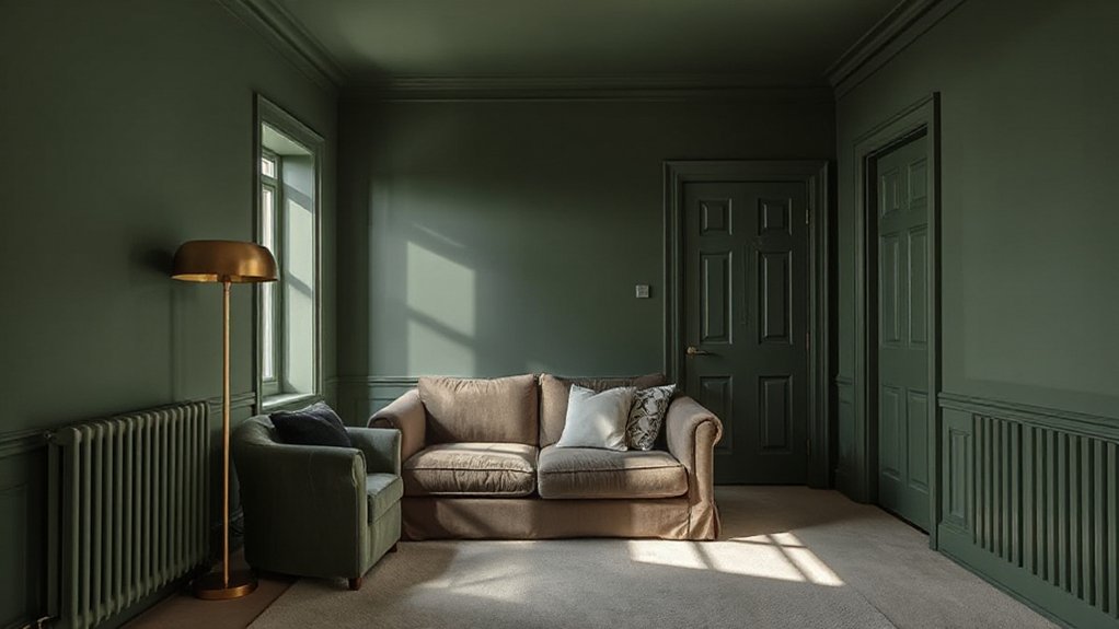
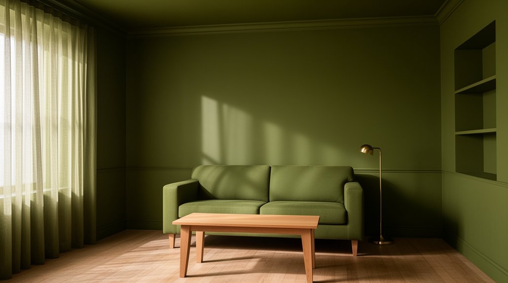
Ever wonder why some rooms feel instantly cohesive, elevated, and intentionally designed? That effect often comes from colour drenching: you paint walls, trim, doors, and sometimes the ceiling in one saturated hue (or tightly related tones) so the room reads as a single, intentional composition. You reduce contrast lines, simplify visual “noise,” and make architectural details feel bespoke instead of busy.
It looks luxe because it mimics high-end, custom finishes and creates depth through sheen shifts—matte on walls, satin on trim—rather than multiple colors. Color psychology matters: deep greens signal calm confidence, inky blues feel tailored, and warm clays read inviting yet refined. Done well, you get Interior harmony, stronger mood control, and a designer-grade statement without pricey materials.
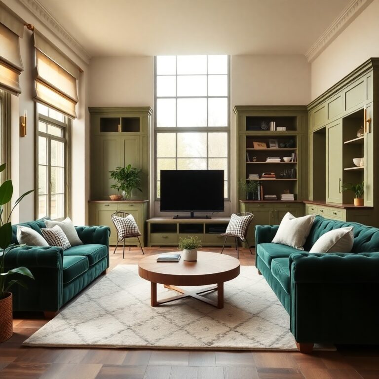
Best Rooms for Colour Drenching (Small to Large)
Most rooms can handle colour drenching, but the best candidates share one thing: they benefit from fewer visual breaks and more atmosphere. In small spaces, you’ll amplify depth and calm by wrapping walls, trim, and ceiling in one tone—classic Color psychology at work. Medium rooms let you control light bounce and make mismatched elements disappear. Large rooms reward drenching when you need cohesion across open sightlines.
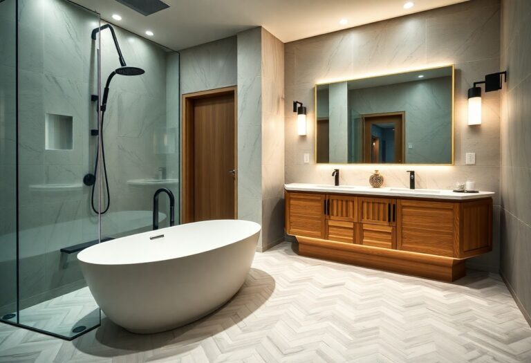
- Powder rooms and hallways: instant boutique-hotel impact, minimal surfaces to cut in
- Bedrooms and snug living rooms: cocooning feel, glare reduction, stronger mood setting
- Kitchens, stairwells, and playrooms: choose higher-sheen finishes for paint durability and easy wipe-downs
Prioritise rooms with consistent daylight and fewer competing finishes so the colour reads intentional, not busy.
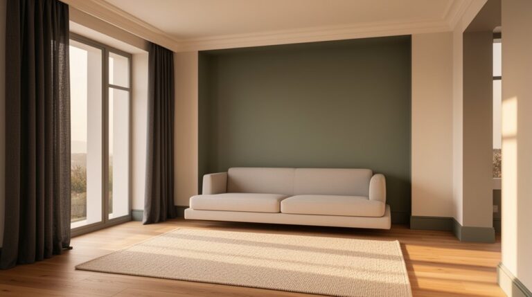
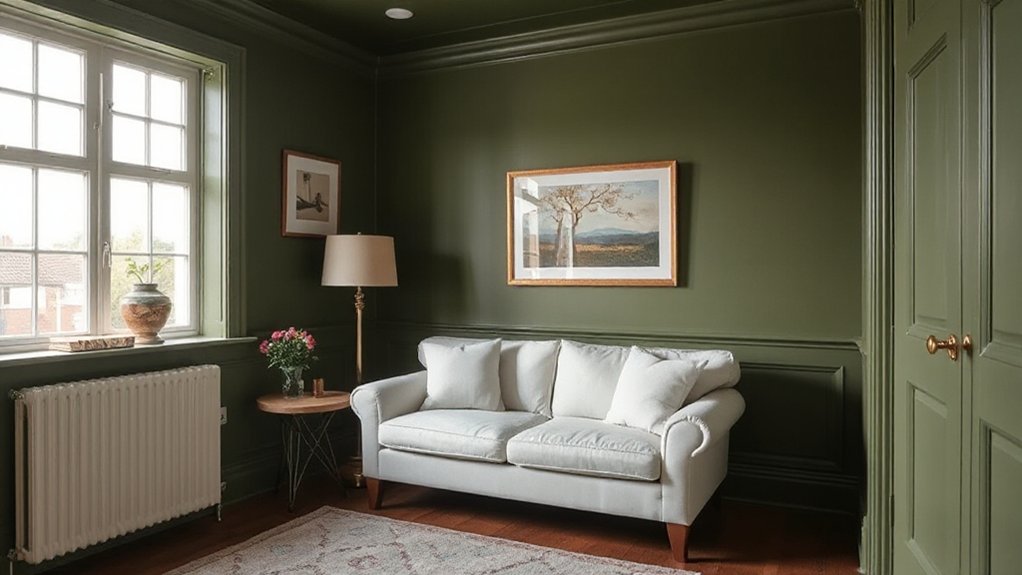
Choose a Colour Drenching Shade That Won’t Date
Start with timeless neutrals—warm white, greige, taupe, or soft stone—so your colour-drenched room reads current without feeling tied to a passing trend. You’ll get the most reliable result when you choose undertones with intention, testing samples against your flooring, textiles, and the room’s fixed finishes. Match the shade to your architecture and light levels, because north-facing rooms flatten cool tones while bright southern sun can over-amplify warmth.
Timeless Neutrals First
- Drench walls, trim, doors, and ceiling for one seamless envelope
- Choose a single neutral across finishes to mimic bespoke joinery
- Let texture (linen, bouclé, oak) add depth instead of trend colours
Consider Undertones Carefully
Once you’ve committed to a timeless neutral envelope, the shade’s undertone becomes the make-or-break detail that keeps colour drenching from feeling “of the moment” in a few years. You’ll want to identify whether you’re leaning warm (yellow, red, peach) or cool (blue, green, violet) and keep every surface aligned to that temperature, so the room reads intentional, not muddied. Use Color psychology to your advantage: warmer undertones feel convivial and cosy, while cooler ones signal calm and tailored restraint. Avoid trendy “in-between” greiges that swing pink or green; they date fastest when tastes shift. Finally, choose a formulation with proven paint durability, because chips and sheen changes expose undertone inconsistencies instantly.
Match Architecture And Light
Where does your room get its light, and what’s the architecture already telling you? Start with lighting harmony: north-facing rooms flatten cool shades, so choose warmer, muted tones; south-facing light amplifies colour, so go softer and earthier to avoid glare. Then read the bones—cornices, ceiling height, panelling, and arches—and pick a drench that supports, not fights, those architectural accents.
- In period homes, try complex neutrals (stone, putty, smoked olive) that feel classic, not trendy.
- In modern boxes, use mineral whites, warm greys, or inky charcoals to sharpen lines.
- In low-light rooms, avoid icy blues; lean into clay, taupe, or deep moss for depth.
Test swatches morning-to-night, under your actual bulbs, before committing.
How to Colour Drench Step by Step (Cheaply)
Although colour drenching looks like a high-end designer move, you can pull it off on a tight budget by working in a smart, repeatable order. Start with color psychology: decide the mood you want (cocooning, energetic, calm), then pick one paint colour that supports it and suits your light. Next, measure your walls, ceiling, and key surfaces so you buy once and avoid costly top-ups. Use Budget friendly techniques: buy larger tins, watch for contractor-grade promos, and choose a versatile mid-tone that hides scuffs. Prep fast but properly—degrease, fill, sand, and spot-prime repairs. Cut in first, then roll large areas in a consistent “W” pattern. Paint the ceiling, then walls, then built-ins to keep edges clean and costs predictable.
Finish Colour Drenching With Sheen, Trim, and Texture
To make colour drenching look intentional, you’ve got to choose the right sheen for depth: matte softens flaws, eggshell balances warmth, and satin adds a crisp, contemporary lift. Then keep the effect seamless by matching your trim to the wall colour and fine-tuning the finish (often one sheen higher on trim) so edges read clean, not choppy. Finally, echo the mood with texture—plush textiles for cocooning rooms, sleek metals and lacquer for modern spaces—so the single-colour scheme still feels layered.
Choose Sheen For Depth
How do you keep colour drenching from reading flat? You choose sheen like a designer: treat finish as your built-in lighting. Even with one colour, strategic Sheen options create depth by shifting how surfaces catch daylight and lamp glow, giving you that boutique-hotel richness on a budget.
- Use matte on broad walls to hide flaws and make the colour feel saturated
- Add eggshell or satin on adjacent planes for subtle lift and wipeability
- Reserve semi-gloss for focal surfaces where you want controlled sparkle, not glare
Balance is the trend right now: low-sheen, velvety rooms with just enough reflectivity to feel tailored. Test swatches at morning, afternoon, and night; sheen reads differently under LEDs. You’ll get intentional texture contrast without changing colour.
Match Trim And Texture
Sheen gives you the light play; trim and texture make colour drenching look finished instead of “painted over.” Paint baseboards, casings, crown, and even radiators the same colour as the walls, then let subtle material changes do the work—wood grain, plaster, panel moulding, and linen shades all read as tonal layers when the colour stays consistent.
For a high-end result, keep Color coordination tight: use one paint formula across walls and trim, adjusting only sheen (eggshell on walls, satin on trim) for crisp definition. Use Texture pairing to add depth without adding colours—bouclé upholstery, matte ceramics, fluted glass, and woven baskets. If you’ve got glossy tile or lacquer, balance it with matte textiles so the room doesn’t glare. Swap bright white outlets for paintable covers to keep the drench seamless.
Colour Drenching Mistakes That Make It Look Cheap
Where colour drenching goes wrong, it usually comes down to finish, prep, and consistency—not the colour itself. If your walls are matte but your trim is semi-gloss in the same shade, mismatched sheen reads accidental, not intentional. You’ll also cheapen the effect by skipping patching, sanding, and caulking; one ridge or flashing spot ruins that seamless, boutique feel. Finally, don’t undermine the drench with random Color pairing or chaotic Pattern mixing—either commit to tonal harmony or choose one controlled contrast.
- Pick one sheen strategy (all matte, or matte walls with satin trim).
- Prep like a pro: fill dents, sand edges, prime stains, then paint.
- Edit styling: limit patterns, repeat one accent colour, and match metals.
Frequently Asked Questions
What Paint Finish Hides Wall Flaws Best When Colour Drenching?
Choose a matte sheen finish; it hides dents and uneven drywall best when you’re colour drenching. You’ll minimize glare and soften shadows. If flaws persist, you can add subtle textured finishes or prep with skim-coat.
Can I Colour Drench Over Wallpaper, Tiles, or Existing Glossy Paint?
Yes—you can, but you’ll prep properly. For wallpaper, prioritize Wallpaper removal or seal tight seams. For tiles, nail Tile preparation: degrease, scuff-sand, prime bonding. Glossy paint needs deglossing, then primer.
How Do I Calculate Paint Quantity for Ceiling, Trim, and Walls?
Picture your room wrapped in a seamless veil of color. You’ll measure wall, ceiling, and trim square footage, subtract openings, then use a paint calculator for coverage estimation—typically 350–400 sq ft/gal—adding 10% waste.
Will Colour Drenching Affect Resale Value or Buyer Appeal?
Colour drenching can boost buyer appeal if you pick broadly liked hues and keep finishes consistent; it can hurt resale if you go too bold. Prioritize Color coordination and furniture compatibility, and you’ll signal a curated, move-in-ready look.
How Long Should Paint Cure Before Rehanging Art and Cleaning Walls?
Wait 7 days for full cure before rehanging art or scrubbing; you can dust lightly after 48 hours. Follow paint drying time on the can. Proper wall preparation helps adhesion and prevents scuffs.
Conclusion
Colour drenching delivers designer drama without designer dollars when you commit to one confident colour across walls, trim, and ceiling. You’ll get the best bang in bedrooms, bathrooms, and boxy halls, then keep it current with a timeless, muted shade. Prep properly, paint strategically, and buy smart—tester pots first, then mid-range matte. Finish with subtle sheen shifts, tactile textiles, and clean caulk lines. Skip streaks, sloppy edges, and stark lighting—they’ll cheapen the charm.