Pick a walnut tone that matches your palette—warm for creamy whites and brass, cool for crisp whites and blackened steel, neutral for mixed finishes. Choose matte if you want a relaxed, low-glare look, or satin to make the grain feel richer. Use one major walnut piece to anchor a room, then echo it in small accents. Brighten it with light walls, lighter woods, stone, and layered textiles. Up next: room-by-room moves, mixes, and mistakes.
Key Takeaways
- Choose walnut undertones (warm, cool, neutral) that match your paint and stone to avoid clashing or muddied color.
- Pick a finish intentionally: matte softens glare and hides wear; satin highlights grain for a richer, luxe look.
- Use walnut as an anchor piece or focal zone, then repeat smaller walnut accents to create cohesive flow.
- Balance walnut with light walls, pale rugs, and lighter woods like white oak to keep rooms bright and airy.
- Mix metals and textiles thoughtfully—repeat each metal twice, and add linen, wool, or bouclé to soften dark wood.
Choose a Walnut Tone (Warm, Cool, Neutral)
Before you commit to walnut in cabinetry, flooring, or built-ins, decide whether you want a warm, cool, or neutral tone—because that undertone will either harmonize with your finishes or make the whole space feel slightly “off.” Warm walnut leans amber or chocolate and pairs easily with creamy whites, brass, terracotta, and warm-veined stone. Cool walnut reads smokier, with gray or purplish cast; match it to crisp whites, blackened steel, concrete, and bluish marbles. Neutral walnut sits in the middle, so it flexes with mixed metals and balanced paint palettes. Review boards in your actual light, because Walnut color variations shift room to room. Use Walnut grain patterns to guide scale: calmer, straight grain for modern; bolder cathedral grain for traditional or eclectic spaces.
Pick the Right Walnut Finish (Matte vs Satin)
- You’ll love how calm matte feels in bright sun.
- Satin can make grain look luxurious and alive.
- Matte forgives everyday chaos and kid hands.
- Satin rewards careful styling with a soft glow.
Place Walnut for Maximum Impact by Room
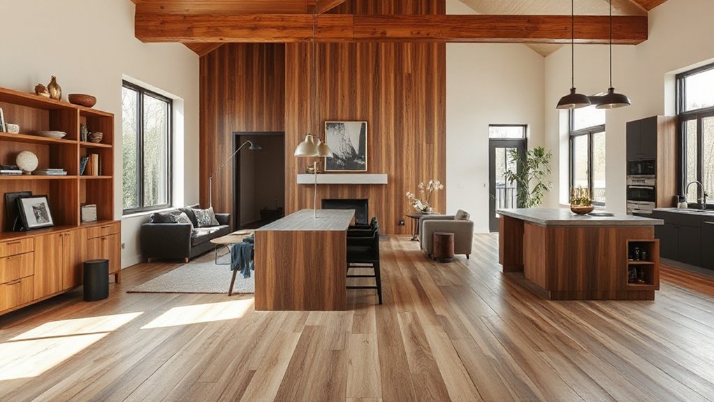
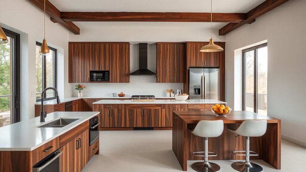
You’ll get the most out of walnut when you place it where your eye naturally lands in each room. In the living room, choose one anchor piece—like a low media console, coffee table, or built-in shelving—so the dark tone reads intentional, not heavy. In kitchens and baths, use walnut as a controlled accent on islands, vanities, open shelves, or trim to warm up stone and tile without overpowering the space.
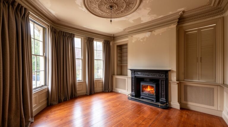
Living Room Anchor Pieces
If you want walnut to read as intentional rather than incidental, make it the living room’s anchor: a single, substantial piece that commands sightlines and sets the tone for everything around it. Choose a low, long media console, a credenza behind the sofa, or a statement coffee table with clean, modern joinery. Nail furniture placement by centering the walnut piece on the room’s main axis, then repeat the tone subtly in frames or side tables. Balance its depth with creamy textiles and warm metals so it feels current, not heavy. Add acoustic considerations: walnut’s density helps, but pair it with a rug, curtains, or upholstered seating to soften echo and sharpen comfort.
- The room suddenly feels grounded
- Your sightline lands with confidence
- Warmth replaces “empty” instantly
- Guests linger longer, relaxed
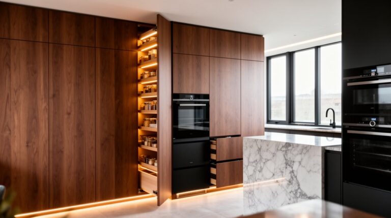
Kitchen And Bath Accents
Because kitchens and baths skew hard and bright—tile, stone, stainless, mirrors—walnut works best as a concentrated accent that warms the room without darkening it. In the kitchen, skip full-wall wood and instead add walnut to a feature run of Kitchen cabinetry (island base, coffee bar, or a tall pantry) paired with matte white or greige fronts. Tie it in with a slim walnut shelf, toe-kick, or vent hood banding, and keep hardware blackened brass. In baths, use walnut for a floating vanity, mirror frame, or niche trim; protect it with marine-grade finish and a drip edge. Repeat the tone in accessories, even Outdoor furniture just outside a bathroom door for continuity.
Choose Wall Colors That Brighten Walnut
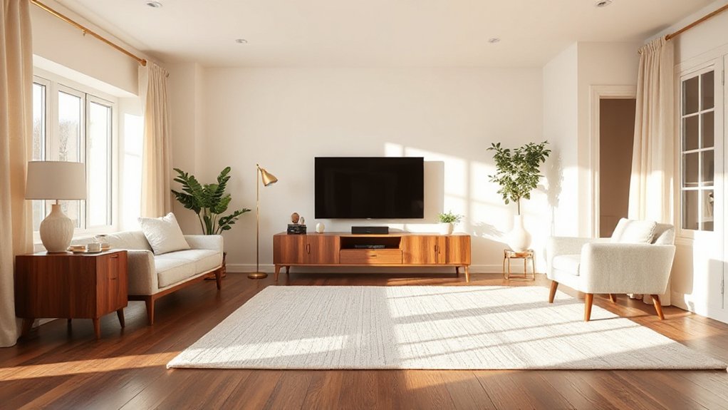
To make walnut feel richer—not heavier—you should start with light neutrals like warm white, creamy ivory, or soft greige that bounce light and keep the grain looking crisp. Then add warm-contrast accent shades—clay, muted terracotta, cinnamon, or dusty olive—to bring out walnut’s depth without turning the room cave-dark. You’ll get the most current look by matching undertones: choose warmer paints for red-brown walnut and slightly cooler neutrals for chocolate-toned boards.
Light Neutral Paint Pairings
While walnut’s deep, warm grain brings instant richness, the right light neutral paint keeps it from feeling heavy and instead makes the wood look cleaner and more dimensional. Start with creamy off-whites or soft greiges that have a hint of warmth, so the undertone echoes walnut rather than fighting it. In north-facing rooms, choose a light neutral with a touch of beige to avoid a flat, icy cast. In brighter spaces, a balanced greige reads current and crisp, supporting Dining room elegance without stealing attention from the wood. For Bedroom cozy accents, pick a muted oatmeal or pale taupe that softens edges and makes textiles feel inviting.
- You’ll notice walnut’s glow feels calmer, not dark.
- Your walls stay bright even at dusk.
- The grain looks sharper and more refined.
- The whole room feels airy, grounded, and luxe.
Warm Contrast Accent Shades
If you want walnut to look brighter and more intentional, lean into warm contrast accent shades that lift the wood’s richness without cooling it down. Try clay, terracotta, muted apricot, or cinnamon—these read current but not loud, and they pull out walnut’s red-brown undertones. For a softer take, use a warm blush-beige or honeyed cream on walls, then add deeper spice on one focal surface. Keep trim a clean warm white so the wood doesn’t feel heavy. Anchor the palette with decorative accents like brass, camel leather, and textured linen. With furniture placement, give walnut pieces breathing room against lighter walls, and avoid crowding them with other dark finishes. Balance with woven rugs and warm artwork nearby.
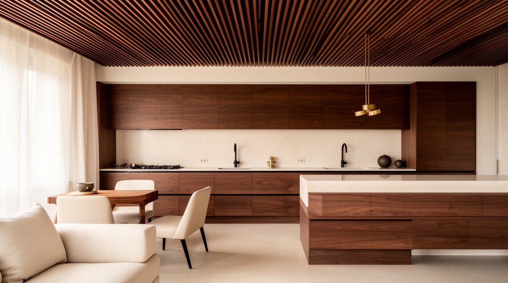
Mix Walnut With Other Wood Tones (No Clash)
Because walnut carries a deep, often chocolate-leaning undertone, it plays best with other woods when you treat it as the “anchor” tone and then layer in one or two supporting finishes with clearly different lightness and grain. Match sheen first (matte with matte, satin with satin) so the mix feels intentional, not chaotic. Then compare wood grain patterns: pair walnut’s cathedraling with a straighter grain, or echo its figure with a subtler, tight-grain species. Pull cues from historical wood styles—Shaker restraint, midcentury continuity, or Arts & Crafts honesty—to guide profiles, stains, and hardware.
- You’ll feel calm when every finish has a “job.”
- You’ll love the lived-in richness of layered tones.
- You’ll avoid that jarring, mismatched DIY look.
- You’ll get a collected, designer-grade warmth.
Add Contrast With Lighter Woods and Stone
Once you’ve anchored the room with walnut and chosen your supporting wood tones, add breathing room with lighter woods and stone that bounce light back into the space. Reach for white oak, ash, or maple on open shelving, island panels, or wide-plank flooring to keep the palette modern and airy.
Use stone as a visual reset: honed quartzite, pale marble, or limestone counters and backsplashes soften walnut’s depth without feeling stark. Keep undertones aligned—warm walnut pairs best with creamy stones, while cooler walnut reads cleaner against gray-beige surfaces. Highlight wood grain variations by placing calmer, straighter-grain light woods next to walnut’s richer figure, so both look intentional. To support walnut sustainability, specify FSC-certified veneer, reclaimed panels, or engineered walnut where it counts most.
Match Walnut With Metals (Brass, Black, Chrome)
While walnut brings instant warmth and depth, the metal finishes you pair with it decide whether the room reads classic, moody, or crisp. Choose brass when you want walnut to feel tailored and timeless; it flatters mid-century and traditional furniture styles alike. Go matte black for a sharper, architectural edge—especially on pulls, sconces, and table bases. Use chrome or polished nickel to brighten walnut and push the look modern, but keep it consistent across the main sightlines.
- Brass hardware makes your cabinetry feel heirloom-worthy and inviting.
- Black frames add drama and confidence without competing with grain.
- Chrome faucets deliver a clean, gallery-like lift in kitchens and baths.
- Mixed metals feel intentional when you repeat each finish at least twice.
Use Textiles and Texture to Soften Dark Wood
Even if you love walnut’s rich, grounded look, the right textiles keep it from feeling heavy or overly formal. Start with a large, low-pile rug to visually “lift” dark floors or cabinetry, then add Textile layering: a nubby throw, linen pillows, and a bouclé or wool accent chair.
Aim for Softening textures that contrast walnut’s sleek grain—think matte cotton, washed velvet, or chunky knits. Keep the palette warm and modern with oat, camel, clay, and muted olive, then sharpen it with one crisp element like a black-and-ivory stripe. Use full-height drapery in linen blends to diffuse light and elongate walls. In dining areas, try upholstered seats or a textured runner to quiet reflections and add comfort.
Avoid These Walnut-and-Dark-Wood Mistakes
If you’re bringing walnut or other dark woods into a renovation, steer clear of the common missteps that make them read flat, heavy, or dated. You’ll get a richer, more current look by balancing depth with contrast and light.
- You don’t want walnut flooring paired with equally dark walls and ceilings—it can feel like a cave.
- You shouldn’t mix clashing undertones; red-leaning walnut beside cool espresso stains can look uneasy.
- You can’t ignore sheen: glossy Dark wood furniture against matte cabinetry reads mismatched and fussy.
- You won’t love oversized, bulky pieces everywhere; too much visual weight makes rooms feel cramped.
Instead, break up dark surfaces with warm whites, soft metals, and pale rugs. Keep grain direction consistent, and sample stains in daylight and evening light.
Frequently Asked Questions
What Is the Average Cost Difference Between Walnut and Oak Cabinetry?
You’ll usually pay about 15–40% more for walnut than oak cabinetry—roughly $50–$200 extra per linear foot. In this cost comparison, walnut’s a luxury material with richer grain, but it can strain budgets.
Does Walnut Require Special Maintenance Products or More Frequent Refinishing?
No—you don’t need special products; walnut’s as tough as a tank. You’ll just match your Wood finish with a pH-neutral cleaner, avoid silicone polishes, and keep Maintenance frequency low unless sunlight, heat, or wear ramps up.
Is Walnut a Good Choice for Homes With Pets and Young Children?
Yes—walnut works for pets and kids if you choose durable, low-sheen finishes. Prioritize Pet safety with low-VOC sealers, add Child proof finishes, and use felt pads and rugs to reduce dents, scratches.
How Does Walnut Perform in Humid Areas Like Bathrooms and Laundry Rooms?
In steamy bathrooms, walnut can hold up if you seal it well; its humidity resistance isn’t bulletproof. You’ll need strict maintenance requirements: wipe splashes fast, run fans, and recoat periodically to prevent warping, staining.
Can Walnut Be Sustainably Sourced or Fsc-Certified for Eco-Friendly Renovations?
Yes—you can source walnut sustainably and even find FSC-certified options, but you’ll need to verify chain-of-custody paperwork. Shop mills committed to sustainable forestry, compare eco certification standards, and choose reclaimed or regionally harvested stock.
Conclusion
When you bring walnut into a renovation, you get instant depth—if you choose the right tone, finish, and placement. Balance dark wood with brighter wall colors, lighter woods or stone, and metals like brass or black to keep it crisp, not heavy. Layer in textiles and varied textures so the room feels lived-in, not showroom-stiff. And don’t mix competing undertones or overdo dark surfaces—why make walnut fight for attention?