Start by matching paint and textiles to fixed finishes like flooring, counters, tile, and cabinetry, then pull 2–3 coordinating neutrals and test large swatches in your room’s lighting. Layer 3–5 related tones (ivory to greige) so the space feels calm but not flat. Add texture with rugs, linen, and upholstery, repeat wood/metal/paint finishes three times, and sharpen photos with matte black, warm oak, and greenery. Up next: room-by-room styling shortcuts.
Key Takeaways
- Match neutral paint and textiles to fixed finishes, then build a 3–5 shade tonal palette for cohesive, calming rooms.
- Test large swatches in each room’s lighting to confirm undertones stay consistent and photograph cleanly.
- Balance materials by repeating wood, metal, and paint finishes at least three times, with one dominant finish and two supporting.
- Use simple, buyer-friendly layouts: anchor seating on rugs, keep clear walkways, and center beds with layered, tonal bedding.
- Style minimally: one countertop vignette, eye-level art sized to furniture, grouped accessories in odd numbers, and consistent bulb temperatures.
Choose a Neutral Palette That Matches Fixed Finishes
Before you pick paint chips or order upholstery, take stock of your fixed finishes—flooring undertones, countertop veining, tile color, and any built-in cabinetry—because they’ll set the temperature of your entire neutral scheme. Pull two to three coordinating neutrals directly from those materials, then repeat them across walls, textiles, and casegoods for a cohesive, buyer-friendly flow. Use Color psychology to guide your ratios: keep the dominant neutral calm and consistent, reserve higher-contrast shades for trim, hardware, and accents that photograph crisply. Audit lighting effects room by room—daylight direction, bulb temperature, and fixture placement—so your chosen neutrals read stable from morning showings to evening open houses. Finish with a simple, labeled sample board to keep contractors and stagers aligned.
Warm or Cool Neutrals? Test Undertones First
Even if you’re committed to a “neutral” look, warm and cool options can read dramatically different once undertones meet your lighting and fixed finishes. Before you buy gallons of paint or textiles, test large swatches on multiple walls and view them morning, afternoon, and night. You’re looking for undertone matching: beige can pull pink, greige can go green, and “white” can flash blue under LEDs.
Use your home’s immovable cues—flooring, stone, cabinetry, metal finishes—as the baseline, then choose neutrals that echo, not fight, those undertones. This is neutral tone psychology in practice: buyers read warm neutrals as inviting and cool neutrals as clean and modern, but only when the undertones stay consistent. Confirm with samples before committing.
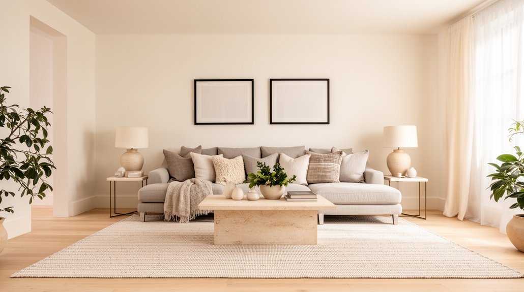
Use 3–5 Tones to Keep Neutrals Layered
You’ll get a richer neutral interior when you build a tonal palette of 3–5 related shades—think ivory to sand to taupe to greige—so every surface has purpose. Mix warm and cool within that range to keep the room from reading flat, and let one tone lead while the others support. This structured layering gives you a cohesive, high-end look that’s easy to shop, repeat, and scale across the space.
Build A Tonal Palette
While a neutral scheme can look effortless, it only feels rich when you build a tonal palette of 3–5 related shades and repeat them on purpose. Pick a base tone for walls, a mid tone for large upholstery, and two accent tones for textiles and decor, so buyers read the room as cohesive, not bland. Aim for monochrome schemes that move from light to dark, then reinforce the order across spaces—entry to living to dining—to photograph as one story. Use color blocking sparingly with neutrals: define zones with a darker rug under seating, or a lighter curtain against deeper furniture. Keep finishes consistent, label paint and fabric choices, and edit extras so the tones stay legible at showings.
Balance Warm And Cool
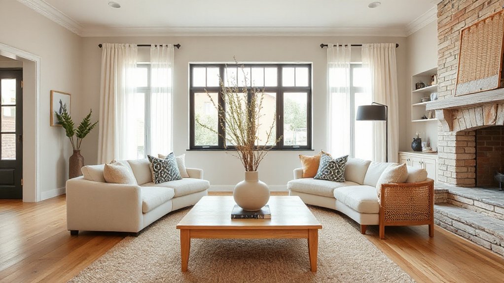
Because neutral rooms can swing flat or dated when they lean too far warm or too far cool, balance both temperatures across your 3–5 tones to keep the space layered and buyer-friendly. Start with a dominant base (soft greige or warm white), then add a cooler countertone (stone, pale taupe, or light gray) in textiles or cabinetry to sharpen edges and read clean in photos. Use a mid-tone wood or camel accent to restore warmth and signal comfort through Color psychology. Keep the darkest tone minimal—charcoal hardware, matte black frames, or deep bronze—so contrast feels intentional, not heavy. Adjust with lighting techniques: select 2700–3000K bulbs, layer ambient plus task lighting, and test samples morning and evening to prevent yellowing or blue cast.
Add Texture With Textiles, Rugs, and Upholstery
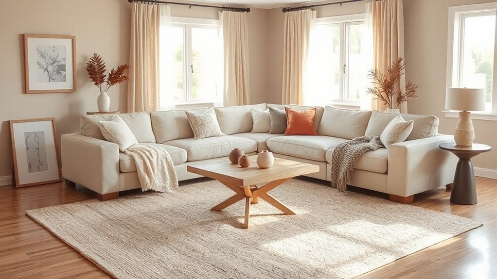
Even if your palette stays firmly in the neutral zone, texture can carry the entire design by adding depth, contrast, and a more premium feel. Use Textile layering to create visual interest without adding color: pair linen curtains with a wool throw, add a bouclé pillow, and keep patterns subtle and low-contrast.
Anchor the room with a rug that’s large enough to frame furniture, preferably in a tight weave or soft pile that reads clean in photos and showings. Choose neutral rugs with slight variation (heathered, nubby, or tonal stripes) to hide light wear. Your upholstery choices should prioritize broad appeal: tailored sofa silhouettes, durable performance fabric, and a mix of matte and soft-sheen finishes. Add one statement chair in textured fabric to signal comfort and quality.
Mix Wood, Metal, and Paint Finishes (Rule of 3)
To keep a neutral interior from feeling flat, you’ll want to balance three finish types—wood, metal, and paint—so no single surface dominates the room. Pick complementary tones (for example, warm oak, brushed brass, and soft white) and distribute them across key touchpoints like lighting, hardware, furniture legs, and trim. Then follow the rule of 3 by repeating each finish at least three times to create a cohesive, high-end look buyers notice.
Balance Wood Metal Paint
When a neutral room starts to feel flat, the fix often comes down to finish variety—specifically balancing wood, metal, and paint using a simple “rule of 3.” Aim to feature one dominant finish (like warm oak flooring or a painted wall color), a secondary finish that supports it (such as matte black or brushed brass hardware), and a smaller accent finish that adds contrast (think a stained wood side table or a painted console). Keep undertones aligned so the palette reads intentional to buyers: pair warm wood grain with creamy whites and brass, or cool paint with ash wood and nickel. Choose consistent sheen levels—eggshell walls, satin trim, matte metal finishes—to avoid visual noise. This mix photographs well, signals quality, and helps spaces feel layered yet universally appealing.
Repeat Finishes Three Times
If your neutral space needs more cohesion without adding color, repeat each finish three times across the room using the rule of 3—wood, metal, and paint should each show up in at least three touchpoints. Choose one dominant wood tone (oak, walnut, or espresso), then echo it in a coffee table, picture frames, and a shelf. Pick one metal finish (matte black, brushed nickel, or brass) and repeat it on cabinet pulls, a floor lamp, and curtain hardware. Lock in one paint finish level—typically matte walls with satin trim—and keep it uniform for finish consistency. Repeating finishes reads intentional, photographs cleanly, and helps buyers quickly understand the home’s style without distraction. It also reduces decision fatigue.
Add Crisp Contrast With Black, Oak, or Greenery
Although a neutral interior feels calm and cohesive, it can read flat without a few high-contrast anchors. Add crisp contrast strategically so buyers notice polish, not personality. Use matte black sparingly—cabinet pulls, picture frames, a slim floor lamp—so your palette gains definition in photos and showings. Balance that edge with warm oak: a simple stool, a tray, or a light wood mirror frame that adds texture and signals quality craftsmanship. For Bold accents that still feel universally appealing, keep shapes clean and finishes consistent with your repeated metals and woods. Finish with Plant integration: one tall leafy plant and one smaller potted stem to introduce organic color, soften hard lines, and make rooms feel cared for without clutter.
Style Neutral Rooms: Living, Bedroom, Kitchen, Bath
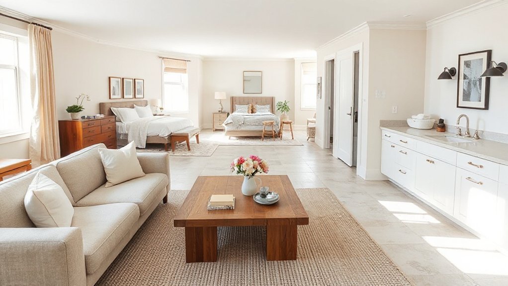
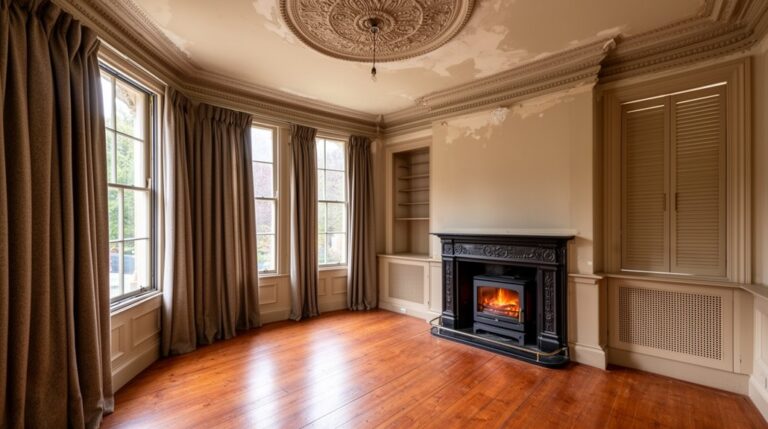
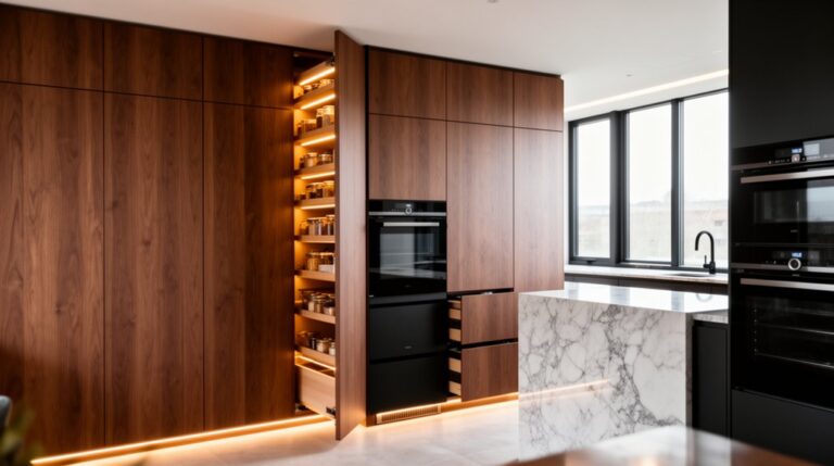
Four rooms sell a neutral home fastest—living, bedroom, kitchen, and bath—so style each one with the same calm palette, repeated finishes, and one or two purposeful focal points. In the living room, use Color psychology: warm whites read welcoming, while soft greige feels upscale; anchor seating on a rug and prioritize clear furniture arrangement that preserves walkways. In the bedroom, keep bedding layered but tonal, add matching lamps, and center the bed to signal balance and space. In the kitchen, limit countertops to one practical grouping, align hardware finishes, and use consistent barstool scale. In the bath, mirror metals and linens, keep storage closed, and brighten with high-Kelvin bulbs for clean, buyer-trusted hygiene cues.
Pick Buyer-Friendly Art and Decor for Neutral Spaces
Because neutral rooms can feel unfinished without a focal point, you’ll want art and decor that add scale, contrast, and polish without narrowing the buyer pool. Prioritize Art placement that supports the room’s sightlines: hang pieces at eye level, center them over key furniture, and size them to fill roughly two-thirds of the width beneath. Keep themes broadly appealing—abstracts, landscapes, or simple line work—so buyers project their own style.
For Decor selection, use a tight palette and repeat materials to signal cohesion and value:
- Choose one statement piece, then echo its color in two smaller accents.
- Layer texture with ceramics, linen, and matte metals for depth.
- Add greenery for life, but keep forms clean and structured.
Neutral Styling Mistakes That Look Cheap in Photos
When you style a neutral interior for listing photos, small shortcuts read as “cheap” faster than bold color ever will. Avoid flimsy curtain panels that puddle unevenly, wrinkled bedding, and undersized rugs that expose too much flooring. These neutral styling mistakes flatten the room and signal low investment.
Watch your finishes: mix too many faux woods, shiny plastics, and chrome, and you’ll create glare and photo quality issues. Skip bargain pillows with sagging inserts; use full, structured forms and tight seams. Don’t over-accessorize with tiny vases or cluttered trays—group pieces in odd numbers and vary heights. Finally, keep lighting consistent: match bulb temperature, hide cords, and swap burnt-out bulbs so your neutral palette reads intentional and premium.
Frequently Asked Questions
How Do I Keep a Neutral Home From Feeling Sterile or Cold?
You’ll keep a neutral home from feeling sterile by prioritizing Texture addition—layer rugs, linen, wood, and matte metals—and smart Color coordination with warm undertones, art, and greenery, so the space photographs inviting and sells faster.
What’s the Best Neutral Paint Finish for High-Traffic Areas?
Choose washable eggshell or satin in high-traffic areas; you’ll get durability, easy cleaning, and a soft sheen that hides scuffs. Add Color contrast with trim and Accent decor so the neutral palette still photographs crisp.
How Can I Stage a Neutral Home on a Tight Budget?
You can stage cheaply: like I once sold faster after swapping thrifted lamps—buyers noticed. Use budget friendly decor: crisp linens, mirrors, greenery. Apply DIY staging tips: declutter 50%, rearrange furniture, add consistent neutral art.
Should I Repaint or Leave Existing Neutral Walls Before Listing?
Repaint only if your current neutral looks dated, patchy, or inconsistent; otherwise leave it. You’ll boost buyer confidence with tight color coordination, crisp touch-ups, and smart furniture arrangement that highlights space, light, and flow.
Do Neutral Interiors Sell Better in Every Market and Price Range?
No, neutral interiors don’t sell better everywhere; Zillow found buyers paid about 5% more for greige than white. You should use Color psychology and Design consistency, but match local tastes and your price segment.
Conclusion
When you style a neutral interior for broad buyer appeal, you’re selling clarity, not character overload. Start by matching your palette to fixed finishes, then test undertones so warm and cool elements don’t clash. Layer 3–5 tones, add texture through rugs and textiles, and mix finishes in a deliberate rule of three. Finish with crisp contrast—black accents, oak warmth, or fresh greenery. Done right, your home photos read like a clean canvas buyers can’t resist.