Nearly 60% of homeowners say comfort now outweighs “wow” factor when they update a room. If you want Cottage Revival to land right, you can’t rely on thrifted charm alone—you need a controlled palette, layered textiles, and authentic patina that looks earned, not staged. You’ll use warm, diffused lighting, edited surfaces, and restrained botanicals to keep it cozy but not cluttered. The part most people miss is what makes it feel timeless instead of kitschy…
Key Takeaways
- Blend classic cottage warmth with modern function using cleaner lines, edited ornament, and durable, high-performance materials.
- Build coziness through layered textures: linen, wool, bouclé, and tightly woven, high-rub textiles in tonal, tactile combinations.
- Use a warm, dimmable lighting plan (2200–2700K, high CRI) with layered tiers and shaded fixtures to control glare.
- Choose warm neutrals plus muted pastels and earth tones in matte/eggshell finishes, testing swatches and using accents sparingly.
- Ground spaces with aged-look woods, matte oil-wax finishes, restrained patterns, curated accessories, and controlled greenery to avoid clutter and kitsch.
Cottage Revival Style, Explained
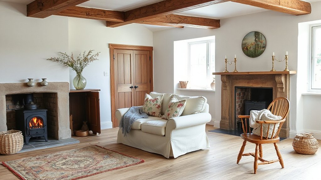
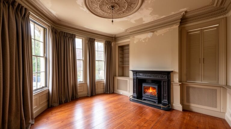
While it borrows the warmth of classic cottage interiors, Cottage Revival updates the look with cleaner lines, higher-performance materials, and a more intentional mix of vintage and new. You read it through disciplined proportions, edited ornament, and practical finishes: limewash, matte enamels, sealed wide-plank floors, and stain-resistant textiles. Cottage revival history tracks a shift from purely pastoral nostalgia to a design language calibrated for modern living—better insulation, upgraded glazing, and durable hardware—without losing handcrafted cues. You’ll notice regional influences shaping the envelope and palette: coastal zones lean to salt-tolerant woods and airy whites; mountain regions favor heavier species, deeper stains, and robust metalwork; farmhouse areas foreground painted millwork and utilitarian ceramics. You balance patina with precision by specifying a few true antiques, then supporting them with contemporary, low-maintenance companions.
The 3 Rules That Make It Feel Cozy
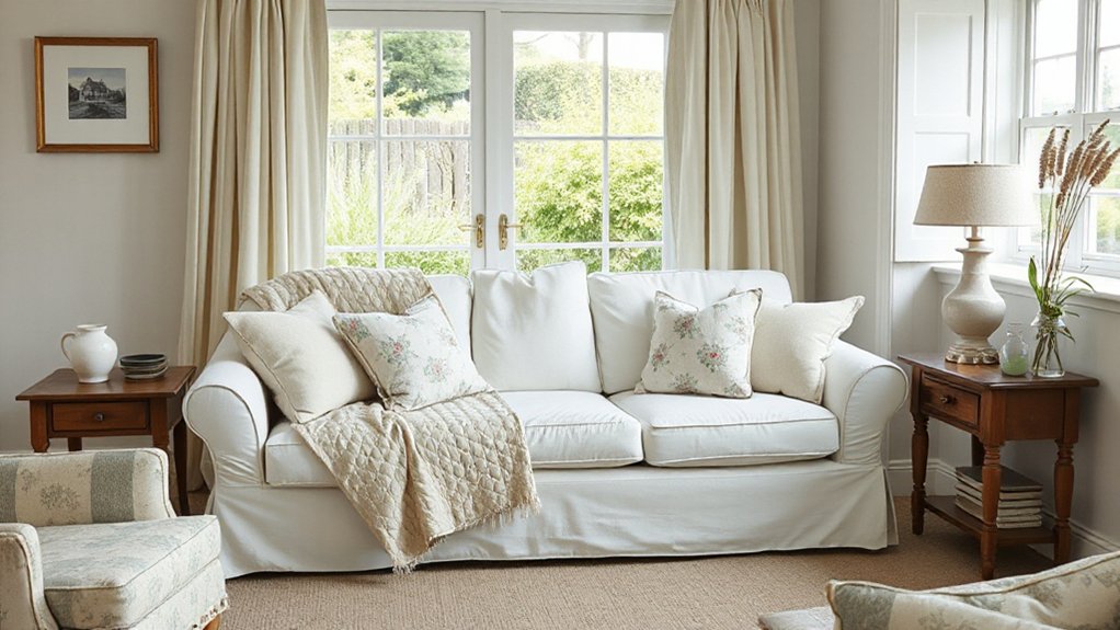
To make cottage revival feel genuinely cozy, you’ll follow a tight framework: layered textures and textiles, plus warm lighting with a controlled glow. You’ll stack tactile materials—nubby wools, washed linen, quilted cotton—across upholstery, throws, and rugs to build visual depth and acoustic softness. Then you’ll specify warm-CCT sources (around 2200–2700K) and diffuse them through shaded table lamps, sconces, and candles so the room reads amber, not harsh.
Layered Textures And Textiles
How do you make a cottage revival room feel instantly lived-in, not staged? You control handfeel and visual depth with three rules: diversify fibers, stack scales, and edit repeats. Start with Textile fiber varieties—linen, wool, cotton, and a touch of velvet—so each surface has a distinct friction, drape, and thermal read. Then Layering color palettes: build from a grounded neutral, add mid-tones in checks or ticking, and cap with a muted accent in embroidery or piping. Next, layer textures across planes: slipcovered upholstery, nubby throws, pleated shades, and braided rugs, mixing matte and low-sheen finishes. Finally, repeat one motif twice, then break it with a solid to avoid pattern fatigue.
Warm Lighting With Glow
Because cottage revival hinges on atmosphere as much as furnishings, you’ll get an instant lived-in feel by treating lighting like a layered material, not an afterthought. Rule one: set your baseline with warm CCT LEDs (2200–2700K) and high CRI (90+), so woods and textiles read rich, never flat. Rule two: build three tiers—ceiling for circulation, task for cozy reading, and low-level accent (sconces, picture lights, candles) to stitch corners together; aim for dimmable drivers, not harsh on/off. Rule three: control glare and shadow with shades, baffles, and uplight, then tune with smart dimmers to keep an ambient glow from dusk to bedtime. Finish with vintage-style bulbs in opal glass for softness.
Calm Cottage Revival Paint Colors to Start
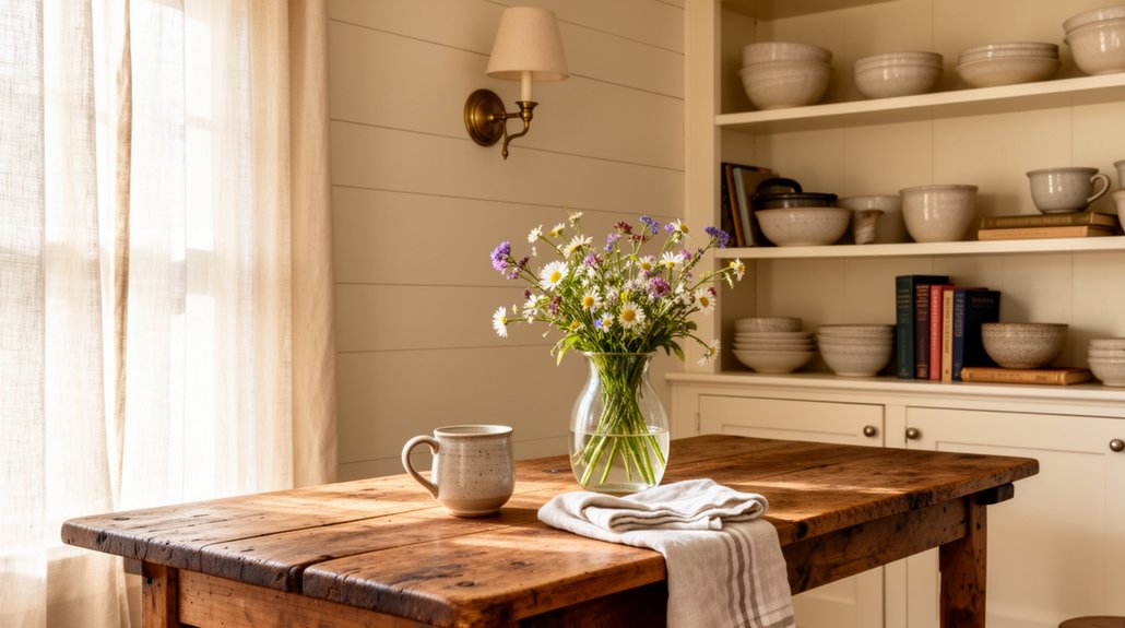
Start your Cottage Revival palette with soft neutrals—creamy whites, oatmeal, and greige—to lock in warmth and keep reflectance balanced across changing daylight. Layer in muted pastels like dusty rose or washed lavender for charm, using low-chroma tones that read vintage, not sweet. Finish with earthy greens and blues—sage, olive, slate, and denim—to ground the scheme and echo today’s biophilic, heritage-forward trend.
Soft Neutrals For Warmth
While bold accents grab attention, soft neutrals do the heavy lifting in a Cottage Revival palette by controlling warmth, light bounce, and undertone compatibility across rooms. Start with creamy off-whites and sand-beige bases to stabilize daylight shifts, then layer greige or mushroom to keep trim, ceilings, and built-ins cohesive. You’ll want an LRV in the mid-to-high range for small rooms, but choose warmer undertones to prevent a sterile cast under LEDs. Test swatches against wood tones, stone, and linen to confirm chroma stays low. These neutrals also let bohemian accents read intentional, not chaotic, and they harmonize with coastal influences like weathered oak and rattan. Finish with a matte or eggshell sheen to soften texture and hide wall imperfections.
Muted Pastels For Charm
If you want Cottage Revival to feel charming without turning saccharine, muted pastels deliver low-chroma color that reads calm across changing daylight and warmer LED temps. Choose dusted blush, chalky lilac, and washed buttercream with an LRV in the mid range so trim and plaster details stay legible. You’ll get softness without losing contrast.
Test swatches at 3×3 feet, then evaluate undertones against your fixed finishes: oak, limestone, aged brass. You can ground the look by repeating the pastel in small doses—door interiors, beadboard, or a ceiling wash—so it behaves like a neutral. Pair with Vintage textiles (faded florals, ticking, quilt blocks) to reinforce period cues, and keep to muted palettes so patina, grain, and joinery remain the focus.
Earthy Greens And Blues
Because Cottage Revival relies on texture and patina more than high-saturation color, earthy greens and blues make the most dependable “calm” paint starting point: they read historically plausible, suppress glare, and stay stable from cool daylight to warm LEDs. Start with low-chroma sage, olive, and lichen greens on millwork; they sharpen relief in beadboard and limewashed plaster without flattening grain. For walls, choose blue-greens with gray undertones—smoke, slate, or duck-egg shifted cooler—to control metamerism across rooms. You’ll get better depth if you spec a matte or eggshell at 10–20 GU and reserve satin for wipeable zones. These hues also support Indoor gardening; foliage looks richer against them. Pair them with eco friendly materials like linseed paint, clay plaster, or FSC oak for a coherent, modern-traditional finish.
Worn-In Textures: Linen, Wool, and Slipcovers
Once you layer in worn-in textiles, cottage revival stops feeling staged and starts reading as lived-in. You’ll get rustic charm by choosing fibers that patinate gracefully, not fabrics that stay crisp and shiny. Prioritize textile durability: look for tight weaves, high rub counts, and resilient blends that resist pilling while still draping softly.
- Washed linen for breathable, rumpled texture on curtains and bedding
- Worsted wool throws to add loft, thermoregulation, and visual depth
- Cotton-linen slipcovers with double-stitched seams for easy laundering
- Nubby bouclé or herringbone pillows to introduce micro-pattern and tactility
Keep your palette tonal, then vary hand-feel: matte, slubby, and lightly brushed. You’ll create a layered envelope that handles real life while staying trend-forward.
Wood Tones and Finishes That Look Aged
While textiles soften the room, your wood tones set the architectural baseline for cottage revival, so choose species and finishes that mimic honest oxidation rather than faux distressing. Start with oak, chestnut, or Douglas fir; their open grain reads period-correct and takes reactive stains well. Specify fumed or ammonia-treated oak for a true tannin shift, or use a wire-brush and liming regimen to open pores before a matte oil-wax topcoat. Keep sheen under 10 gloss to avoid a showroom look. For casegoods, layer a dye stain, then a thin pigmented glaze, and lock it with conversion varnish in dead-flat. Pair with Vintage hardware in aged brass or blackened iron. Skip heavy distressed finishes; target softened edges, not gouges.
Cottage Patterns That Won’t Feel Busy
To keep cottage patterning elevated, you’ll prioritize low-contrast prints with generous negative space so the room reads airy, not cluttered. Choose soft florals with spaced motifs and a restrained palette to maintain visual cadence across upholstery, drapery, and bedding. Ground it all with subtle stripes and small-scale checks, then control density by repeating one pattern family per zone and scaling up or down for balance.
Soft Florals With Space
Because cottage florals can overwhelm a room when scale and density run unchecked, you’ll get a calmer, more current look by choosing prints with built-in negative space. Prioritize Delicate botanicals rendered in watercolor washes or sketch lines, where the ground reads as a field of light. You’ll control visual noise by limiting contrast and repeating one hue across upholstery, drapery, and bedding, then letting solids do the heavy lifting. Pair these motifs with airy textiles—linen, voile, light cotton—so the pattern floats instead of crowds. Keep placement intentional, and you’ll maintain that nostalgic softness without sacrificing contemporary restraint.
- Choose large repeats with sparse stems and open background
- Use low-chroma palettes: dusty rose, sage, chambray
- Anchor with matte solids and lightly textured weaves
- Reserve florals for one focal plane per room only
Subtle Stripes And Checks
Even if you love pattern, you’ll keep a cottage room feeling edited by choosing stripes and checks with low contrast, fine line weights, and generous ground. Prioritize ticking, pencil stripes, and micro-gingham in washed neutrals or sun-faded blues so the repeat reads as texture, not noise. Scale matters: reserve tighter repeats for upholstery and shade linings, then step up slightly on bedding to create hierarchy. Anchor with solid trim to sharpen edges and prevent visual vibration. To stay trend-right, blend Coastal influences—denim stripe, driftwood taupe, salt-bleached navy—with Botanical motifs in adjacent layers, like a leafy block print pillow. Finish with matte linens and nubby cottons; their diffuse reflectance keeps geometry soft. Keep metals quiet, too.
Furniture That Feels Collected, Not Matchy
While a true cottage revival room nods to nostalgia, it shouldn’t read like a showroom set—aim for furniture that looks accumulated over time, not purchased in one swipe. You’ll get that collected cadence by varying silhouettes, finishes, and proportions, then anchoring the plan with repeat materials like oak, rattan, and painted pine. Keep upholstery in a tight color range, but shift textures to avoid visual monotony. Add antique accents and eclectic accessories as punctuation, not clutter, so the room reads curated.
- Prioritize mixed leg profiles and staggered seat heights
- Use patina-forward woods alongside matte painted casegoods
- Choose one “hero” storage piece, then layer smaller support tables
- Edit hardware and pulls for consistent sheen and scale
How to Mix Vintage and Modern Pieces
If you want cottage revival to feel current, you’ve got to choreograph the tension between vintage warmth and modern restraint. Start by setting a clean baseline with Modern furniture: simple silhouettes, tight upholstery, and disciplined proportions. Then layer patina strategically—one standout antique per zone—so contrast reads intentional, not cluttered.
Use a consistent undertone: match wood temperatures, repeat a single metal finish, and keep your color palette edited to three to five hues. Scale matters; pair a chunky farmhouse table with slim-line chairs, or anchor a petite settee with an oversized vintage rug. Add Vintage accessories in controlled clusters: ceramics, brass, framed sketches. Maintain negative space, and let craftsmanship, not novelty, drive the mix.
Soft, Layered Lighting (No Harsh Overheads)
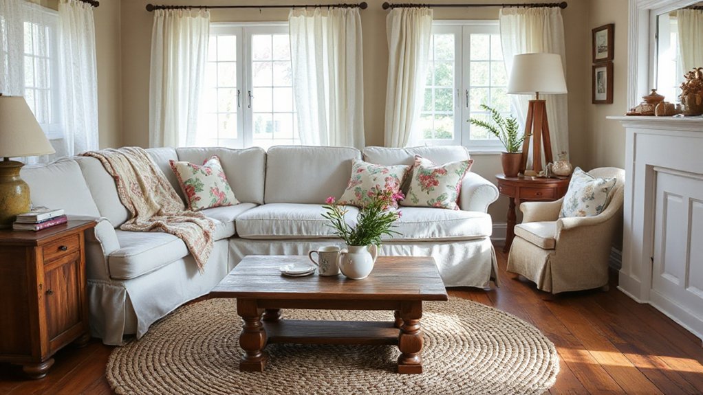
A well-mixed vintage/modern room still falls flat without the right lighting hierarchy, so treat illumination as another layer of curation. Skip harsh overheads; they flatten texture and exaggerate contrast. Instead, build a soft, layered scheme that supports sightlines and mood, with dimmable sources and warm CCT (2200–2700K) for a cottage-leaning ambient glow. Control glare with shades, bounces, and lower mounting heights, and you’ll keep patina looking rich, not dingy.
- Use plug-in sconces to create vertical light without ceiling glare
- Add a shaded floor lamp for mid-level diffusion and balanced luminance
- Choose high-CRI bulbs (90+) to render woods and textiles accurately
- Introduce candle ambiance via LED tapers or enclosed votives for safety
Simple Shelf and Tabletop Styling Rules
Because shelves and tabletops read like micro-vignettes, you’ll get a cleaner cottage revival look by styling with constraints: limit the palette, control scale, and build an intentional visual rhythm. Keep finishes within one temperature (warm brass, aged nickel, or blackened iron) and repeat two materials, like ceramic and wood, to unify decorative shelf arrangements. Anchor each surface with a “hero” object, then bracket it with medium forms and a small accent for a 60/30/10 massing ratio. Vary height, not clutter: stack two books, add a low bowl, and cap with a vertical candlestick or framed print. Use negative space as a delimiter, and align edges to an invisible grid. These tabletop styling techniques look curated, not precious.
Greenery and Branches for a Lived-In Look
While florals can skew fussy in a cottage revival scheme, restrained greenery and bare branches add structure, scale, and that “just-picked” authenticity without tipping into décor overload. You’ll get the best read when you treat foliage like an architectural element: prioritize line, negative space, and repeatable silhouettes. Source clippings from garden pathways and stage them in weighted vessels so they hold an upright, tensioned stance. Then echo the same species near outdoor seating to connect interior vignettes with the landscape.
- Use olive, eucalyptus, or bay for controlled, matte tonality
- Choose branchy stems (dogwood, birch) for vertical emphasis
- Cluster in odd counts and vary stem caliper for depth
- Keep waterlines clean and rotate greens to maintain crispness
Cottage Revival Mistakes That Make It Kitschy
If you pile on cottage cues without a hierarchy, the look collapses into themed décor fast. You’ll get kitsch when every surface competes: ruffled textiles, busy florals, novelty signage, and distressed finishes stacked without negative space. Instead, specify one dominant motif, then control repetition through scale, spacing, and restraint. Avoid over-antiquing; too much crackle, faux patina, and chalk paint reads like a set. Treat Vintage appliances as functional anchors, not props—pair them with clean-lined cabinetry or a tight color palette so they feel intentional. Keep Modern accents crisp and limited: one streamlined sconce, one graphic rug, or matte hardware. Finally, edit collectibles; curate vignettes, not clutter.
Frequently Asked Questions
What’s the Typical Budget Range for a Cottage Revival Room Makeover?
You’ll typically budget $1,000–$5,000 for a cottage revival room makeover, depending on scope and labor. You’ll spend more if you source vintage furniture, layer floral patterns, and upgrade lighting, textiles, and finishes.
Which Retailers Are Best for Affordable Cottage Revival Decor Finds?
You’ll score affordable finds at Target, IKEA, HomeGoods, and World Market; thrift smart at Goodwill and Facebook Marketplace. Source vintage textiles on Etsy, grab rustic accessories at Michaels and Amazon, and compare price-per-use for value.
How Do I Create Cottage Revival Style in a Rental Without Painting?
Skip paint by layering removable wallpaper, plug-in sconces, and peel-and-stick molding. Anchor rooms with Rustic furniture, then add Vintage textiles, botanical prints, and warm lamps. Use renter-safe hooks, area rugs, and antique-look hardware.
What Are the Best Curtain and Window Treatment Choices for Cottage Revival?
Choose linen café curtains, pinch-pleat drapery, or relaxed Roman shades—like a frame for light. Use Vintage fabrics (florals, checks), layer sheers, and mount on Rustic hardware, blackened iron or aged brass. Keep hems generous.
How Can I Incorporate Cottage Revival Style in a Small Studio Apartment?
You’ll incorporate cottage revival in a studio by zoning with Vintage textiles, layering slipcovers and rugs, and choosing Rustic furniture with scaled proportions. Use matte paint, beadboard panels, brass hardware, and warm lighting to maximize charm.
Conclusion
You’ve got everything you need to nail Cottage Revival: follow the three coziness rules, anchor the room with calm, low-chroma paint, then stack worn-in textiles like linen slipcovers and wool throws for tactile depth. Choose wood with authentic patina, not faux distressing, and replace harsh overheads with layered lamps at warm Kelvin temps. Style shelves with negative space, add restrained branches for life, and edit accessories—otherwise the look tips into kitsch like sugar in tea.