Wondering what’s going to be the Best Colour Combination For Hall And Stairs this year? Your hall can feel bright yet calm, modern yet timeless. You’ll get the best colour combination by balancing natural light, size, and the mood you want at the door. Start with a soft greige, warm beige, or misty white on main walls, then add depth with a dusty blue or muted sage feature and slightly lighter trim. Finish with matte paint and warm brass or copper accents—then consider what changes when your hall gets low light…
Key Takeaways
- Assess your hall’s natural and artificial light; colour choices should reduce glare in bright spaces and warm up low-light areas.
- For small or tight halls, use soft off-white or warm greige walls with trims one shade lighter to lift height and widen perception.
- In bright halls, pair warm whites or soft sage with walnut accents or matte charcoal details to add depth without harsh contrast.
- In mixed-light halls, choose balanced neutrals like oat or taupe, then add a mid-tone feature wall (dusty blue or olive) for stability.
- In low-light halls, use deep teal, inky navy, or cocoa with brass hardware and warm LEDs; keep ceilings matte and walls satin/eggshell.
How to Pick a Hall Colour Combination (Light + Size)
Because your hall’s colour combination can either amplify or shrink the space, start by judging two things first: how much natural light you get and how large the room actually feels. Walk the hall at morning and evening; note glare, shadows, and where light falls.
If the hall feels tight, choose lighter wall paint options with a soft undertone (warm greige, sandy beige, misty white) and keep trims one shade brighter to lift edges. If it feels wide but flat, add depth with a mid-tone feature wall or colour-blocking around niches, staying within the same undertone family for a clean, current look. Finish with flooring coordination: match warm paints to honey/oak tones, cool paints to ash/grey tiles, and keep contrast low for a seamless, elongated run.
Best Hall Colour Combinations (By Lighting Level)
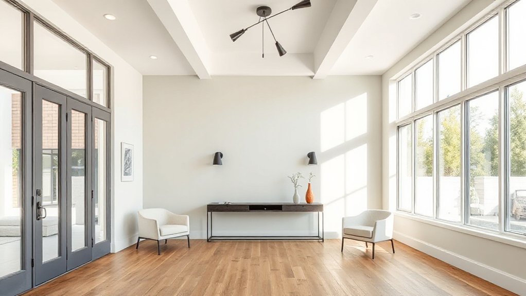
Once you’ve sized up your hall and tracked how light moves through it, match your colour combination to the lighting level you actually live with—bright all day, mixed and shifting, or mostly low-light. In bright halls, temper glare with warm whites, greige, or soft sage, then add depth via matte charcoal trims or walnut accents. For mixed light, choose balanced neutrals (oat, taupe, mushroom) and pair them with a stable mid-tone like dusty blue; it won’t flip harshly from morning to evening. In low-light halls, lean into Color psychology: deep teal, inky navy, or cocoa create cosy enclosure, while brass hardware and warm LED lighting drive Mood enhancement. Keep sheen satin on walls to catch light, matte on ceilings to reduce shadow banding.
Light Colour Combinations for Small Halls
Even if your small hall doesn’t get much breathing room, you can make it feel wider and taller with a light, low-contrast palette that reflects what daylight you do have. Pair soft off-white walls with pale greige trims to blur edges, or use misty blue walls with a crisp white skirting for a clean, airy look. Choose wall paint textures like eggshell or soft matte to hide minor bumps while still bouncing light; reserve satin for trims to sharpen lines. For ceiling color options, go one shade lighter than the walls, or use a flat bright white to visually lift height. Keep doors and frames in the lightest tone, and add a single cool-toned runner to anchor the space.
Warm Hall Colour Combinations for a Welcoming Entry
Light, airy palettes open up small halls, but warm colour combinations make your entry feel instantly inviting and lived-in. Try creamy off-white walls with caramel or terracotta on the lower half, then add a walnut-toned console to ground the space. Soft clay pink paired with muted rust feels current and flattering under warm LEDs (2700–3000K). For depth, use cinnamon, saffron, or olive on one focal wall, keeping the rest in a warm neutral so the hall doesn’t shrink. When Choosing accent colors, pull from metals: brushed brass, antique gold, or copper, then repeat them in hooks, frames, or lighting. You’ll master Balancing bold hues by limiting saturated shades to 10–20% and letting texture do the rest.
Match Your Hall Colour Combination to Décor Style
Because your entryway sets the tone in seconds, you’ll get the cleanest, most intentional result when your hall colour combination mirrors your décor style—Scandi looks best in soft whites with pale oak and muted greige, modern spaces sharpen up with crisp white plus charcoal or ink blue, and traditional halls suit warm neutrals layered with heritage greens or burgundy accents.
Keep finishes consistent: pair matte paint with natural textures for Scandi, satin with metal for modern, and eggshell with mouldings for classic homes. Use furniture contrast to stop narrow halls feeling flat—light walls with a dark console, or deep walls with a pale runner. Let wall art guide your undertones: black frames suit cool palettes, brass frames lean warm. If you’ve got patterned tiles, pull one accent colour and repeat it in cushions or lamps.
Frequently Asked Questions
What Paint Finish Works Best for High-Traffic Hallways?
Choose satin or semi-gloss for high-traffic hallways; you’ll get scrub-friendly performance and a modern look. Compare paint sheen options and weigh durability considerations: satin hides flaws better, while semi-gloss resists scuffs most.
How Can I Choose Hall Colours That Hide Scuffs and Fingerprints?
Like a trusty raincoat, you’ll pick mid-tone greiges, taupes, or muted olives to mask marks. Choose subtle wall texture and low-sheen paint; test lighting effects with swatches, and favor warm undertones.
Should Hall Colours Match Adjacent Room Colours or Contrast Them?
You can match adjacent rooms for flow, or use contrasting wall colours for definition. Start with matching colour schemes if your space is open-plan; choose contrast at doorways, using shared undertones, to keep it cohesive.
How Do I Test Hall Paint Colours Without Repainting the Whole Space?
Do Color swatch testing first: buy sample pots, paint two coats on A3 card for Sample board creation, then move boards around. Check morning/night lighting, pair with trim, and photograph beside furniture.
What Are Budget-Friendly Ways to Update Hall Colour Without Repainting?
Channel your inner set designer: you’ll refresh hall color cheaply with removable wallpaper, peel‑and‑stick decals, and strategic wall decor. Swap bulbs, add warm LEDs, and mirrors; lighting effects shift tone. Update runners, art, and curtains.
Conclusion
When you pick the best colour combination for your hall, you’ll balance light, size, and style. In bright spaces, keep it crisp with misty white and cool contrasts like dusty blue. In dim halls, go warmer with soft greige, warm beige, and brass details. For small entries, choose pale paints, lighter trims, and matte finishes to reduce glare. Finally, match your palette to your décor—modern, classic, or rustic—so everything feels seamless and stylish.