You’ll get the best room colour combination when you balance light, undertones, and contrast, not when you copy a trending swatch. Start with a reliable base like greige, warm off-white, or soft sage, then control the mood with one darker anchor—navy, charcoal, or matte black accents. Use the 60-30-10 rule to keep it intentional. But the real choice depends on your room’s direction and how it behaves at different hours…
Key Takeaways
- Start with fixed elements (floors, counters, sofa) and match paint by undertone to avoid clashing and keep cohesion.
- Try timeless pairings: greige walls with crisp white trim, or soft sage walls with matte black hardware for modern balance.
- For calm bedrooms, use low-saturation greige, ivory, misty blue, or muted sage with matte finishes and layered textures.
- Adjust for light: warmer paints suit north-facing rooms; slightly cooler or muted shades work best in bright south-facing rooms.
- Use the 60-30-10 rule: dominant neutral base, supportive secondary tone, and a 10% accent colour for controlled contrast.
Best Room Colour Combinations: Quick Ideas List
Here are 10 best room colour combinations you can use right away—each one balances undertone, contrast, and finish so your space looks current, not chaotic. 1) Greige walls + crisp white trim. 2) Soft sage + matte black hardware. 3) Dusty blush + warm off-white ceiling. 4) Navy accent wall + pale stone neutrals. 5) Charcoal + oyster gray textiles. 6) Terracotta + creamy beige. 7) Olive + brass accents + ivory. 8) Misty blue + clean white + light oak. 9) Sand + muted teal + linen. 10) Deep plum + mushroom taupe. Use Color psychology: pair calmer bases with confident accents to steer mood. Nail paint application: sample 2’ swatches, check daylight/night, and match sheen to traffic.
Warm vs Cool Palettes: Pick Your Vibe
If you want a room that feels inviting and energetic, you’ll get that mood boost from warm palettes like terracotta, caramel, blush, and golden neutrals. If you’re aiming for calm and a more expansive look, cool palettes—sage, icy blue, slate, and soft lavender—visually push walls back and sharpen the airy vibe. Pick your direction first, then tune saturation and undertones so the finish looks intentional, not accidental.
Warm Palettes And Mood
You’ll get the best results by managing lighting influence. In north-facing rooms, warm tones counteract flat daylight; in south-facing rooms, they can turn too golden, so balance with creamy whites or muted taupes. Keep saturation controlled: use one spicy accent (rust, paprika) and let mid-tone neutrals carry the rest for a modern, grounded look.
Cool Palettes And Space
Why do cool palettes make a room feel larger and calmer? You’re pushing walls back visually with blues, blue-greens, and soft greys that recede instead of advancing. Pair them with crisp white trim to sharpen edges and boost perceived volume.
You’ll get the best Lighting effects when you match undertones to your bulbs: cool LEDs keep a spa-clean look, while warm bulbs soften slate and seafoam so they don’t read icy. Balance saturation—use mid-tone colour on main walls and reserve deeper navy for one accent to anchor the space. Your furniture styles matter: pale oak, ash, and light boucle feel airy; black metal and walnut add contrast without shrinking the room. Finish with matte paint for modern calm and reduced glare.
Pick Colours for North vs South Light
You can’t choose the best colour combination for a room until you read the light: north-facing spaces throw cooler, flatter daylight, while south-facing rooms amplify warmth and contrast. In a north-facing room, you’ll typically get better results with creamy whites, warm greiges, and softened terracottas that counteract the chill without looking dated. In a south-facing room, you can confidently use crisper whites, cooler blues/greens, or even saturated jewel tones because the sun will keep them balanced and vibrant.
North-Facing Room Colours
Although two rooms can share the same paint colour, north-facing light usually makes it read cooler, flatter, and slightly greyer—so your best choices are shades with warm undertones (creamy whites, soft greiges, warm beiges, muted terracottas) that counterbalance that blue cast. Prioritise finishes with better Sunlight reflection: eggshell or satin boosts bounce without looking glossy, helping walls feel brighter. Test large swatches morning to evening; north light shifts subtly but stays cool, so undertones matter more than depth. Use Colour psychology strategically: warm off-whites read clean yet welcoming, greiges feel modern and calming, and clay-leaning terracottas add grounded comfort. Pair them with brass, oak, and warm textiles to keep the palette cohesive, not yellow.
South-Facing Room Colours
Because south-facing rooms soak up warm, golden daylight for most of the day, paint colours read brighter and more saturated than they do elsewhere—so you’ll get the best result by choosing slightly cooler or more muted shades (crisp whites, balanced greiges, sage greens, dusty blues) that stay clean and modern instead of tipping yellow or overly intense. Test swatches morning to late afternoon to track lighting effects; many creams will shift buttery by 2 p.m. If you want colour depth, pick complex mid-tones like slate blue or eucalyptus, not high-chroma teal or lemon. Ground the warmth with matte finishes and blackened-brass accents. For furniture placement, keep bulky dark pieces off sunlit walls so the room doesn’t feel bottom-heavy; use light oak, linen, and pale rugs to balance brightness.
Small or Dark Rooms: Colours That Open Up Space
When a room feels tight or light-starved, the right colour palette can visually push the walls back and lift the ceiling line. Choose warm off-whites, soft greiges, or pale sage to bounce light and reduce harsh shadows. Prioritise matte walls with satin trim for controlled Lighting effects, and keep the ceiling one step lighter to add height. Then sharpen the look with deliberate furniture contrast—think dark oak, black metal, or cognac leather against airy walls—so the space feels curated, not bland.
- You’ll breathe easier the moment the room stops “closing in.”
- You’ll notice corners glow instead of disappearing.
- You’ll feel calmer as visual clutter fades into the background.
- You’ll sense quiet luxury, even in a compact footprint.
Use the 60-30-10 Colour Rule (Fast)
If you want a room that looks pulled-together in minutes, use the 60-30-10 rule to lock in balance without overthinking. Pick a dominant 60% base color for the largest visual surfaces, a 30% secondary color to build depth, and a crisp 10% accent to add energy.
Use Color psychology to choose the mood: soft blues and sages read calm, warm neutrals feel welcoming, and inky tones signal modern sophistication. Then audit lighting effects before you commit—north light cools colors, warm bulbs amplify reds and creams, and evening shadows deepen saturation. Keep the base and secondary close in undertone for cohesion, and make the 10% pop with high-contrast trims, art, pillows, or a statement lamp. Adjust proportions, not palettes.
Match Wall Colours to Sofa, Floors, and Wood
The 60-30-10 rule gives you the proportions; now match the palette to what you can’t easily change—your sofa upholstery, flooring tone, and wood finish. Start by reading undertones: cool greys need crisp whites or blue-based neutrals; warm beiges prefer creamy whites and clay tones. Use Color psychology to steer mood—soft greens calm, inky blues focus, warm terracottas energize—then test swatches through morning-to-night lighting effects so the wall doesn’t flip muddy or icy. Balance wood by echoing its warmth or cooling it with complementary paint.
- You’ll feel instantly “put together” when undertones align.
- You’ll avoid that nagging clash that makes rooms feel off.
- You’ll get depth without darkness as light shifts.
- You’ll trust your choices every time you walk in.
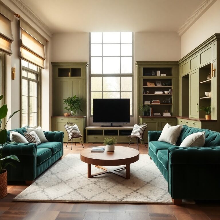
Living Room Colour Combinations That Always Work
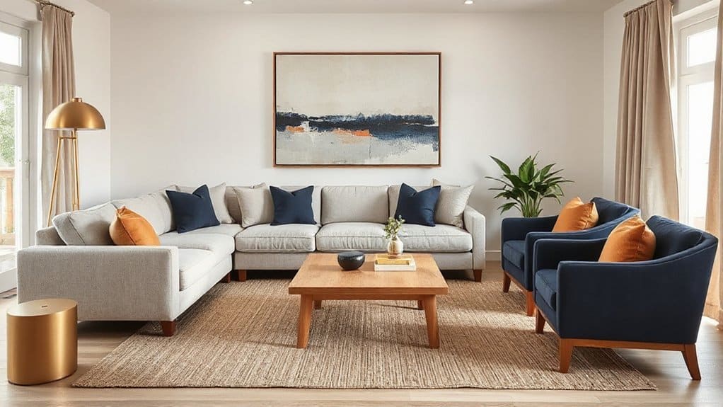
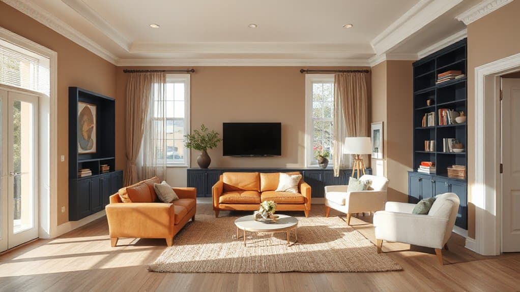
Because your living room has to look good in real life—not just in a pin—stick with colour pairings that designers return to year after year: warm white + greige + matte black, soft sage + cream + light oak, navy + crisp white + brass, or sand + terracotta + walnut. Keep the walls in the lightest tone to bounce daylight, then anchor the space with a deeper accent through rugs, cabinetry, or a single feature wall. Repeat your darkest note three times (frame, lamp, table base) so it reads intentional, not random. Bring in Bold patterns on pillows or an area rug, and balance them with Textured fabrics like bouclé, linen, or velvet for depth. Finish with metals that match your palette—black, brass, or bronze—so everything looks edited.
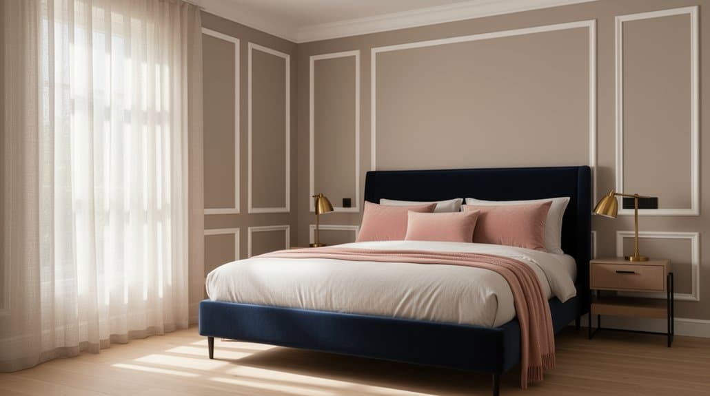
Bedroom Colour Combinations for Better Rest
For a bedroom that supports deeper rest, you’ll get the best results by starting with calming neutral pairings like warm greige with crisp ivory or sandy beige with soft white. Layer in cool sleep-friendly tones—misty blue, muted sage, or blue-gray—on a feature wall or bedding to lower visual intensity without feeling cold. Finish with soft accent colours such as dusty blush, clay, or muted lavender in pillows and art so the room feels current, balanced, and easy on your eyes at night.
Calming Neutral Pairings
While bold hues can energize a space, calming neutral pairings set your bedroom up for deeper, more consistent rest by reducing visual “noise” and keeping the mood steady from day to night. Lean on Color psychology: soft contrasts signal safety and order, so your brain stops scanning and starts unwinding. Match undertones to your natural lighting—north-facing rooms love warmer creams, while sunnier spaces can handle greige without feeling flat. Keep finishes matte and layered (linen, boucle, light oak) for a modern, hotel-calm effect.
- You’ll exhale faster when walls feel quiet, not demanding.
- You’ll sink into bedding that looks cloud-soft and forgiving.
- You’ll wake up gentler, without harsh visual jolts.
- You’ll feel grounded, like your room’s finally on your side.
Cool Tones For Sleep
Neutral pairings quiet the room, and cool tones take that calm one step further by nudging your nervous system toward “night mode.” Build your bedroom palette around blue-grey, misty sage, or soft lavender, then anchor it with crisp white trim and pale oak or ash wood so it stays airy, not icy. Color psychology backs this: cooler wavelengths can lower perceived visual temperature and reduce stimulation, helping you unwind. Keep saturation low and undertones consistent—either all green-leaning or all violet-leaning—to avoid a restless, muddy cast under warm bulbs. For paint finish options, choose matte or flat on walls to mute glare, then use eggshell on trim for clean wipeability. Pair with 2700K lighting so the cool paint reads soft, not stark.
Soft Accent Color Ideas
Because a bedroom still needs dimension, soft accent colors let you layer personality onto a calm base without waking the palette up. Start with muted neutrals or cool tones, then add Soft accent color ideas in small, repeatable doses: one pillow hue, one art note, one bedside object. Choose dusty rose, misty sage, buttercream, or clay—current, calming, and flattering under warm LEDs. Keep contrast low and finishes matte to reduce visual “noise.” Place Subtle color accents where your eyes land naturally, not everywhere at once, so your brain reads order and safety.
- A pale terracotta throw that feels like late-sunset warmth
- Sage bedside ceramics that cue slow breathing
- Smoky lilac art that quiets mental chatter
- Champagne-beige curtains that soften morning light
Kitchen Colour Combinations for Cabinets and Walls
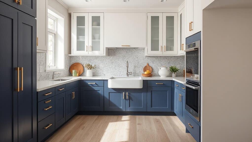
If you want a kitchen that looks intentional (not just “matching”), start by pairing your cabinets and walls with a clear undertone strategy—warm with warm, cool with cool, or a controlled contrast that repeats elsewhere in the room. Try creamy oak or greige cabinets with warm white walls for a relaxed, timeless look. Prefer crisp? Choose matte white or pale taupe walls with slate, ink, or sage cabinetry for a modern, grounded feel. Use Color psychology: greens read fresh and restorative, blues feel clean and calm, and charcoals add authority without going black. Account for lighting effects—north light cools paint, warm LEDs yellow it—so sample both surfaces together. Tie it up with matching metals and a repeated accent in textiles or art.
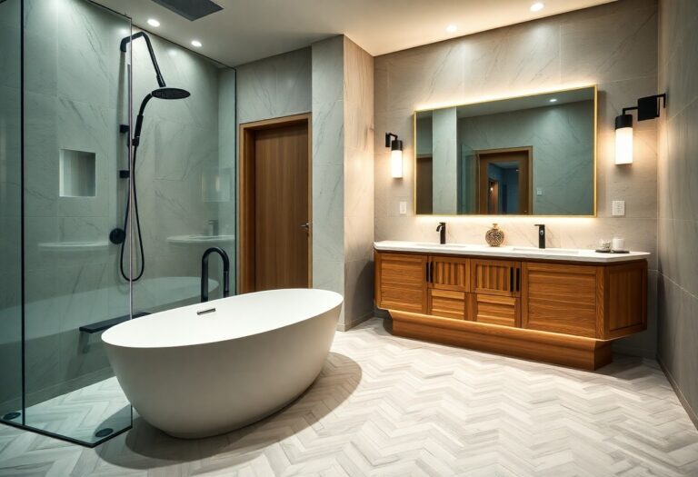
Bathroom Colour Combinations for Tile and Paint
While you can mix tile and paint almost endlessly, the best bathroom colour combinations start with the tile as your fixed “anchor” and let the paint fine-tune the mood around it. Use Color psychology: cool blue-grey paint calms busy mornings beside white subway tile, while deep forest green elevates marble-look porcelain with spa seriousness. Match undertones—warm beige tile needs creamy paint, not icy white. Prioritise paint finish options: satin for walls, semi-gloss for trim, and moisture-rated matte for ceilings to control glare and steam.
- You’ll feel instantly refreshed when crisp aqua meets bright white tile.
- You’ll feel grounded when terracotta tile pairs with muted clay paint.
- You’ll feel luxe when charcoal tile contrasts with soft blush walls.
- You’ll feel serene when sage paint wraps around creamy travertine.
Neutral Colour Combos for Any Room
Bathrooms teach you a useful rule: start with a fixed element and let colour do the shaping, and that same approach makes neutral colour combos work in any room. Pick your anchor first—oak floors, a stone countertop, or a warm white sofa—then build a tight palette of three neutrals.
Use Color psychology to steer undertones: creamy whites and greiges read welcoming, cool whites and soft charcoals feel crisp and focused. Keep contrast intentional: pair a light wall with a mid-tone textile and a deeper accent in trim or cabinetry. Vary paint texture for depth without noise; matte hides wall flaws, eggshell cleans easily, and satin sharpens millwork. Finish with blackened metal or brushed brass to modernise the scheme.
Bold Colour Combos (Without Chaos)
Although bold palettes can tip into visual noise, you can keep them sharp by limiting your “loud” colours to two and letting one neutral do the heavy lifting. Choose a grounded base like warm white, greige, or charcoal, then pair two saturated tones with clear roles: one dominant, one supporting. Color psychology matters—deep teal steadies the mood, while saffron or coral adds optimism without shouting. Keep saturation consistent, and repeat each hue at least twice across large surfaces so your eye reads intention, not clutter. Plan for seasonal palette changes: swap a cool jewel pairing for a sun-baked terracotta partner, while the neutral stays constant.
- You’ll feel energized, not overwhelmed
- You’ll create drama with control
- You’ll guide attention where it belongs
- You’ll make the room feel confidently “you”
Accent Colours: Cushions, Art, Rugs, Trims
You’ll lock in your room’s colour scheme with accents that repeat key tones in cushions, artwork, rugs, and trims. Start with cushion colour pairings—pull one shade from your main palette and one contrasting “pop” colour—then echo those tones in art and wall accents for a cohesive, gallery-ready look. Finish by anchoring the space with a rug that carries both hues, and sharpen the edges with trim details (crisp white, colour-matched, or a high-contrast frame) to make everything read intentional.
Cushion Color Pairings
When you treat cushions as your room’s colour “switchboard,” you can shift the entire mood without repainting a single wall. Start with your sofa’s base tone, then build Cushion color pairings that feel intentional: warm neutrals love rust, ochre, and olive; cool greys sharpen with ink blue, sage, and crisp white. Keep Textile coordination tight by repeating one hue across at least two cushions, then vary texture—linen, bouclé, velvet—to add depth without chaos. Limit yourself to three core colours plus one “spark” shade, and balance prints with solids so the room reads curated, not busy.
- Rust + cream makes you feel grounded and cosy
- Ink blue + sand feels calm and confident
- Olive + terracotta reads earthy and welcoming
- Blush + charcoal feels modern yet soft
Art And Wall Accents
How do you make a room’s palette feel finished instead of merely “matched”? You anchor it with art and intentional wall accents that repeat your key hues in smarter proportions. Choose Art styles that echo your scheme: graphic black-and-white for modern neutrals, warm abstracts for earthy palettes, or botanicals for fresh greens. Then set a controlled accent ratio—about 10–15% of the room—in frames, mats, and small decor so colour reads curated, not chaotic.
Use Wall textures to add depth without introducing new colours: limewash, microcement, or subtle vertical panelling amplify light and make midtones look richer. Keep metal finishes consistent across picture rails and sconces, and edit your gallery wall to one dominant tone plus one supporting accent for cohesion.
Rugs And Trim Details
Art and wall accents lock in your key hues; rugs and trim details make them feel built into the room. Choose Rug patterns that echo your dominant colour, then pull a quieter secondary tone into cushions so the palette reads intentional. Ground open plans with a larger rug than you think—you’ll create calm, not clutter. Treat trim like architecture: the right Trim materials and sheen sharpen contrast and elevate paint.
- A bold border rug gives you that “finished” heartbeat when you enter.
- Warm wood trim makes cool walls feel welcoming and lived-in.
- Soft, tonal rugs quiet busy days and slow the room down.
- Crisp white trims frame art and furniture with gallery-level confidence.
Room Colour Combo Mistakes (And Easy Fixes)
Although a great palette can make a room feel pulled-together instantly, a few common colour-combo mistakes can just as quickly make it look flat, chaotic, or oddly dated. If you pick colours without Color psychology, you’ll fight the room’s mood—cool greys can drain north light, while hot reds can spike energy in a bedroom; fix it by matching undertone to daylight and purpose.
Another slip is using equal-strength colours everywhere. Instead, anchor with one dominant neutral, layer a secondary tone, then add a tight accent (10% rule) for modern balance.
You’ll also see mismatched paint finish choices: all-matte reads dusty, all-gloss screams. Use matte on walls, eggshell for wipeability, satin on trim, and reserve semi-gloss for doors.
Frequently Asked Questions
How Do I Choose Paint Finishes (Matte, Eggshell, Satin) for Each Room?
Choose matte for ceilings and low-traffic bedrooms to soften room ambiance; use eggshell in living areas for subtle paint finish effects; pick satin for kitchens, baths, and trim since it’s durable, wipeable, and trend-smart.
Which Wall Colours Increase Resale Value Without Looking Generic?
Choose warm greige, soft white, or muted clay; they boost resale while feeling curated. You’ll leverage wall colour psychology (clean, calm, spacious) and trending colour palettes, then anchor with charcoal/olive accents for depth.
How Can I Coordinate Room Colours With Open-Plan Spaces and Sightlines?
Like a soft dawn spilling through doorways, you’ll unify open-plan sightlines by choosing one anchored neutral, then shifting tints per zone. Apply Color psychology, track lighting effects, repeat accents, and match undertones for cohesion.
What Are the Best Colour Combinations for Renters Using Removable Options?
You’ll get the best renter-friendly combinations by pairing Temporary wallpaper in soft neutrals with bold accents, then echoing tones using Peel and stick tiles. Try sage/cream/brass, navy/white/black, or terracotta/sand/olive.
How Do I Match Room Colours to My Existing Artwork Collection?
Match your room to your artwork by sampling dominant and accent hues, then balancing them with warm or cool neutrals for artwork color harmony. You’ll guide room mood creation by repeating key tones.
Conclusion
You’ve got endless options, but you don’t need endless stress. You’ll choose warm or cool, match north or south light, and make small or dark rooms feel twice as big with smarter neutrals. You’ll lock it in with the 60-30-10 rule—no guesswork, no chaos. You’ll lean on greige and white, sage and black, blush and off-white, or navy and stone, then punch it up with art, rugs, and trim—perfectly.