When you’re planning a blue living room, you need to start by choosing the right blue for your light and undertone, then balance it with warm neutrals that suit typical UK homes. You’ll get a cleaner look with white, a softer feel with cream, and more warmth with beige or tan, while terracotta and muted greens add depth without shouting. But the best pairing depends on what you can’t change—so where do you begin?
Key Takeaways
- Pair blue with crisp white trim and light textiles to brighten the room and make blue walls or furniture feel clean and timeless.
- Combine blue with cream to add warmth; use blue in cushions, rugs, and art, layered with wool, linen, or boucle textures.
- Match blue with beige or tan for a cosy balance; anchor with beige seating, tan rugs or leather, and oak or walnut tables.
- Add warm accents like mustard, blush pink, or terracotta in small doses to prevent blue schemes feeling cold or flat.
- Use consistent metals and woods—brushed brass and warm oak with navy, or chrome and pale oak with cool blues—for a cohesive finish.
Pick Your Blue: Undertone, Light, and Mood
Before you settle on furniture or soft furnishings, choose your blue by checking its undertone, the room’s natural light, and the mood you want to create. In north-facing UK rooms, favour warmer blues with green or violet undertones to counter cool daylight; in south-facing spaces, you can use clearer, crisper blues without them turning icy. Test large swatches on several walls and view them morning, afternoon, and under your lamps, because LEDs can shift blues towards grey. Apply Color psychology: deep navy reads calm and authoritative, mid blues feel balanced, and pale sky tones can lift small lounges. Finally, select paint finishes to suit wear: matt hides flaws, eggshell wipes clean, and satin or durable acrylic helps in busy family rooms.
Match Blue to What You Can’t Change (Sofa, Floors)
Once you’ve settled on the right blue undertone and finish, check it against the elements you can’t easily swap out—your sofa and flooring—so the room feels intentional rather than mismatched. In UK light, blues can swing cooler, so test swatches beside upholstery and timber at morning and evening. Use Colour psychology: deep blues steady busy spaces, while mid-tones keep a relaxed, sociable feel. Factor paint durability too; high-traffic living rooms suit washable matt or durable eggshell, especially near skirting boards and doorways.
- Match cool blues to grey sofas and pale oak floors
- Pair inky blues with tan leather and dark walnut
- Balance teal blues with beige fabric and honey pine
- Avoid violet blues against red-toned parquet
- Use a large sample card at floor level and sofa height
Blue Living Room With White: Crisp and Bright
Although blue already brings depth and calm, pairing it with white sharpens the scheme and makes a UK living room feel brighter, even on grey days. Use white to frame blue: ceilings, skirting boards, architraves, and shelving keep the room crisp, while blue walls or a statement sofa hold visual weight.
Apply Color psychology by choosing a blue that suits how you’ll use the space: inky navy supports focus, while softer blue feels restful. For paint selection, test samples in north- and south-facing light; UK daylight shifts quickly. Pick a clean, slightly warm white to prevent a clinical look, and match whites across trims and woodwork for consistency. Finish with white lampshades, linen cushions, and light rugs to bounce light.
Blue Living Room With Cream: Soft and Cozy
Choose cream walls to soften the room’s mood, then add blue accents through cushions, artwork, and a rug for definition. Build comfort with cosy textures and layered throws in wool, linen, and boucle to keep the scheme grounded and inviting. Finish with warm lighting and neutral finishes—think brass lamps, soft white shades, and oak—so the space feels balanced on grey UK days.
Cream Walls, Blue Accents
With cream walls as your base, you can introduce blue accents to create a living room that feels soft, warm, and quietly sophisticated. You’ll achieve balance by treating blue as a measured counterpoint, using complementary color schemes to keep the palette coherent. Apply furniture placement techniques to maintain clear sightlines and let your accents read as intentional rather than scattered.
- Choose navy or denim cushions for a grounded contrast against cream
- Add a blue glazed lamp or vase on a side table for controlled impact
- Hang artwork with cream matting and blue details to link both tones
- Use a blue-painted console behind the sofa to define the seating zone
- Repeat one blue shade in two or three places for a tidy, UK-ready finish
Cozy Textures And Layers
When you layer cosy textures over a blue-and-cream scheme, you’ll make the room feel warmer without dulling its clean contrast. Build from the floor up: choose a wool or jute rug beneath a blue sofa, then add a cream boucle or brushed-cotton throw for immediate softness. Aim for Textural contrast by mixing matte linens with velvets, and smooth ceramics with woven baskets. Use layered fabrics on windows—sheer voiles with heavier curtains—so you control privacy while keeping the palette calm. Bring in cushions in varying weaves, from herringbone to ribbed knit, and keep patterns subtle, such as small checks or pinstripes, to suit UK terraces and flats. Finish with natural oak or pale ash for balance. Keep tones cohesive.
Warm Lighting With Neutrals
Cosy layers feel even softer once you light them well, so keep the blue-and-cream contrast gentle by leaning on warm, neutral illumination. In a UK lounge, choose bulbs around 2700K to create an Ambient glow that flatters cream upholstery and calms blue walls. Layer fittings so you control mood through the day, and keep shades in linen or parchment to preserve Color harmony rather than introduce sharp whites.
- Fit dimmable ceiling lights for flexible evening brightness
- Add a floor lamp beside the sofa for reading comfort
- Use table lamps on sideboards to soften corners
- Choose warm LED filament bulbs in matching colour temperature
- Place a shaded lamp near artwork to balance blue tones
Blue Living Room With Beige/Tan: Warm and Inviting
Although blue can feel cool on its own, pairing it with beige or tan instantly brings warmth and balance to your living room. In terms of Color psychology, sandy neutrals soften blue’s intensity and create a welcoming mood that suits British homes with limited daylight. Choose warm beige paint, a tan wool rug, or linen cushions to lift navy or teal walls without competing with them.
Keep furniture placement deliberate: anchor the seating with a beige sofa against the blue backdrop, then add tan accent chairs to form a conversational U-shape. Use oak or walnut side tables to bridge both tones. Finish with brass hardware and cream lampshades for a cohesive, inviting scheme that still feels tailored.
Blue Living Room With Gray: Modern, Not Cold
To keep a blue-and-grey living room modern rather than cold, you’ll want greys with warm undertones, especially in paint and larger upholstery pieces. You can then layer blue-grey textures—think velvet cushions, woven throws, and a subtly patterned rug—to add depth without visual clutter. Finish with metallic touches (brass or brushed nickel) and natural wood accents to bring balance and warmth that suits most UK homes.
Warm Gray Undertones
When you pair blue with warm grey undertones, you keep the scheme crisp and modern without letting the room feel cold. You’ll notice, from a colour psychology perspective, that blue stays calming while warmth in the grey adds approachability. Choose greys with a hint of taupe or beige, especially in north-facing UK rooms, so the light doesn’t turn them steely. Keep contrast deliberate: let blue lead, and use warm grey to steady it across large surfaces. Consider paint finishes carefully; matte softens, while eggshell or satin reflects enough light for practicality.
- Pick a warm grey (greige) for walls behind blue seating
- Use off-white trims to sharpen edges
- Match metals to warmth: brushed brass over chrome
- Test samples in morning and evening light
- Balance with natural oak or walnut tones
Layered Blue-Gray Textures
Because blue and grey sit so close on the spectrum, you’ll stop the room reading flat or chilly by layering texture rather than pushing contrast. Use layered textures to create depth: a matte blue wall, a wool or bouclé sofa in soft grey, and velvet cushions in inky tones. Add a ribbed throw and a flatweave rug so light catches different surfaces across the day, which suits the UK’s changeable skies. Keep patterns subtle—herringbone, pinstripe, or tonal checks—so the palette stays modern. In terms of colour psychology, blue steadies the space while grey calms visual noise; texture supplies the warmth your eye expects. Finish with glazed ceramics and stacked books to break up smooth planes and sharpen focus.
Metallic And Wood Accents
Although blue and grey set a clean, contemporary base, you’ll stop the scheme feeling cold by introducing warm wood and a measured hit of metal. Choose wood textures with visible grain to soften sharp lines, then add Metallic accents to bounce light around typically overcast UK rooms. Keep finishes consistent so the look stays modern, not fussy, and use metals as punctuation rather than a full stop. Aim for balance: if you go for deep navy, lift it with lighter oak or ash; if your grey runs warm, try walnut for depth.
- Brass wall lights to warm cool paint
- Oak coffee table with matte legs
- Chrome picture frames for crisp definition
- Blackened steel curtain pole for structure
- Copper tray to group candles and remotes
Blue Living Room With Warm Wood: Natural Balance
If you want a blue living room to feel inviting rather than cool, pair it with warm wood to create a natural, balanced look. Choose oak, walnut, or ash with honey or chestnut stains to soften blue walls, sofas, or cabinetry. From a colour psychology perspective, blue signals calm, while warm timber adds reassurance and familiarity, so the space feels composed rather than stark. Aim for furniture harmony by repeating the same wood tone across key items, such as a coffee table, shelving, and picture frames, then vary texture through rattan, linen, or wool. Keep undertones aligned: navy suits deeper walnut, while sky or powder blue complements pale oak. In UK light, matte finishes reduce glare and look more refined.
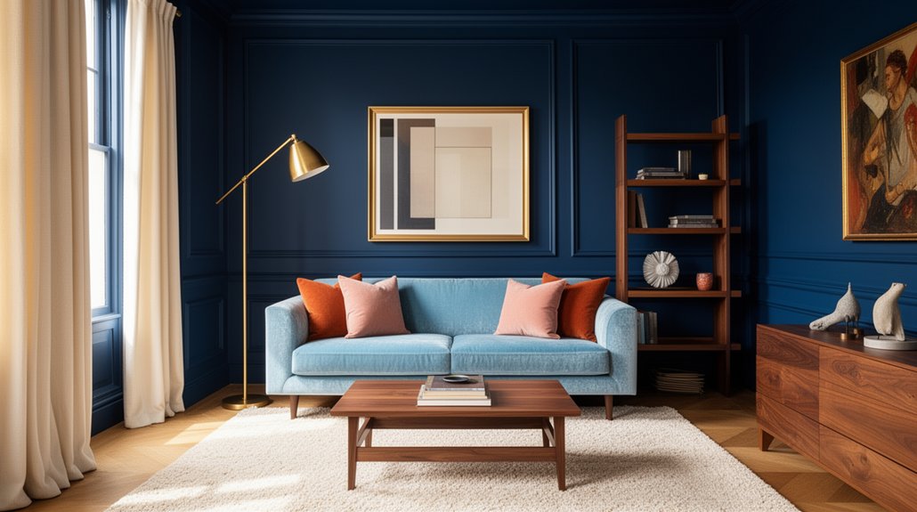
Blue Living Room With Brass/Gold: Instant Warmth
While blue sets a calm, cool base, brass and gold accents add instant warmth and a more polished, grown-up finish. Use colour psychology to balance serenity with welcome: blue steadies the room, while metallics reflect light and lift mood on grey UK days. Keep furniture harmony by repeating brass tones across key touchpoints, rather than scattering them randomly, and choose finishes that suit your blue—brushed brass for muted navy, brighter gold for clearer mid-blues. Aim for restraint so the scheme feels curated, not flashy.
- Swap chrome for brass on table and floor lamps
- Add a gold-framed mirror to bounce daylight
- Choose side tables with brass legs and blue tops
- Introduce antique-brass curtain poles and finials
- Style shelving with small gilded picture frames
Blue Living Room With Black: Sharp Contrast
When you pair blue with black, you create a sharp contrast that can look refined rather than severe if you keep the balance in check. You’ll get the best result by limiting black to deliberate accents and fixtures—such as matte black lighting, curtain poles, or a slim-framed coffee table—so the blue remains dominant. You can then soften the effect with pale textiles and warm wood tones, a practical choice for many UK living rooms with limited natural light.
Balancing Bold Contrast
Although blue already brings depth to a living room, pairing it with black delivers a sharper, more architectural contrast that can feel both modern and deliberate. To keep it balanced, you’ll need to manage proportion and light. Colour psychology suggests blue calms while black adds authority, so aim for visual harmony rather than dominance. In UK homes with limited daylight, you’ll get better results by keeping blue as the main field and using black sparingly, then softening progressions with mid-tones and texture.
- Keep black to a small percentage of the scheme
- Choose one blue depth and repeat it for consistency
- Add warm neutrals (stone, oatmeal) to prevent chilliness
- Use layered textiles to diffuse hard edges
- Test paint in morning and evening light before committing
Black Accents And Fixtures
If you introduce black through accents and fixtures rather than large surfaces, you’ll sharpen a blue living room without stripping it of light. Choose black fixtures with slim profiles: curtain poles, cabinet pulls, and a metal-framed coffee table read crisp against navy or cornflower. Anchor the scheme with one statement piece, such as a matte-black fireplace surround or TV unit, and keep adjacent walls lighter to prevent a heavy feel in typical UK terraces. Use accent lighting to add depth: black wall sconces or a track system creates definition while directing warm LEDs onto artwork and textured paint. Balance the contrast with pale oak, off-white linen, and a woven rug, and repeat black in small doses for cohesion.
Blue Living Room With Mustard: Bold, Retro Pop
For a bold, retro look that still feels polished, pair a deep blue living room scheme with mustard accents to add instant warmth and contrast. In terms of color psychology, mustard reads optimistic and sociable, balancing blue’s calm authority without feeling childish. Keep the scheme controlled by limiting mustard to a few high-impact points, and let blue dominate larger surfaces. Prioritise furniture placement: set the main seating against the blue wall, then use mustard to guide sightlines towards the fireplace or bay window. Choose matte finishes to avoid glare under typical UK daylight, and soften edges with textured fabrics for comfort.
- Mustard velvet cushions on a navy sofa
- Ochre rug to zone seating
- Brass floor lamp beside the armchair
- Mustard artwork in black frames
- Amber glass accessories on the mantelpiece
Blue Living Room With Blush Pink: Subtle Softness
Pairing blue with blush pink lets you balance cool and warm tones without losing a calm, refined feel. You’ll get the best result by keeping blush to accents and textiles—cushions, throws, and a rug—so the room stays grounded. Choose finishes with intention, combining brushed brass or black metal with pale oak or walnut to keep the palette cohesive.
Balancing Cool And Warm
Although blue sets a calm, cool foundation, blush pink introduces just enough warmth to keep your living room feeling welcoming rather than stark. To balance cool and warm, you’ll need deliberate proportion and placement, guided by Color psychology and design harmony. Keep blue dominant for serenity, then use blush to soften edges without shifting the room into sweetness. In typical UK light, test both shades morning and dusk, as north-facing rooms can mute pink and intensify blue. Ground the scheme with measured neutrals so neither tone feels isolated.
- Keep a 70/30 split: blue first, blush second
- Choose greys or off-whites to bridge temperatures
- Repeat each hue at least twice for visual continuity
- Use warm metals sparingly to counter cool undertones
- Check shades against your flooring before committing
Blush Accents And Textiles
When you introduce blush through accents and textiles, you soften blue’s crispness without repainting the room. Start with Blush accents in cushions, a throw, or a lampshade, then repeat the tone once more in artwork or a rug detail so it looks intentional. Choose muted blush rather than sugary pink to suit typical UK light and to complement navy, denim, or powder blue.
Use textured textiles to add depth: velvet cushions, a boucle footstool cover, or a wool-mix throw will warm the scheme while keeping it refined. Balance blush with off-white or oatmeal linen for calm contrast, and keep patterns small-scale, such as pinstripes or subtle florals. Finally, edit ruthlessly—too many pink notes can dilute blue’s elegance.
Finishes, Metals, And Wood
Once you’ve introduced blush through cushions and throws, lock the scheme in with considered finishes, metals, and wood so the room feels cohesive rather than styled in layers. Keep your blue as the anchor, then choose Finish options that temper it: matte paint, lightly textured plaster, or a soft eggshell for joinery. For metal finishes, favour warm tones that echo blush and prevent the blue reading too cool. Wood should sit between them, with medium oak or walnut bringing depth without heaviness. Balance sheen levels so light reflects evenly across the space, particularly in typical UK low winter light.
- Brushed brass for lamps and picture frames
- Aged bronze on handles and curtain poles
- Matt black sparingly for contrast
- Natural oak coffee table or shelving
- Pale ash to lift darker navy
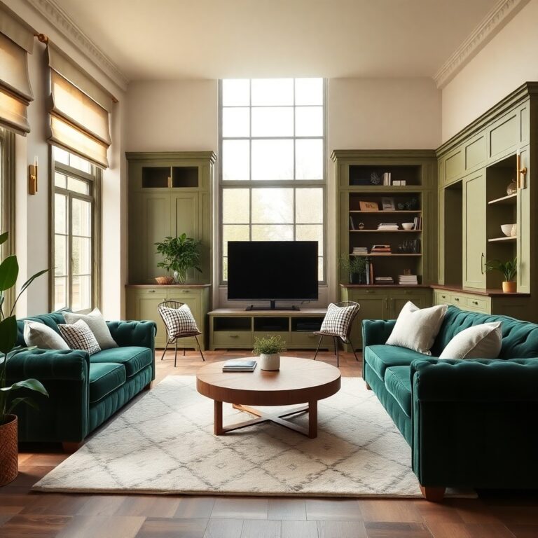
Blue Living Room With Green: Earthy Depth
If you want a blue living room to feel grounded rather than icy, introduce green accents to add earthy depth and balance. Nature inspired palettes work best when you pair deep navy or inky blue with olive, sage, or forest green, keeping undertones consistent for a cohesive finish.
Use Color psychology to guide placement: blue steadies the space, while green signals restoration and calm, so you’ll want it where your eye rests. Add green through cushions, a wool throw, artwork, or a large houseplant near the window. Choose patterned textiles that blend both hues to soften hard edges. In smaller UK sitting rooms, limit green to two or three key pieces to avoid visual clutter. Finish with off-white trim to keep the room bright.
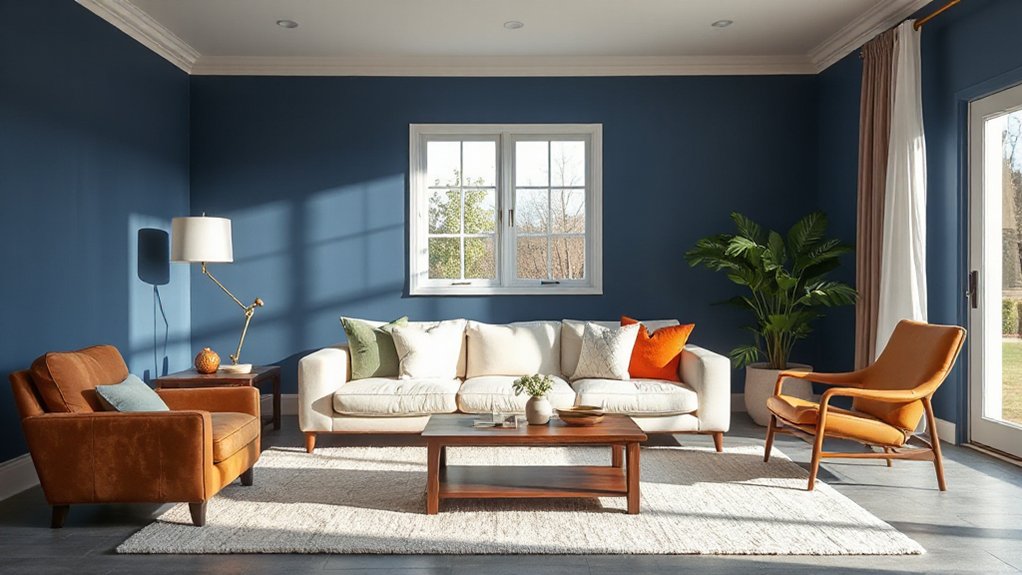
Blue Living Room With Terracotta: Sunbaked Warmth
How do you warm up a blue living room without losing its calm? Pair it with terracotta to introduce Sunbaked warmth while keeping the space grounded. You’ll get a balanced contrast: blue recedes and soothes, terracotta advances and comforts, ideal for UK light that can feel cool.
- Add Terracotta accents through cushions, a throw, or a lampshade for quick impact.
- Choose a clay or rust rug to anchor seating and soften hard flooring.
- Display earthenware on shelves; matte finishes prevent glare in overcast weather.
- Paint one alcove in muted terracotta to frame artwork without overpowering blue walls.
- Repeat the tone in timber, leather, or dried grasses so the warmth feels intentional.
Blue Living Room Palette Recipes by Style + Mistakes to Avoid
Terracotta proves that a blue living room can feel warmer without sacrificing its calm, and the same principle applies when you build a full scheme: use a clear palette recipe matched to your style. For modern flats, pair inky blue walls with crisp white trim, light oak, and brushed brass. For a coastal look, choose denim blue, warm sand, and chalky off-white, then add rattan. For heritage homes, combine navy with sage, antique gold, and walnut. Use Color psychology: deeper blues steady the room, while warm neutrals prevent it feeling cold. Avoid mistakes: don’t mix too many blues, don’t ignore undertones, and don’t place all colour on one wall. Plan furniture placement so larger pieces sit on quieter tones, keeping accents for cushions and art.
Frequently Asked Questions
What Sheen Should Blue Living Room Paint Be: Matte, Eggshell, or Satin?
Choose eggshell for most blue living rooms; it balances washability and softness. Use matte if you want calmer colour mood and pristine walls. Pick satin when you’ve got busy household, sleek furniture style, higher durability.
How Do I Choose Blue Lighting Temperature: 2700K, 3000K, or 4000K?
Like choosing the right key, you’ll pick 2700K for cosy evenings, 3000K for balanced everyday use, and 4000K for crisp tasks. With Blue lighting, match the colour temperature to room use and furnishings.
Which Window Treatments Work Best With Blue Walls: Curtains, Shades, or Blinds?
You’ll get the best results with curtains for softness and insulation, paired with simple roller shades for control; choose blinds only for moisture-prone rooms. Use Decorative curtain styles and Window treatment textures to balance blue walls.
How Can I Make a Blue Living Room Feel Bigger in a Small Space?
You’ll make a blue living room feel bigger by using pale, reflective blues and mirrors; apply color psychology for calmness, and optimise furniture arrangement by floating slim pieces, keeping clear walkways, and choosing light-toned rugs.
What Accent Colors Complement a Blue Room With Lots of Indoor Plants?
You’ll suit a plant-filled blue room with warm terracotta, brass, soft blush, and creamy white as Complementary plant colors. Try accent wall options in deep teal or muted sage; keep textiles light, add oak accents, and consider matte finishes.
Conclusion
Choose your blue with care, then balance it with warm neutrals and earthy accents for a room that feels inviting, not cold. You’ll get the best results when you match undertones to fixed features like flooring and your sofa, then layer in texture, timber, and a touch of brass. Importantly, 70% of UK homeowners say their living room is the space they update most often—so you’re right to prioritise a versatile palette that ages well.