You probably don’t know your “neutral” paint can shift pink, green, or yellow depending on your floors and the time of day. If you want a cohesive interior, you’ve got to start with fixed finishes, check undertones in real light, and balance neutrals with a disciplined accent strategy. Get that wrong, and even expensive décor looks mismatched. Get it right, and every room feels intentional—starting with one quick test most people skip.
Key Takeaways
- Start with fixed finishes (floors, tiles, benchtops) and pull 2–3 reference colours to guide all paint choices.
- Identify warm or cool undertones and choose wall and trim colours that match, testing large swatches in real lighting.
- Use the 60-30-10 rule: 60% wall colour, 30% secondary furniture/cabinetry tones, 10% accents for balance.
- Choose a cohesive neutral base (warm beige, greige, or soft white) and add depth with charcoal, walnut, or brass details.
- Apply room-ready combos: warm greige + white trim + teal accent; sage cabinetry + warm white walls + black hardware; dusty blue + cream.
Pick an Interior Paint Palette in 5 Steps
Before you pick up a brush, lock in a paint palette that matches how you actually live in the space—not just what’s trending on a swatch card. Step 1: set the mood per room (calm, energetic, focused). Step 2: map your lighting—north/south exposure and evening bulbs—and test large samples. Step 3: choose a three-colour framework: main wall colour, trim/ceiling white, and an accent for depth. Step 4: factor in Wall texture; matte hides bumps, satin sharpens detail, and limewash reads artisanal. Step 5: prioritise paint durability by zone: washable eggshell for hallways, moisture-resistant satin for baths, and scuff-proof finishes for kids’ rooms. Lock in undertones, then repeat accents for cohesion throughout.
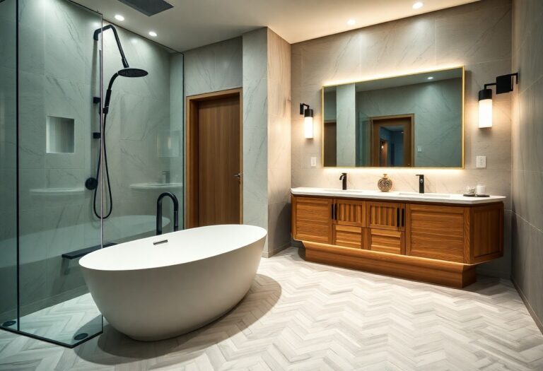
Start With Fixed Finishes (Floors, Tiles, Benchtops)
Because you can repaint walls in a weekend but you can’t easily swap out timber floors, stone benchtops, or tile, start your colour plan with these fixed finishes and let them set the undertone direction. Walk the space in daylight and note dominant surfaces: floor species and stain, grout colour, countertop veining, and any built-in cabinetry.
Pull 2–3 reference colours directly from those materials and treat them as your non-negotiables. Use them to choose wall and trim shades that look intentional, not “almost matching.” If you’re using Decorative ceiling finishes, align their sheen and tint with your major surfaces so the room reads cohesive from every angle.
Finally, plan Exterior paint coordination now, so interior neutrals progress smoothly at entryways, windows, and doors.
Check Undertones Before Choosing Paint Colours
Before you choose paint, you’ve got to identify whether your room reads warm or cool—undertones decide if a “neutral” looks creamy, greenish, or icy. You’ll get the most accurate read by testing large swatches and checking them in morning light, afternoon sun, and under your evening bulbs. Then coordinate the winner with your fixed finishes—floors, tiles, and benchtops—so the whole palette looks intentional and current.
Identify Warm Vs Cool
Even if you’ve nailed your “perfect” paint colour, it can still read wrong on the wall if you haven’t checked whether it’s warm or cool. Start with the undertone: warm shades lean yellow, red, or beige; cool shades lean blue, green, or grey. Do a quick Warm vs cool tones check by holding your sample next to a true white sheet and a crisp black item; warmth looks creamier, coolness looks cleaner and slightly steely.
Use a colour temperature comparison across your fixed finishes—flooring, countertops, tile, and metals. If your oak reads honeyed or your brass feels golden, you’ll usually want warm-leaning neutrals. If your concrete looks bluish or your chrome feels icy, choose cool-leaning paints for cohesion.
Test Swatches In Lighting
Once you’ve sorted warm versus cool, you need to see your paint swatches under the same lighting your room lives in, not the flattering glow of a paint store. Paint a minimum 12×12-inch sample on two walls, then check it morning, midday, and night to catch shifting undertones. Watch for Lighting effects: north light can gray out beige, while late-afternoon sun can amplify red or yellow. Turn on your actual bulbs too; 2700K warms neutrals, 4000K can sharpen them. Don’t judge color in isolation—place swatches beside true white paper so you’ll spot sneaky green, pink, or violet casts. Finally, test the intended paint finish sheen; higher sheen reflects more and can read lighter or cooler.
Coordinate With Fixed Finishes
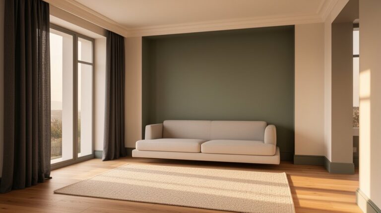
Because your floors, countertops, tile, and upholstery won’t change every time trends do, you need to pull undertones from these fixed finishes first and let them lead your paint choice. Identify whether each surface reads warm (gold, red, creamy) or cool (blue, green, gray). Then choose wall colours that echo that bias, not fight it. If your oak floor runs honey-warm, skip icy whites and lean into soft greiges or muted clay. If your marble veers blue-gray, avoid beige and pick crisp off-whites or smoky sages. Use sample chips against finishes at eye level. Reserve bolder moves—Accent walls, Faux finishes—for areas where they complement the dominant undertone, not compete, so everything feels intentional.
Use the 60-30-10 Rule (With Real Examples)
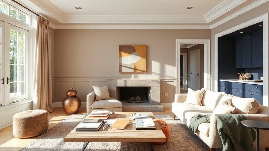
Once you’ve confirmed undertones, you can lock in a balanced palette with the 60-30-10 rule: 60% dominant wall colour, 30% secondary upholstery or cabinetry tone, and 10% accent through art, cushions, or trim. You’ll see it work in a modern living room with warm greige walls (60), camel leather and oak (30), and matte black metal or deep forest green accents (10). Or in a crisp kitchen with soft white walls (60), slate-blue lower cabinets (30), and brushed brass hardware plus terracotta accessories (10).
60-30-10 Rule Basics
While color trends shift from warm neutrals to moody jewel tones, the 60-30-10 rule stays a reliable framework for building a balanced interior palette. You’ll assign 60% to a dominant wall color, 30% to a secondary color that supports it, and 10% to an accent that adds punch. Start by defining your intent with Color psychology: calming hues for rest, energizing tones for activity, or grounded shades for focus. Then control contrast by choosing values (lightness) and undertones that harmonize. Finally, refine the look with paint finish options—matte for softness, eggshell for everyday durability, satin for subtle sheen, and semi-gloss for crisp definition on trim. You’ll keep the room cohesive without feeling flat or chaotic.
Real Room Color Examples
The 60-30-10 rule gets even easier to apply when you can picture it in real rooms, so let’s map it to palettes designers actually use right now. In a modern living room, run 60% warm off-white on walls, 30% oat-beige sofa and rug, then 10% matte black through frames, lighting, and hardware for crisp contrast.
For a calm bedroom, use 60% soft greige, 30% dusty blue bedding and drapery, and 10% brushed brass plus creamy textiles—Color psychology in interiors says blue cues rest while brass adds warmth.
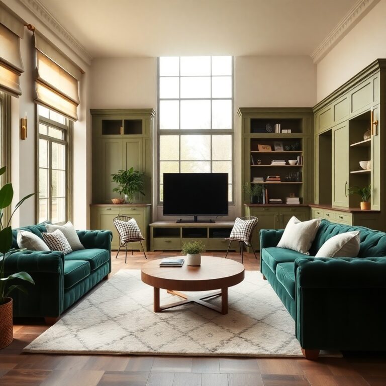
In a kitchen-dining zone, go 60% pale sage, 30% natural oak cabinetry or table, and 10% terracotta stools or art. For Creative accent wall ideas, paint one deep charcoal wall as your 10% and repeat it in accessories.
Match Interior Paint Colours to Natural and Warm Light
Because light shifts the way pigment reads on your walls, you’ll get the best results when you choose interior paint colours based on the room’s natural exposure and the type of warm bulbs you use at night. In north-facing rooms, lean into warmer whites, greiges, and muted clay tones to counter cool daylight and keep Natural light harmony. In south-facing spaces, you can handle cleaner whites, soft sages, or dusty blues without them turning icy.
Then factor in evening lighting: 2700K–3000K LEDs amplify reds and yellows, so avoid overly creamy whites if you don’t want a buttery cast. For balanced Warm light reflection, pick neutrals with a subtle undertone that matches your flooring—pink-beige for oak, green-grey for walnut—and your colours will stay consistent.
Test Swatches: Samples, Sheen, and Feature Walls
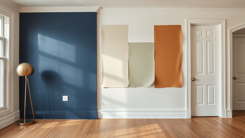
After you’ve narrowed your palette, test swatches the way designers do: paint large samples (at least 12″ x 12″, ideally 24″ x 24″) on multiple walls or on foam boards you can move, then check them morning, afternoon, and under your actual 2700K–3000K bulbs at night. Don’t judge against white primer; compare beside your flooring and key fabrics. Next, lock in sheen options: matte hides wall flaws but can mark, eggshell balances washability and softness, satin reads crisper on trim-adjacent walls, and semi-gloss spotlights texture. Keep ceilings flatter to reduce glare. For a feature wall, pick the most visually anchored surface (often behind a sofa or bed) and repeat that colour in small accents so it feels intentional. Avoid high-contrast stripes here.
Go-To Neutral Colour Combinations That Always Work
When you want a neutral scheme that won’t date, pair warm beige with crisp white to keep the room bright while softening contrast. If you’re after a more contemporary read, use greige as your main wall colour and anchor it with charcoal on trim, built-ins, or an accent wall for clean definition. You’ll get a layered, designer-finished palette that works across modern, interior styles, and classic interiors.
Warm Beige And White
Why does warm beige and white never fall out of favour? You get a balanced neutral base that flatters most light conditions and finishes. Warm beige adds softness and lived-in comfort, while crisp or creamy white sharpens edges, lifts ceilings, and makes trim look intentional. From a colour psychology standpoint, beige signals calm and approachability; white reinforces cleanliness and space, so rooms feel settled yet fresh.
You’ll keep it current by varying undertones: pair a honey-beige wall with a warm white for cohesion, or choose a sand-beige with a slightly brighter white for contrast. Use Accent walls strategically—beige behind the sofa or bed anchors the room without shrinking it. Finish with matte walls and satin trim for modern definition.
Greige And Charcoal
Because greige sits neatly between warm beige and cool grey, it gives you a flexible wall colour that won’t fight your flooring, upholstery, or changing daylight. You’ll get greige elegance as a calm base, then dial up contrast with charcoal accents that feel modern, not heavy. Keep undertones aligned: choose taupe-leaning greige for warm woods, or a cooler greige for concrete, steel, and crisp whites. Use charcoal where you want definition, then soften with layered textures and warm metals.
- Paint trim in soft white to keep edges clean
- Add charcoal on doors, built-ins, or a feature wall
- Repeat charcoal in hardware, frames, and lighting
- Balance with linen, oak, and brushed brass for warmth
Warm, Cosy Interior Colour Combinations (No Yellowing)
Although warm palettes often get blamed for that dated golden cast, you can still build a cosy scheme that stays crisp by choosing modern, low-yellow undertones and pairing them with clean neutrals. Start with a soft clay or cinnamon-beige on main walls, then balance it with warm white trim (think creamy, not buttery) to prevent yellowing. Add depth through walnut, terracotta textiles, and brushed brass, which read rich without skewing orange.
For Accent wall ideas, pick a muted rust, cocoa, or aubergine behind open shelving or a fireplace to anchor the room. Apply Color psychology tips: clay tones feel welcoming, cocoa adds security, and aubergine signals sophistication. Keep ceilings a clean white and choose LEDs around 3000K to maintain true warmth at night.
Cool, Calming Colour Combinations for Bedrooms and Baths
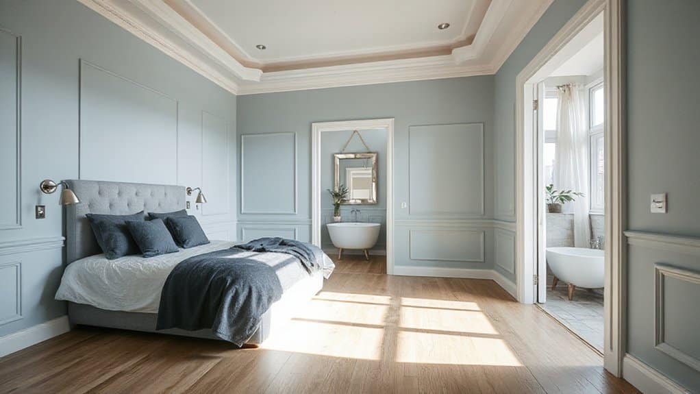
For bedrooms and baths, you’ll get the calmest results by pairing soft blues with crisp whites to keep the space bright and spa-clean. You can also lean into sage green neutrals—muted, greyed greens that read modern, grounded, and easy to coordinate with stone, wood, and brushed nickel. For a quieter, boutique-hotel mood, you’ll like lavender gray, which softens cool light and adds serenity without feeling sugary.
Soft Blues And Whites
When you want a bedroom or bath to feel instantly calmer, pair soft blues with clean whites to create a crisp, spa-like palette that still reads warm and livable. You’ll get hotel-grade freshness without the clinical edge, especially if you keep undertones consistent (icy blue with bright white, dusty blue with creamy white). For Minimalist palettes, stick to two blues max and let texture do the work.
- Paint ceiling and trim in the same white for seamless height
- Use a powder-blue accent wall choice behind the headboard or vanity
- Balance cool paint with warm metals (brass or champagne nickel)
- Add soft contrast via linens: white waffle towels, pale-blue bedding
Choose washable satin in baths and matte in bedrooms, and sample under morning and evening light.
Sage Green Neutrals
Why does sage green keep showing up in the most relaxing bedrooms and baths? You get a cool, botanical softness that reads modern yet timeless, especially under warm LEDs and morning daylight. Use Sage green on the main walls, then balance it with Neutral tones like creamy off-white trim, stone-beige towels, and light oak or ash cabinetry. Keep undertones aligned: choose a gray-leaning sage with crisp whites for a cleaner spa look, or a yellow-leaning sage with warmer neutrals for a cozier retreat. Add matte black or brushed nickel hardware to sharpen edges without raising visual temperature. In bedrooms, layer oatmeal linens and textured rugs so the green stays calm, not clinical. Choose low-sheen finishes for durability.
Lavender Gray Serenity
- Pair with creamy off-white trim for crisp edges, not harsh lines.
- Add greige or pale taupe textiles to keep the palette grounded.
- Use brushed nickel or champagne brass for a spa-level sheen.
- Bring in charcoal accents (towels, frames) for depth and definition.
Keep saturation low, avoid icy whites, and let one darker element guide the room’s focal point.
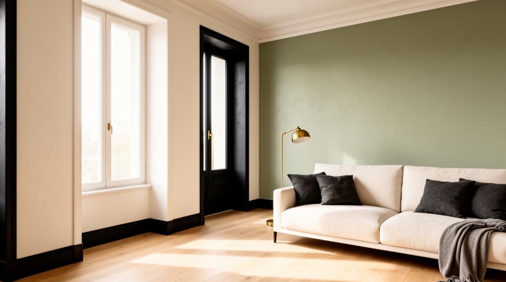
Earthy Interior Paint Colours: Clay, Olive, and Sand
How do you make a room feel grounded without turning it flat or dated? Start with earthy tones built from natural palettes: clay, olive, and sand. Clay reads warm and modern when you choose a muted terracotta with a soft, dusty undertone; use it on a feature wall or in a dining nook to add depth. Olive works best in a greyed, mid-value range, so it feels sophisticated rather than military; apply it to cabinetry, built-ins, or an entry for quiet richness. Sand acts as your balancing neutral—pick a beige with a hint of taupe to avoid yellowing. Keep sheens consistent (eggshell for walls, satin for trim) and let blackened metal and light oak sharpen the look.
Bold Colour Combinations That Still Feel Cohesive
Even when you lean into bold colour, you can keep the room feeling cohesive by anchoring everything to one consistent undertone and a clear value plan. Pick one dominant shade, support it with two accents, then add a steady neutral to manage Bold contrasts without visual chaos. You’ll get Harmonious palettes by repeating each colour at least twice across walls, textiles, and art.
- Pair inky navy with saffron and warm white for crisp depth
- Match emerald with blush and camel for a modern, boutique feel
- Combine terracotta with teal and parchment for confident warmth
- Use aubergine with chartreuse and soft greige for fashion-forward drama
Keep sheen consistent, and limit high-chroma colours to one feature wall or built-in. Test at night too.
Modern Monochrome Palettes That Don’t Look Flat
After you’ve mastered bold pairings, a modern monochrome scheme gives you the same designer-level cohesion with a calmer, more architectural look. To keep it from reading flat, you’ll build contrast through value shifts: pair a deep base with mid-tone walls and a pale ceiling, or invert it for a gallery feel. Add texture as your “second colour”—matte walls, satin trim, limewash, microcement, or ribbed paneling—so light creates movement. Reference Historical color palettes to choose undertones that stay believable, like smoke-gray charcoals or warm stone beiges. Respect Cultural influence on interior colors by aligning the hue’s symbolism with your aesthetic: inky blacks, mineral whites, or sand tones. Finish with one precise accent.
Room-by-Room Colour Combinations (Living, Kitchen, Bed)
Because each room has a different job, you’ll get better results by tailoring your colour combinations to the way the space is used. Lean on Color psychology to steer mood, then add a Bold accent for modern edge.
- Living room: Warm greige walls, crisp white trim, and a deep teal or terracotta statement wall to energize conversation.
- Kitchen: Soft sage or clay cabinetry with warm white walls; matte black hardware creates clean contrast without glare.
- Bedroom: Dusty blue or muted lavender with creamy off-white; add charcoal on a headboard wall for calm depth.
- Whole-home flow: Repeat one metal (brass or black) and one undertone (warm or cool) so adjacent spaces feel intentional.
Avoid These Interior Paint Colour Combination Mistakes
While a strong palette can make a space feel designed, a few common missteps can instantly flatten it—like mixing warm and cool undertones without a plan, pushing contrast to the point of harshness, or skipping a real-world paint test under your room’s lighting. Don’t pick colours in isolation; check them against fixed finishes like flooring, countertops, and tiles. Use Color psychology deliberately: saturated reds can raise energy, while dusty greens calm, so match mood to function. Avoid “all-neutral” schemes with no depth—add one anchored accent or a deeper trim tone. Keep sheen consistent: random gloss shifts read patchy. Also weigh paint finish durability; matte hides flaws but marks easily, so reserve it for low-traffic rooms. Finally, repeat a core hue across spaces to prevent visual whiplash.
Frequently Asked Questions
How Often Should Interior Walls Be Repainted in High-Traffic Homes?
You should repaint high-traffic interior walls every 3–5 years, or sooner if scuffs and fading show. Use color psychology to refresh mood, and consider accent wall ideas to hide wear and track trends.
What Paint Types Are Safest for Children, Pets, and Allergy Sufferers?
Choose zero-VOC, water-based acrylic paints with GreenGuard Gold certification; they off-gas less and clean easily. Use hypoallergenic paints and non toxic finishes, avoid added biocides/fragrances, and ventilate well during curing.
How Do I Calculate How Much Paint I Need for Each Room?
Measure, multiply, subtract: get each room’s wall area, minus doors/windows. Divide by coverage per gallon, then add 10–15% for waste, especially with Wall texture options. Adjust for Paint color schemes needing extra coats.
Can I Paint Over Dark Walls Without Priming First?
You can, but you shouldn’t. Dark wall challenges cause bleed-through and extra coats; priming benefits include better adhesion, uniform sheen, and true color. Use a stain-blocking, high-hide primer, then apply two quality coats.
What’s the Best Way to Clean and Maintain Painted Walls?
Treat your walls like quiet guests: you’ll keep them fresh with gentle Wall cleaning. You’ll dust weekly, spot-wash with mild soap, avoid harsh scrubbers, and touch up chips promptly—smart, modern Paint maintenance that lasts.
Conclusion
You’ve now got a paint plan that won’t fall apart in real life: you’ve anchored colours to fixed finishes, confirmed undertones, applied 60-30-10, and tested them in both daylight and warm bulbs. Like Midas, don’t turn every surface to “gold”—let one bold accent earn the spotlight while modern monochromes stay layered with texture. Room by room, you’ll keep flow, avoid clashing warmth, and land a cohesive, current interior.